❌

Normal view

There are new articles available, click to refresh the page.
Before yesterdaySpace

Hunting Red Leaves with Satellites

26 October 2026 at 00:01


September 29 to October 4
October 5 to 11

A map depicts vegetated parts of Earth's land surfaces from September 29 to October 4. Vegetation color is depicted on a spectrum ranging from dark green to light yellow to dark red. The largest patches of red vegetation appear in Alaska, northern Canada, Mongolia, and Russia. Smaller patches of red are visible in Australia.
A map depicts vegetated parts of Earth’s land surfaces from September 29 to October 4. Vegetation color is depicted on a spectrum ranging from dark green to light yellow to dark red. The largest patches of red vegetation appear in Alaska, northern Canada, Mongolia, and Russia. Smaller patches of red are visible in Australia.
NASA Earth Observatory / Lauren Dauphin

A similar global map depicts the redness of vegetation from October 5 to 11. The reddest areas have shifted equatorward, with more color visible in the Mid-Atlantic, the U.S. Southeast, southern Russia, China, and Mongolia.
NASA Earth Observatory / Lauren Dauphin

A map depicts vegetated parts of Earth's land surfaces from September 29 to October 4. Vegetation color is depicted on a spectrum ranging from dark green to light yellow to dark red. The largest patches of red vegetation appear in Alaska, northern Canada, Mongolia, and Russia. Smaller patches of red are visible in Australia.
A map depicts vegetated parts of Earth’s land surfaces from September 29 to October 4. Vegetation color is depicted on a spectrum ranging from dark green to light yellow to dark red. The largest patches of red vegetation appear in Alaska, northern Canada, Mongolia, and Russia. Smaller patches of red are visible in Australia.
NASA Earth Observatory / Lauren Dauphin
A similar global map depicts the redness of vegetation from October 5 to 11. The reddest areas have shifted equatorward, with more color visible in the Mid-Atlantic, the U.S. Southeast, southern Russia, China, and Mongolia.
NASA Earth Observatory / Lauren Dauphin

September 29 to October 4

October 5 to 11


These maps show the redness of vegetation as measured by the OCI (Ocean Color Instrument) on the PACE (Plankton, Aerosol, Cloud, ocean Ecosystem) satellite in September and October 2026. Red foliage appears to peak in New England, northern Canada, and northern Russia from September 29 to October 4, then spreads southward into the Mid-Atlantic, Mongolia, and northern China from October 5 to 11 (right).

The Japanese tradition of momijigari, or “red leaf hunting,” stretches back more than a millennium, as evidenced by ancient poems describing journeys to admire fall foliage. In America, mentions of foliage trips began appearing in the historical record in the 19th century, around the time artists and poets such as Frederic Church and Emily Dickinson celebrated autumn color in depictions of the Northeast.

Modern-day leaf peepers have a new way to track and savor the seasonal phenomenon. The hyperspectral OCI (Ocean Color Instrument) on NASA’s PACE (Plankton, Aerosol, Cloud, ocean Ecosystem) satellite observes the planet’s oceans and vegetation daily at 286 spectral bands. Among this array are a few groups of wavelengths that allow scientists to track subtle changes in leaf pigments key to fall foliage displays, including anthocyanins (reds), carotenoids (yellows and oranges), and chlorophylls (greens).

NASA scientists can track fall color by measuring how much red, orange, and yellow forests show compared with green. Tracking the ratio over time reveals where leaves are changing and when color peaks. The maps above show vegetation “redness” from September 29 to October 4 (left) and October 5 to 11 (right). Areas shown in green have values near 1, meaning the satellite detects about as much red as green, and most leaves have not yet turned. Areas shown in light yellow and red have higher values, indicating progressively more red pigment relative to green.

The satellite detected particularly high levels of redness in parts of northern and eastern Russia, northern Alaska, and northern Canada from September 29 to October 4. In New England and upstate New York, redness began to fade during the week of October 5 to 11, even as it spread across much of the Midwest and the Mid-Atlantic. (Not all the yellows and reds on the maps represent fall colors. Crops in some agricultural areas, for instance, show high anthocyanin levels as they age and after they are harvested. Also, in some regions, clouds produce what appear to be gaps in the vegetation.)

Seeing Red in Vermont

Many of the reddest areas—such as the Adirondacks in New York, the Green Mountains in Vermont, and the White Mountains in New Hampshire—have large numbers of sugar maples (Acer saccharum) and red maples (Acer rubrum), deciduous trees that turn a brilliant shade of crimson in the fall. Blueberries, bilberries, sedges, mosses, and grasses likely contribute to the intense reds detected in marshy tundra areas in northern Alaska, Canada, and Russia.
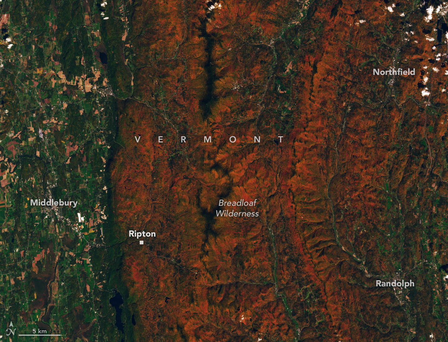
Ridges and mountains in a forested area appear orange, while river valleys and lower-elevation areas are still green.
Red and orange hues cover the forested ridges of central Vermont, while river valleys and lower-elevation areas are still green. The OLI (Operational Land Imager) on Landsat 9 captured this image on October 3, 2026.
NASA Earth Observatory / Lauren Dauphin

The OLI (Operational Land Imager) on Landsat 9 captured an image (above) of intensely red foliage around Ripton, Vermont, on October 3, 2026, around the peak of redness in the region. Poet Robert Frost, author of “October,” “The Road Not Taken,” “Nothing Gold Can Stay,” and several other poems that evoke fall foliage, kept a summer home and farm in Ripton and taught at Middlebury’s Bread Loaf School of English.

Some other satellites with hyperspectral sensors can measure fall foliage pigments in a way that is similar to PACE, but only in more localized areas and less frequently. PACE is the first satellite capable of measuring all three key leaf pigments—anthocyanins, carotenoids, and chlorophylls—across the entire planet every day or two.

“It’s the ability to collect time-series data of anthocyanins and carotenoids everywhere on Earth repeatedly that is game-changing,” said Karl Huemmrich, a vegetation scientist with the Goddard Earth Sciences Technology and Research II center at the University of Maryland, Baltimore County. Huemmrich, who is also a member of the PACE science team, was eager to work with the satellite because of OCI’s broad swath and short revisit time. “The time-series data allow us to determine peak redness and yellowness anywhere on Earth,” he said.

In the fall, leaves change colors as they lose chlorophyll, a green molecule that plants use to synthesize food. Since chlorophyll is not a stable compound, plants must continuously synthesize it, a process that requires ample sunlight and warm temperatures. As temperatures decrease and days shorten in autumn, levels of chlorophyll drop, causing greens to fade and presenting an opportunity for carotenoids and anthocyanins to show their colors.

Observing Leaves in a Canopy Near You

As part of the ongoing North American Phenology Campaign run by the Global Learning and Observations to Benefit the Environment (GLOBE) program, NASA data scientist Skye Caplan has been posting weekly foliage maps of vegetation redness. The maps show waves of red emerging in the high latitudes in August and shifting equatorward in September and October. The PACE team is asking the public to submit photos of fall foliage to help scientists “ground truth” the satellite observations and better understand how various factors influence vegetation color.
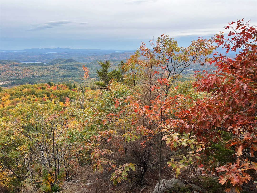
A photograph looking down a hill shows forested hills dotted with patches of yellow, orange, and red. An oak tree with rusty red leaves is visible on the right side of the image.
Fall foliage sprinkles a forested New England landscape in a photo taken in Meredith, New Hampshire, on October 11, 2026, by a participant in GLOBE’s North America Phenology Campaign.
GLOBE

“Changes in pigments can also occur when vegetation is stressed due to drought or insect damage,” said Caplan. She noted that changes like these likely help explain why PACE measures high levels of redness in agricultural regions of Brazil, Australia, and Canada that don’t track closely with broader seasonal changes.  

“The more photos we can get from the ground, the better,” Caplan said. Ground photos help scientists refine PACE’s observations of vegetation color, which the team hopes will eventually support several lines of research. These include how the timing of spring greening and fall senescence is changing, how vegetation changes affect the global carbon cycle, and how leaf color influences wildfire risk. Scientists also want to know whether PACE can detect early warning signs of drought, insect infestations, and plant disease.

People can participate in the GLOBE campaign even if they live in an area without dense forests or picturesque fall foliage displays. Scientists also want ground observations of shrubs, grasses, wildflowers, evergreens, crops, and other vegetation. But when it comes to “red leaf hunting,” don’t delay, Caplan said. “Color changes happen kind of slowly, then all at once, and then they’re gone.”

NASA Earth Observatory images by Lauren Dauphin, using PACE data courtesy of Skye Caplan/NASA’s Goddard Space Flight Center and Landsat data from the U.S. Geological Survey. Photo courtesy of the GLOBE Program. Story by Adam Voiland.

Downloads

A map depicts vegetated parts of Earth's land surfaces from September 29 to October 4. Vegetation color is depicted on a spectrum ranging from dark green to light yellow to dark red. The largest patches of red vegetation appear in Alaska, northern Canada, Mongolia, and Russia. Smaller patches of red are visible in Australia.

September 29 – October 4, 2026

JPEG (3.12 MB)

A similar global map depicts the redness of vegetation from October 5 to 11. The reddest areas have shifted equatorward, with more color visible in the Mid-Atlantic, the U.S. Southeast, southern Russia, China, and Mongolia.

October 5 – October 11, 2026

JPEG (3.10 MB)

Ridges and mountains in a forested area appear orange, while river valleys and lower-elevation areas are still green.

Landsat 9: October 3, 2026

JPEG (4.44 MB)

References & Resources

You may also be interested in:

Stay up-to-date with the latest content from NASA as we explore the universe and discover more about our home planet.

An Early Look at Fall Color in Canada

3 min read

Reds, yellows, and oranges are already sweeping across tundra landscapes in Nunavut.

Article

Autumn Paints Poland’s Bieszczady Mountains

3 min read

Fall color covers the forested slopes of Bieszczady National Park, while patches of polonina, a type of high-mountain meadow, have…

Article

Wild, Scenic, and Increasingly Rusty

5 min read

Orange streams are now being spotted in hundreds of watersheds in permafrost areas throughout Alaska’s Brooks Range.

Article

NASA Satellites Observe Historic 2026 El Niño

15 October 2026 at 13:59
6 Min Read

NASA Satellites Observe Historic 2026 El Niño

This visualization compares three ocean data products, sea surface temperature anomaly, apparent visible wavelength, and sea surface height anomaly, over the same months in 2025 and 2026. Signals of El Niño in each map are highlighted with pop-up labels.
Credits:
NASA’s Scientific Visualization Studio

A phenomenon rarer than a solar eclipse and more powerful than any single storm system is unfolding this fall, and NASA is tracking it closely.

El Niño is a natural climate pattern that emerges roughly every two to seven years marked by warmer-than-normal water temperatures in parts of the equatorial Pacific. NASA scientists are keeping watch as it flips trade winds, redistributes ocean heat, scrambles rain patterns, and raises sea surface height across parts of the Pacific.

As of October, the National Oceanic and Atmospheric Administration (NOAA) has said that there’s an 83% chance that the strongest El Niño since 1950 is currently unfolding. People around the world, including farmers, firefighters, and coastal communities, are already experiencing the effects in different ways.

Follow along with these maps as NASA tracks El Niño from its epicenter in the equatorial Pacific Ocean.

Sea surface height in flux 

Lower-than-normal sea level conditions appear blue, and higher areas are orange and red in this map, which compares the ocean in 2025 (a weak La Niña year) and 2026. The map was created using altimetry data from the Sentinel-6 satellites, which measure water height for the entire ocean every 10 days, down to fractions of an inch.
Credit: NASA’s Scientific Visualization Studio

One of the first clues appeared in satellite imagery in January 2026, when a swell of warm water called a Kelvin wave was spotted near Micronesia in the western Pacific. Kelvin waves are slow-moving pulses of water thousands of miles long. Like underwater freeways, they transfer heat from west to east across the Pacific. The warm water heats the air directly above it, making it rise. The change in air pressures weakens or even reverses the trade winds that typically blow in the opposing direction, from the Americas toward Asia, causing sea levels in the eastern Pacific to rise further, and waters to warm even more. This chain reaction signifies the start of an El Niño.

The map above shows that by early April, those Kelvin waves had reached the eastern Pacific, and sea surface temperatures had begun to warm. Warm water expands in volume, elevating local sea levels in some areas by as much as 1 to 1.3 feet (30 to 40 centimeters). The higher-than-normal water can be seen sloshing toward South America then moving up the coast to California. Sea levels that are six to eight inches (15 to 20 centimeters) lower than normal are visible around Indonesia and northern Australia.

“Kelvin waves are like the heartbeat of El Niño,” said Josh Willis, project scientist for sea level missions at NASA’s Jet Propulsion Laboratory in Southern California. “And our sea level satellites let us peer into the ocean and watch every beat.”

Scientists have used satellite altimetry to track the height of the ocean with ultraprecision since 1993. That unbroken data record continues today with the Sentinel-6 satellites. State-of-the-art radar altimeters aboard these satellites survey millions of square miles of ocean in a single day, complementing NOAA’s fleet of ocean sensors and buoys drifting and diving through the water below.

Warming Pacific waters 

The map above compares sea surface temperatures in 2025 (a weak La Niña year) and 2026. Data are acquired from satellite instruments, buoys, and ship sensors.
Credit: NASA’s Scientific Visualization Studio

Warmer-than-normal seawater is one of the best-known indicators of El Niño. Already, sea surface temperatures in the eastern Pacific are about 3 degrees Fahrenheit (1.7 degrees Celsius) warmer than the long-term average and could jump another fraction of a degree in the coming months, Willis said. 

Satellites carrying microwave and infrared radiometers can see through and around clouds to measure heat energy at the sea surface. Satellites in 2026 mapped the band of warmer-than-normal water as it expanded throughout the spring. The band, seen in dark red, stretches for millions of square miles from the heart of the Pacific to the coast of South America.  Ocean temperatures can influence weather patterns around the world. Air above the water’s surface carries heat and moisture into the atmosphere, seeding rainstorms and rearranging weather patterns across the globe.

Ocean gets bluer

The map above compares Apparent Visible Wavelength from 2025 (a weak La Niña year) and 2026. Apparent Visible Wavelength is a data product from NASA’s PACE satellite utilizing ocean color data from the Ocean Color Instrument.
Credit: NASA’s Scientific Visualization Studio

El Niño’s warm waters also change the color of the ocean. A NASA satellite is tracking these subtle shifts in hues, as equatorial Pacific waters have become measurably more blue over the last several months.

“Some people think of water as being just blue, but it’s amazing the multitude of colors the ocean can be,” said Matthew Kehrli, a lead research scientist for the PACE (Plankton, Aerosol, Cloud, ocean Ecosystem) satellite team at NASA’s Goddard Space Flight Center in Greenbelt, Maryland.

This spectrum is in part thanks to microscopic plants called phytoplankton, which form the basis of the marine food web. There are thousands of different species of phytoplankton, which come in shades like teal, brown, or green. This year, in areas of the Pacific Ocean along the equator that are typically lush with phytoplankton and greener as a result, these hues are waning.

This is an expected effect of El Niño. Phytoplankton thrive in cool, nutrient-rich waters, but during an El Niño, the weakening trade winds reduce the upwelling of nutrient-rich deep water to the ocean surface. With limited food supply, phytoplankton abundance drops. This decline can trigger cascading effects across the marine food web, forcing other marine life to relocate to new feeding grounds.

This year’s El Niño is the first since PACE launched in 2024, providing new views of the phenomenon. The Ocean Color Instrument aboard PACE observes the ocean in hyperspectral color — across several hundred different wavelengths of visible, near-infrared, and ultraviolet light — monitoring phytoplankton and other ocean-color changes in near-real time. With PACE data, researchers calculate the average color of the ocean, simplifying spectra of light into a single number, known as apparent visible wavelength.

The 2026 map above shows the green area along the equator in the western Pacific Ocean shrink as a bluer shade fills in, indicating fewer phytoplankton. In contrast, the map from 2025 shows how the green-hued section stays steady over time.

“You have expectations of what you would think would happen,” Kehrli said. “But to visually see the results with the data products that you’re working with in real time is gratifying.”

NASA scientists will continue to monitor the signs and impacts of this El Niño with its fleet of Earth-observing satellites.

“El Niño touches almost all of us in some way every time it occurs,” Willis said. “While many have seen what it can do, we look to the ocean to understand why.”

View and download these data visualizations here.

Keep Exploring

Discover More Topics From NASA

❌
❌