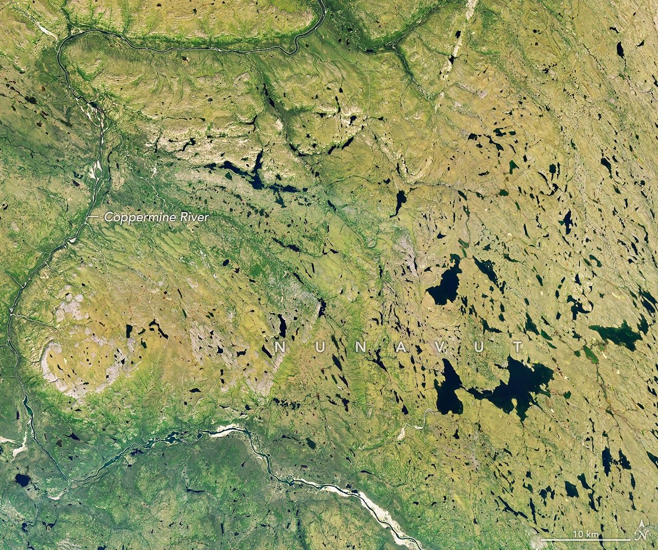
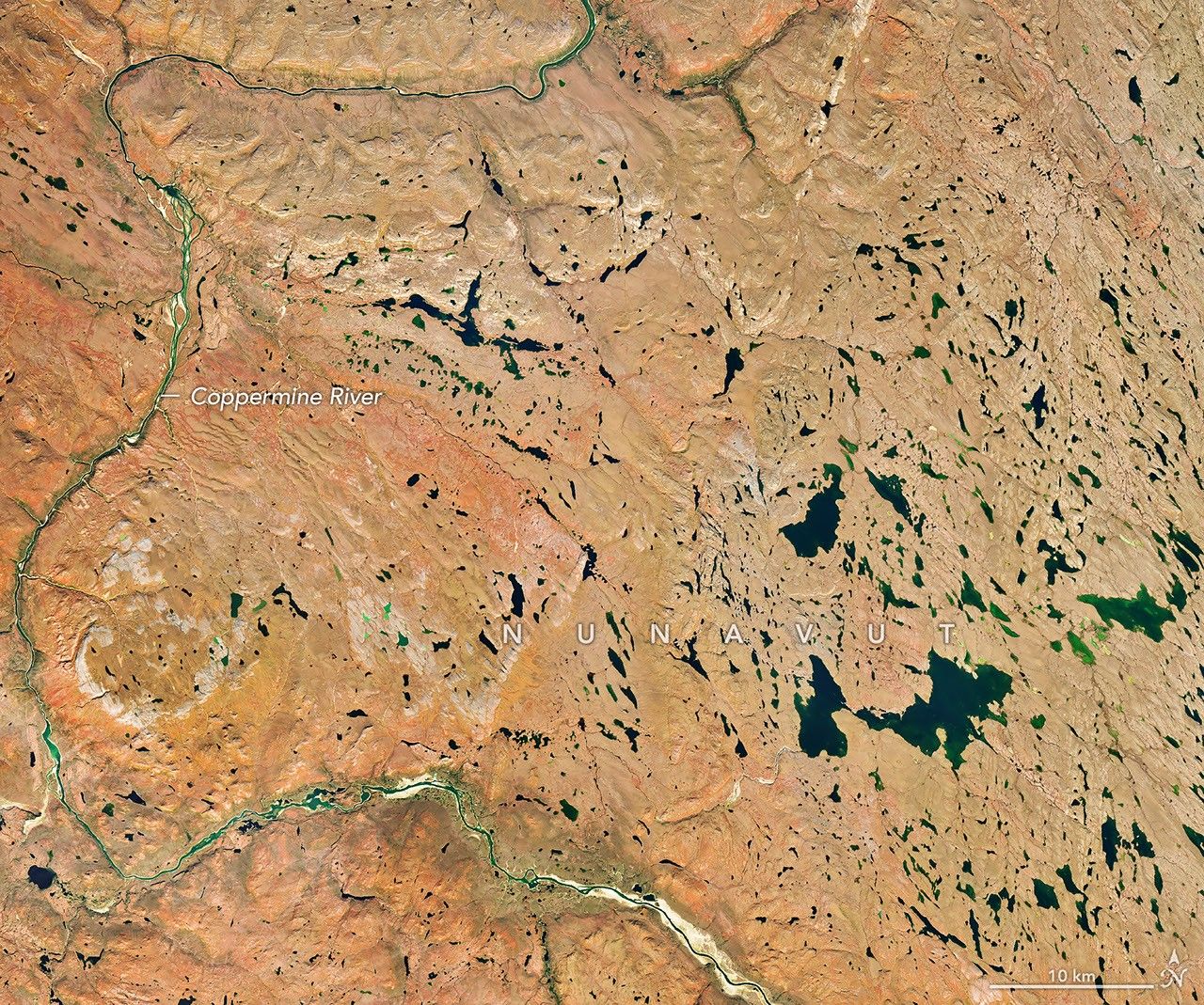
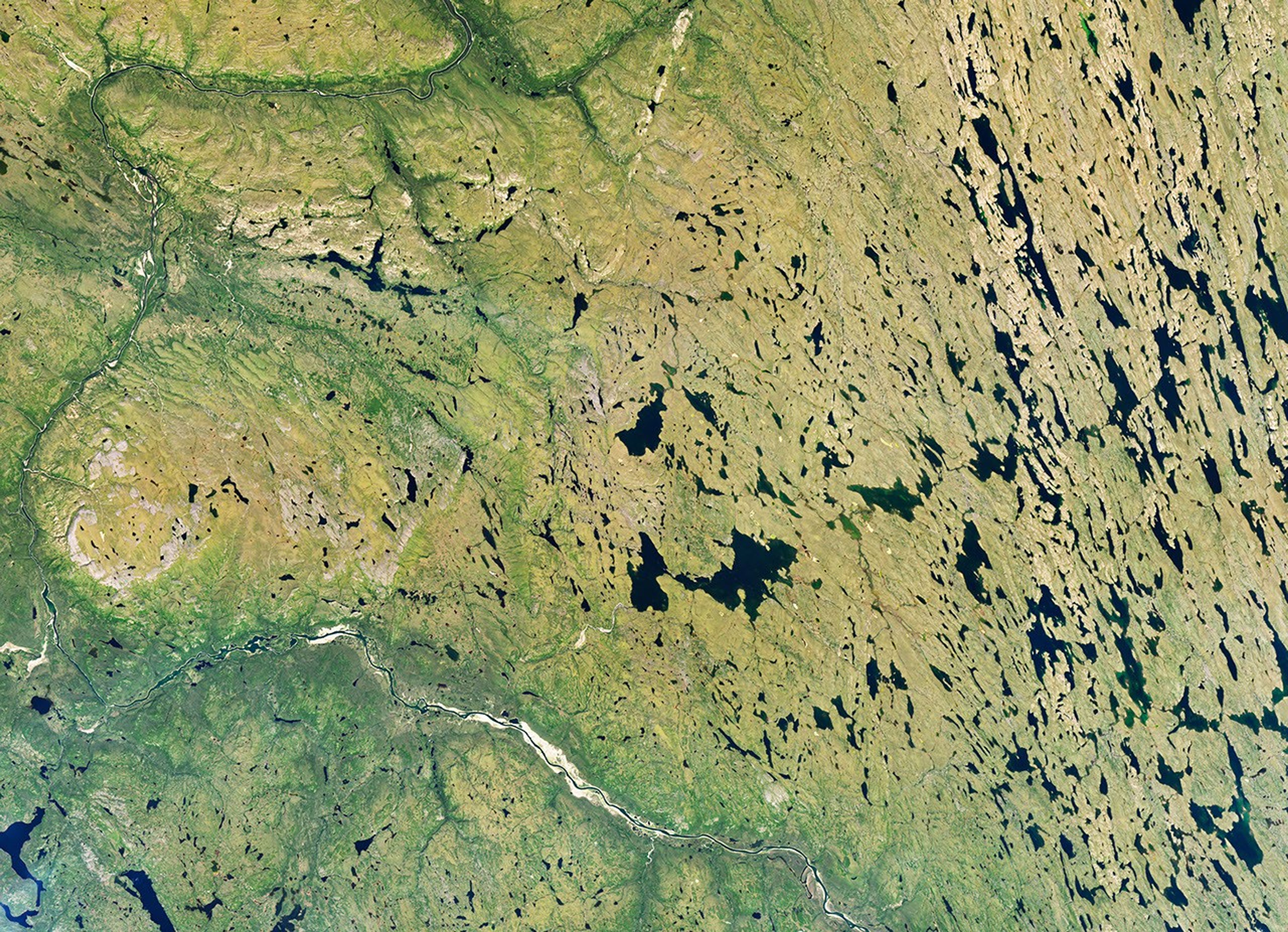
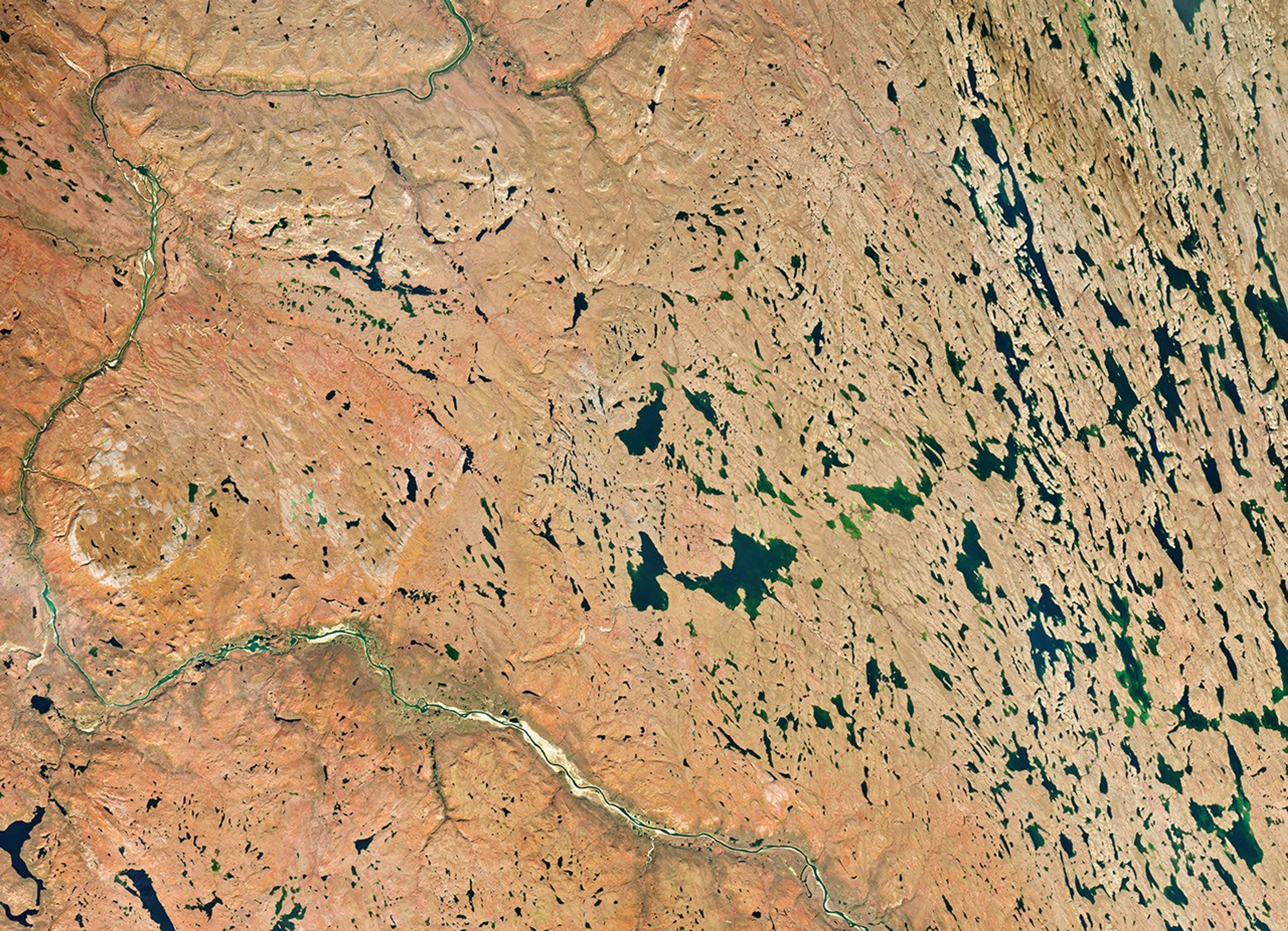
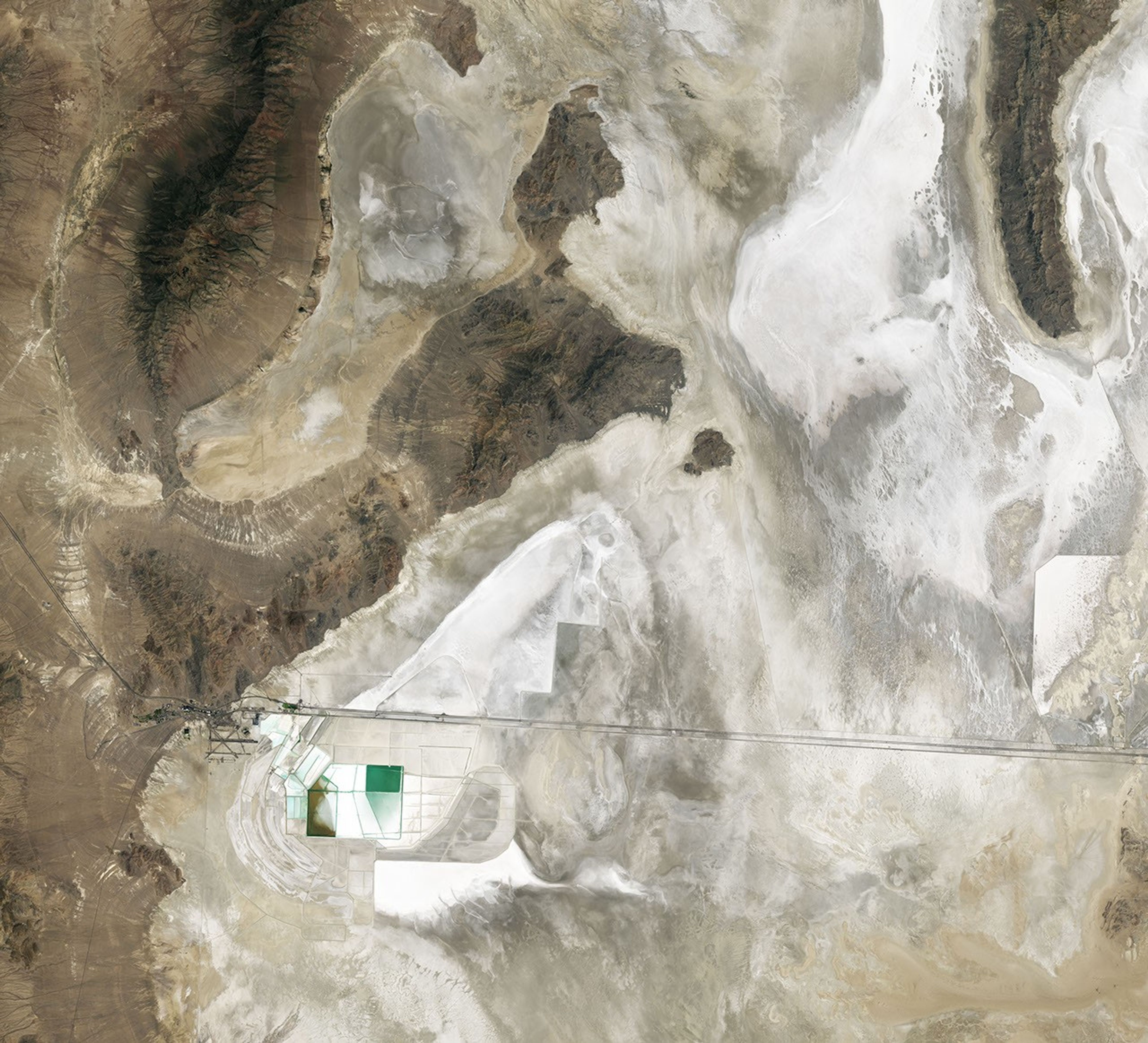
Autumn color sweeps across the low-growing shrubs and tundra vegetation of Nunavut, Canada, in this image pair captured by the OLI (Operational Land Imager) on Landsat 9. NASA Earth Observatory images by Michala Garrison.
As North America rode out a summer of remarkable heat, fall foliage and cool, crisp weather still seemed like distant, alien concepts across much of the continent in early September 2026. But fall comes early in the tundra and subarctic ecosystems of Nunavut, in far northern Canada.
Vivid signs of the season were already sweeping across the landscape on September 6 when the OLI (Operational Land Imager) on Landsat 9 captured this image (right) of the Coppermine River winding through low-growing shrubs and tundra vegetation upriver of Kugluktuk, a community at the river’s mouth. The other image (left) shows the same area on July 27, 2026, when vegetation was still green.
The region is known for willow and birch shrubs, blueberries, bearberries, and other low-growing tundra plants that turn shades of red, orange, and yellow each fall. A NASA and South Dakota State University analysis of seven years of satellite data found that foliage in the region begins to change in early September and peaks in mid-month, making this one of the first places on the North American continent to change color. But blink and you might miss it: the analysis also showed that far northerly regions tend to have shorter periods of peak color—sometimes a week or less—compared to many lower-latitude areas.
In the fall, leaves change colors as they lose chlorophyll, the molecule that plants use to synthesize food. Chlorophyll makes plants appear green because it absorbs the red and blue light from sunlight as it strikes leaf surfaces. However, chlorophyll is not a stable compound, and plants must continuously synthesize it, a process that requires ample sunlight and warm temperatures. As temperatures drop and days shorten in autumn, levels of chlorophyll fall as well.
As concentrations of chlorophyll decline, the green fades from leaves, presenting an opportunity for other pigments—carotenoids and anthocyanins—to take the stage. Carotenoids absorb blue-green and blue light, so in the absence of chlorophyll, they cause leaves to appear yellow. Anthocyanins absorb blue, blue-green, and green light, so light reflecting off the pigments appears red.
Citizen scientists have an opportunity to help NASA scientists track fall color and contribute to long-term environmental databases with the GLOBE North American Phenology Campaign. Participants observe and record leaf color changes during the spring and fall, helping scientists understand plant responses to climate and environmental changes.
NASA Earth Observatory images by Michala Garrison, using Landsat data from the U.S. Geological Survey.Story by Adam Voiland.
The curving, parallel mountain ridges of the Sierra Madre Oriental are an eye-catching feature of northeastern Mexico’s landscape. The spot where these folds nestle up against Mexico’s second-largest metropolitan area captured the attention of an astronaut aboard the International Space Station, who took this photo on August 26, 2026.
Monterrey, the capital of the state of Nuevo León, is an industrial hub supporting heavy industries such as ironworks and steelworks, as well as manufacturing facilities for goods ranging from textiles to processed foods to glass and plastics. The metropolitan area is home to 5.3 million people, according to the 2020 census. And while the city has seen overall population growth since 1990, the number of people living within 5 kilometers (3 miles) of the city center has declined, researchers have found—a trajectory shared with many of Mexico’s metropolitan areas.
In Monterrey’s case, urban expansion runs up against some unforgiving terrain. Along the city’s southern edge, layers of limestone, deposited in the late Mesozoic era and then folded between about 80 and 50 million years ago, form the Sierra Madre Oriental. Over millions of years, weaker rock layers have eroded away, leaving behind the distinct ridgelines that bound Monterrey today.
The Río Santa Catarina carves through the mountains and onto the semiarid floodplain where the city lies. Because of the dry environment, the river carries little to no water for much of the time. But its channel is crucial for collecting runoff from summer rains and serves as an important natural area for plant and animal life within the city.
The river runs through Monterrey’s urban core and between several island-like protrusions of folded rock. One of these is the Sierra Las Mitras, a state nature reserve established in 2000. The mountain ridge rises approximately 1,500 meters (4,900 feet) over the city and provides a haven for wildlife. As conditions become cooler and wetter with higher elevations, vegetation turns from cacti and thorny shrubs on lower rocky slopes to oak and pine forests higher on the ridge. Cerro de la Silla (Mount Silla or Saddle Hill) is another prominent feature of the landscape, contrasting with the built environment.
Near the city’s border with the Sierra Madre Oriental sits Universidad de Monterrey, a host venue for the NASA Space Apps Challenge. This annual hackathon will take place in November 2026 in person and virtually at sites around the world. Participating teams use NASA and partner agency data to tackle challenges in fields such as software development, astrophysics, space exploration, and agriculture.
Astronaut photograph ISS075-E-70481 was acquired on August 26, 2026, with a Nikon Z9 digital camera using a focal length of 400 millimeters. It is provided by the ISS Crew Earth Observations Facility and the Earth Science and Remote Sensing Unit at NASA Johnson Space Center. The image was taken by a member of the Expedition 75 crew. The image has been cropped and enhanced to improve contrast, and lens artifacts have been removed. The International Space Station Program supports the laboratory as part of the ISS National Lab to help astronauts take pictures of Earth that will be of the greatest value to scientists and the public, and to make those images freely available on the internet. Additional images taken by astronauts and cosmonauts can be viewed at the NASA/JSC Gateway to Astronaut Photography of Earth. Story by Lindsey Doermann.
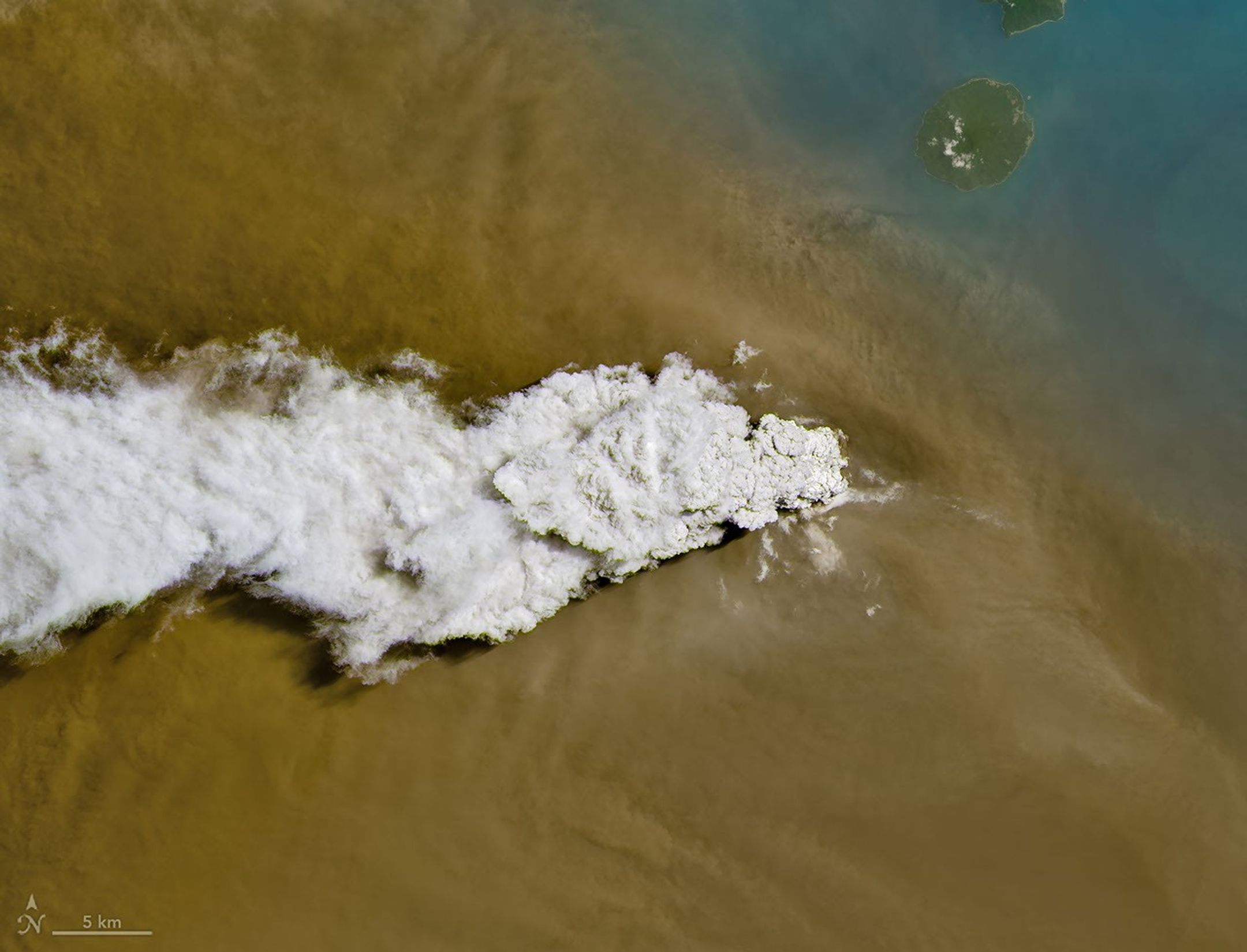
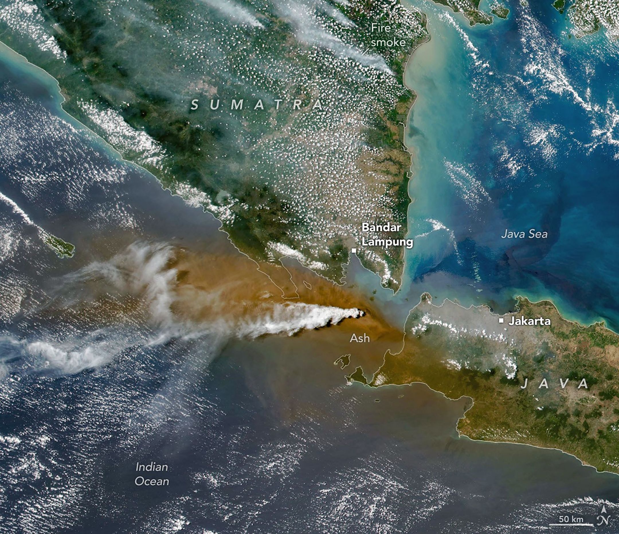
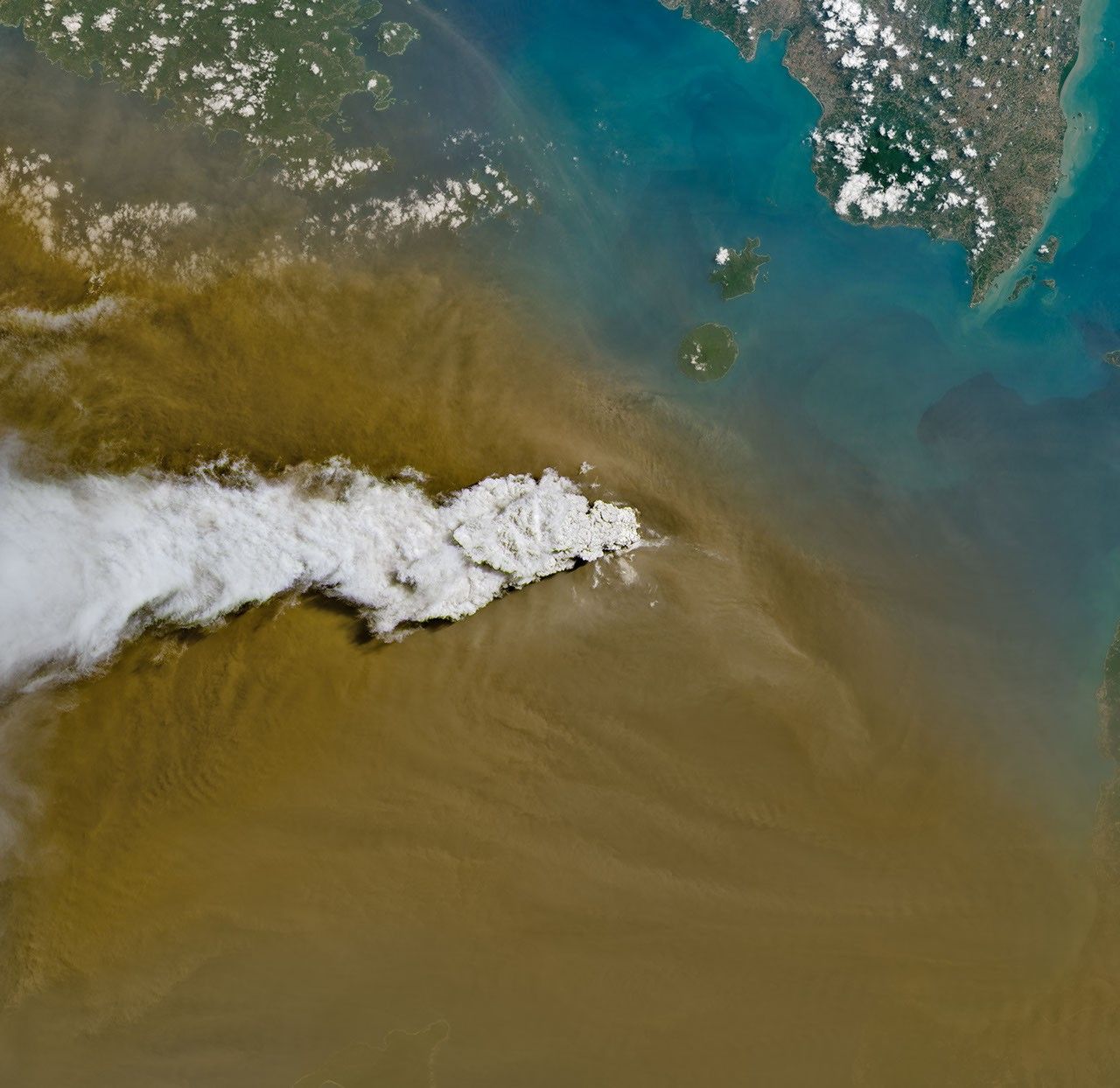
Anak Krakatau erupts ash and volcanic gases in this image acquired with the OLI (Operational Land Imager) on Landsat 8 on September 5, 2026.
NASA Earth Observatory/Michala Garrison
Eruptions are a regular occurrence at Anak Krakatau, a small volcano between the Indonesian islands of Java and Sumatra. Much of its activity remains relatively mild, but it occasionally puts on more impressive and hazardous shows of force. In early September 2026, a booming eruption lasting more than 24 hours sent gas and ash high into the atmosphere, disrupting thousands of flights and degrading air quality in parts of the country, including the capital city of Jakarta.
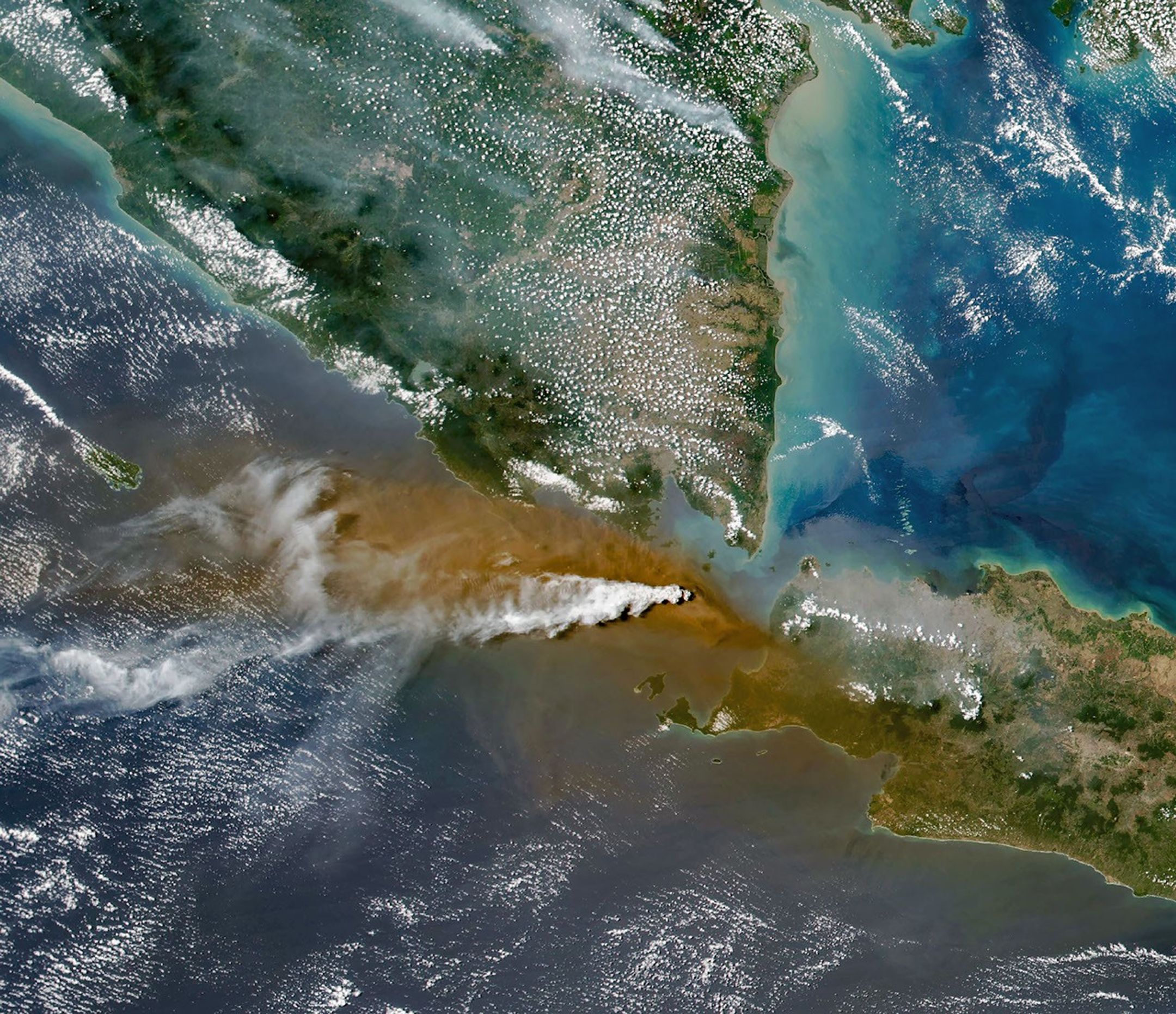
Satellites passing over the area during the eruption on September 5 captured images of the explosive activity. In the scene above, acquired with the OLI (Operational Land Imager) on the NASA-USGS Landsat 8 satellite, a white plume of volcanic gas billows over a brown ash cloud. Below, a wider view captured by the VIIRS (Visible Infrared Imaging Radiometer Suite) on the Suomi NPP satellite shows the volcanic material dispersing over a large area.
Indonesia’s meteorological agency reported that ash had reached altitudes up to 6,000 meters (20,000 feet) to the east of the volcano and 15,000 meters (50,000 feet) to the west by September 6. The presence of ash in the atmosphere prompted the temporary closure of eight airports on Java and Sumatra, disrupting nearly 3,000 flights in and out of the area, according to news reports.
Plumes of ash and volcanic gases from Anak Krakatau drift over Indonesia and the Indian Ocean in this image captured by the VIIRS (Visible Infrared Imaging Radiometer Suite) on the Suomi NPP satellite on September 5, 2026.
NASA Earth Observatory/Michala Garrison
Ashfall affected populated areas, particularly to the east of Anak Krakatau in Jakarta and other parts of West Java, the Indonesian Humanitarian Coordination Platform (IHCP) reported. Volcanic ash poses health risks to people and can irritate the respiratory tract, eyes, and skin. However, this air quality hazard differs from the smoke produced by peatland fires elsewhere in the country in terms of particle characteristics, dispersal patterns, and protection measures, the IHCP noted.
On September 6, the continuous explosive eruption from Anak Krakatau subsided, though the volcano kept rumbling. It returned to a more typical pattern of Strombolian eruptions, characterized by intermittent spurts of ash and volcanic material. Airports had resumed operation by September 8, but the volcano remained at the second-highest alert level on the country’s scale, as it has been since early July.
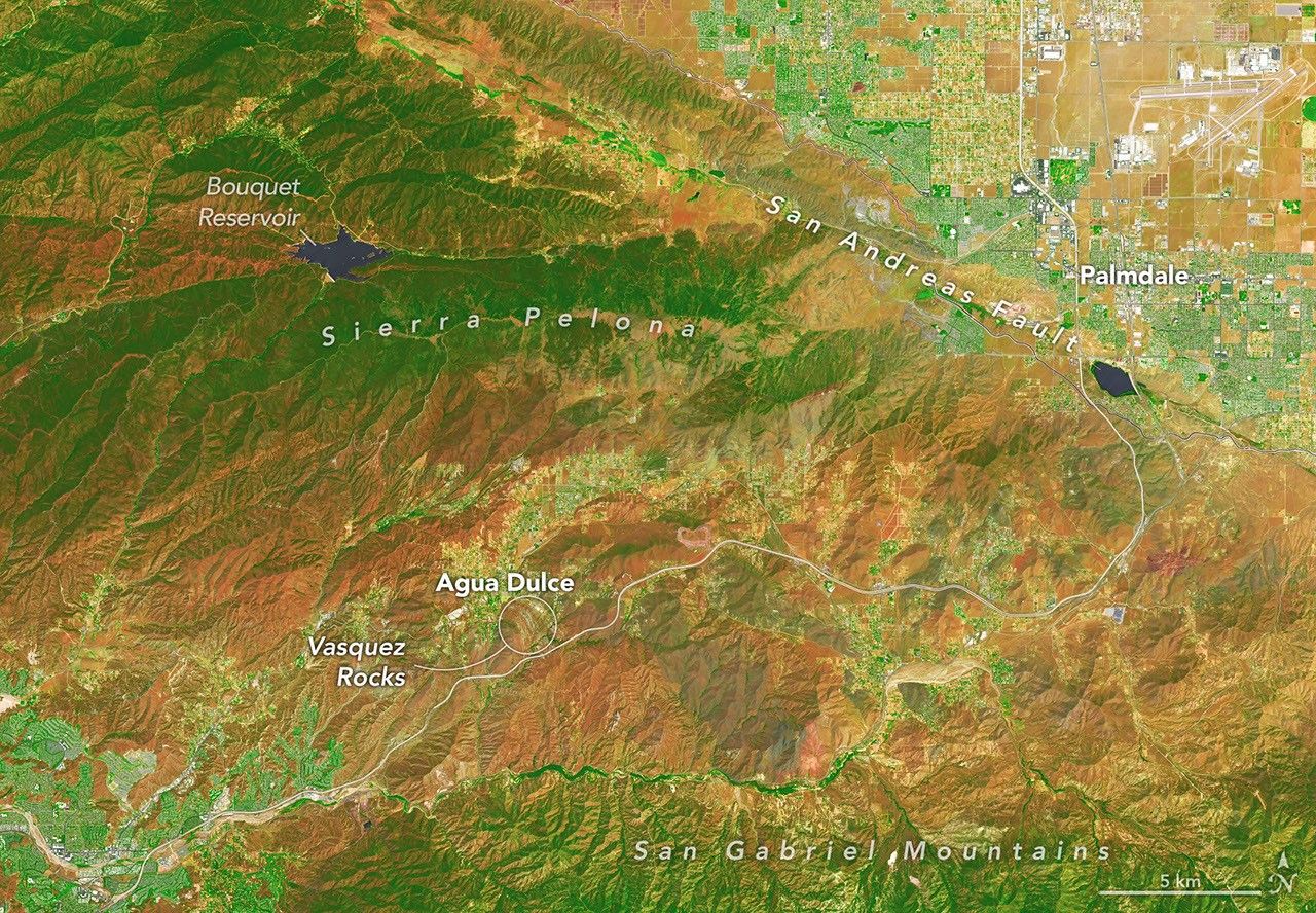
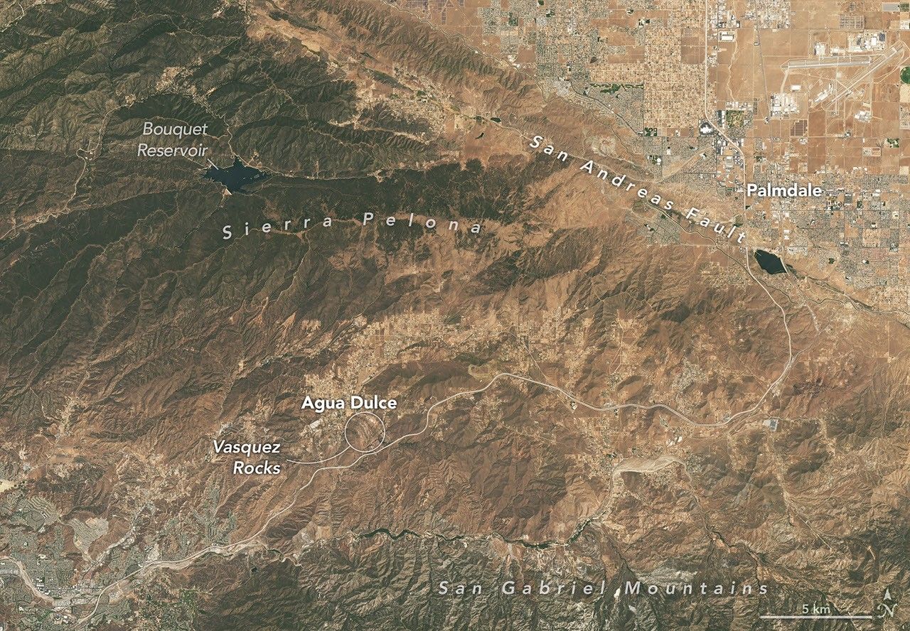
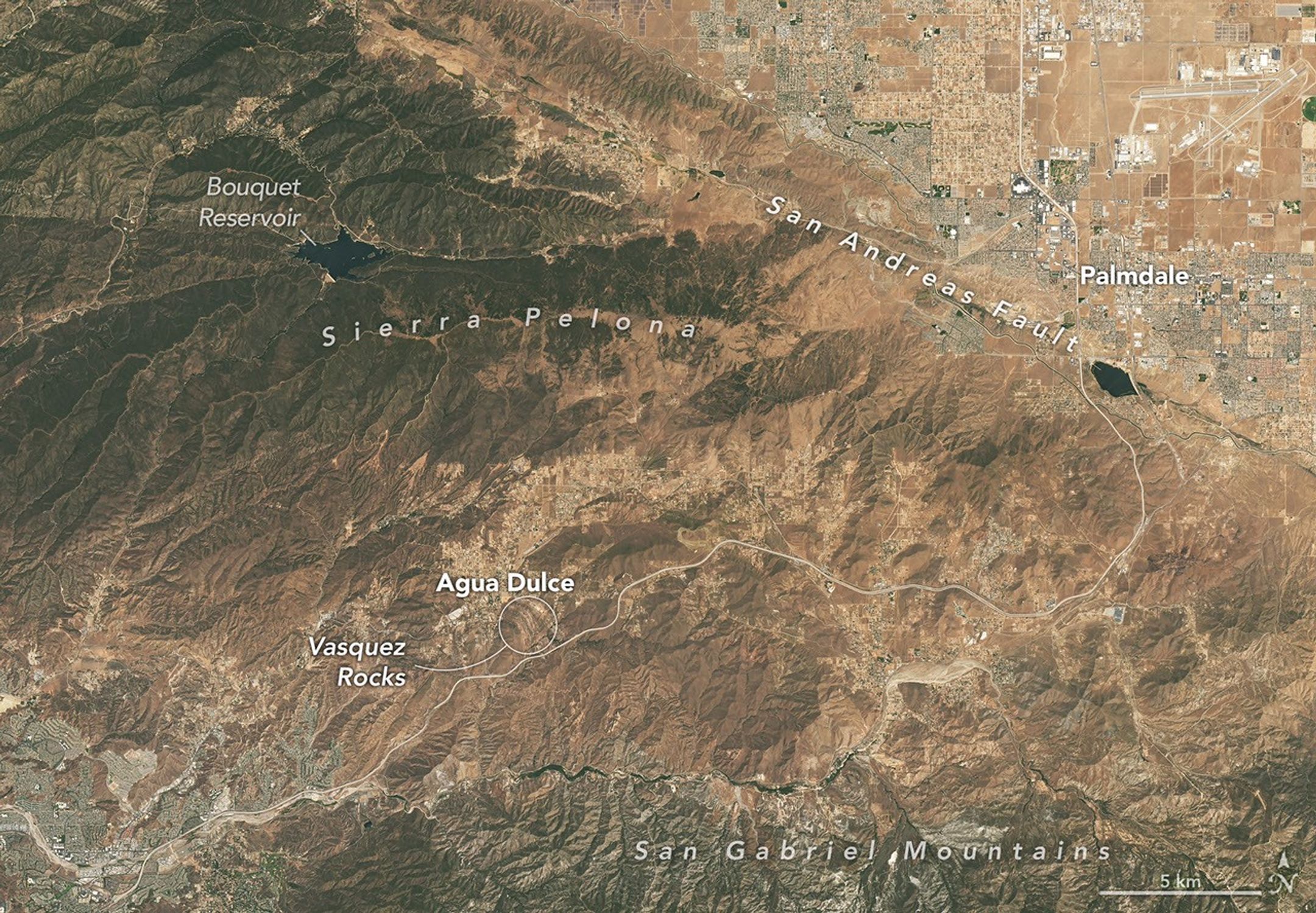
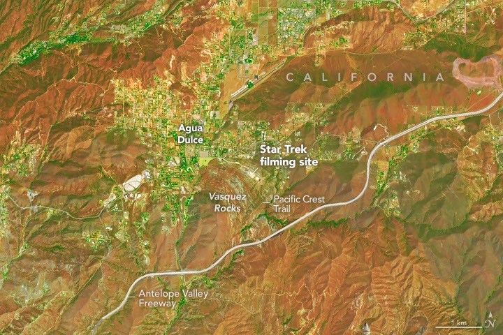
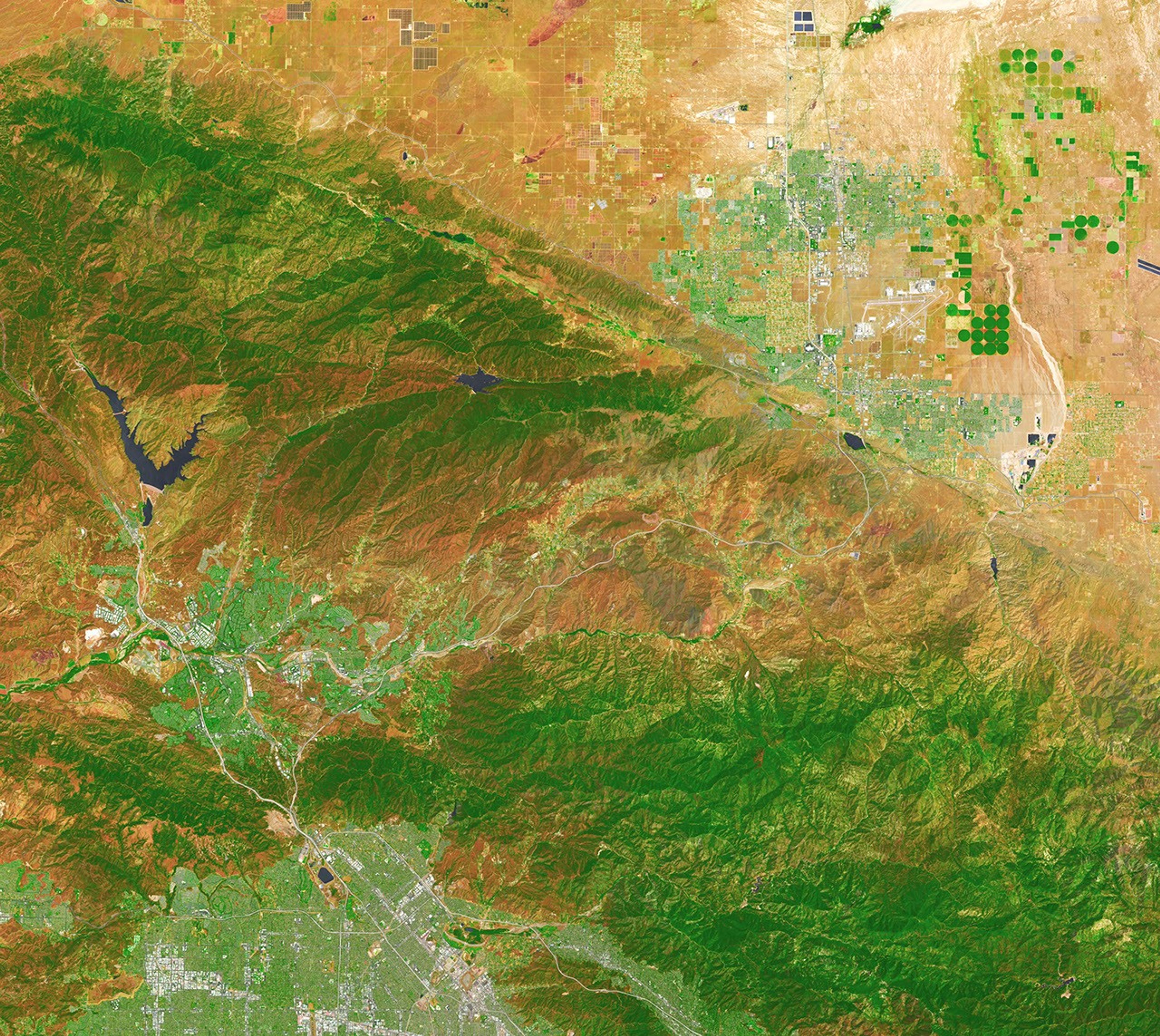
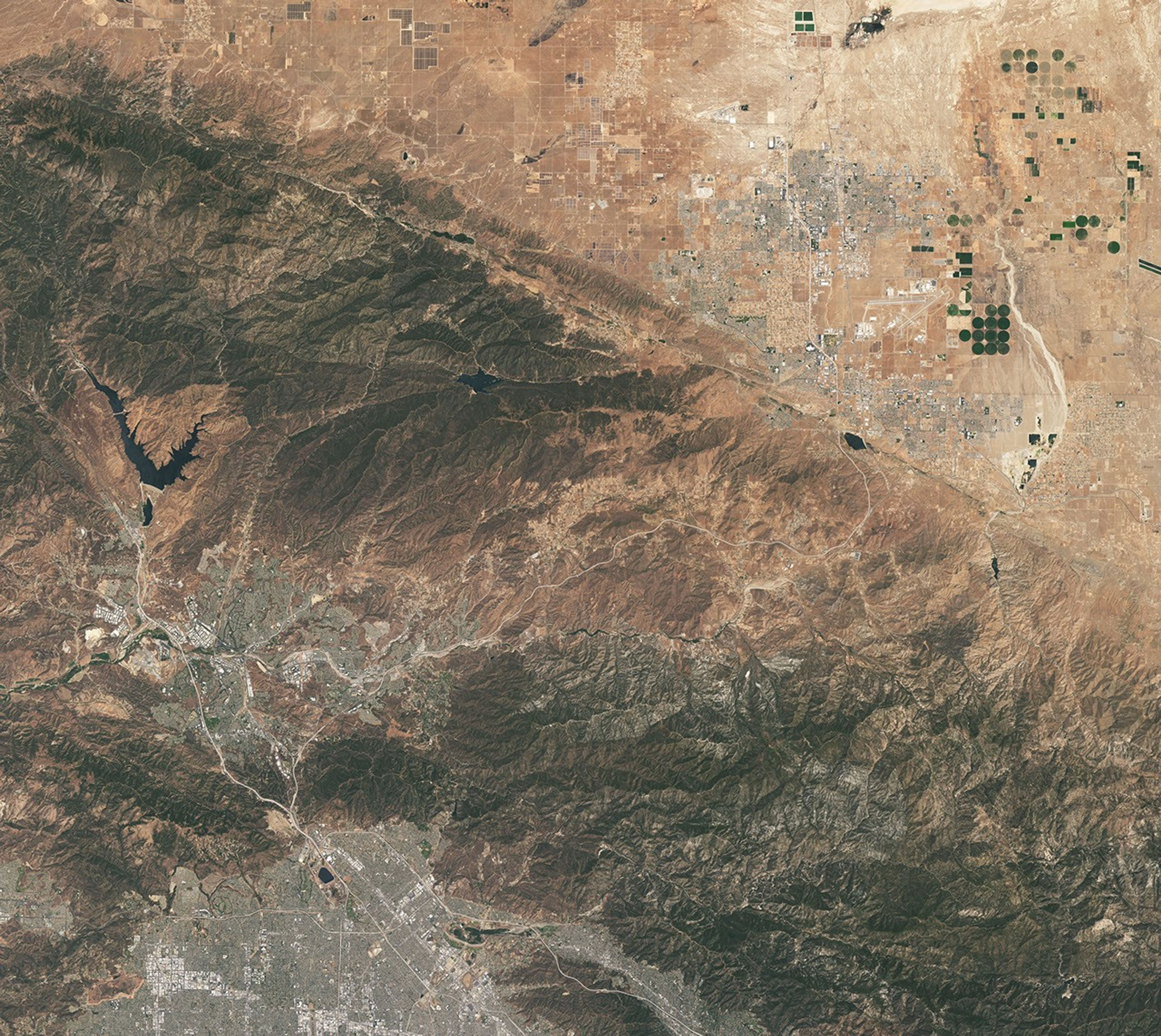
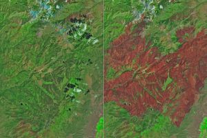
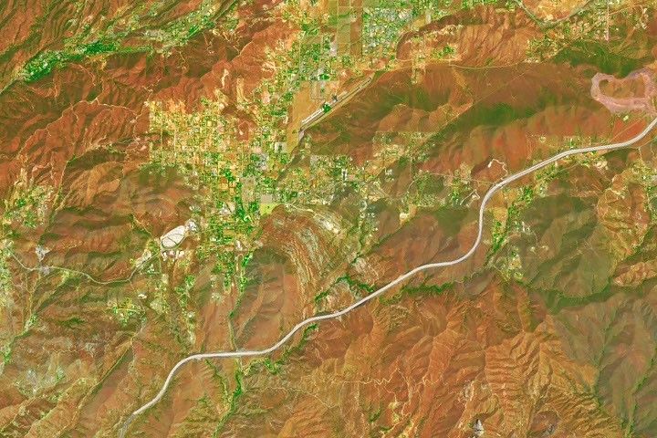
A patchwork of chaparral and sage scrub vegetation shades the hills and mountain ranges surrounding Agua Dulce and Vasquez Rocks in this pair of images captured by the OLI (Operational Land Imager) aboard Landsat 9 on July 28, 2026. The false-color image (bands 6-5-4) on the left incorporates shortwave-infrared and near-infrared observations that accentuate differences in vegetation and soil moisture in comparison to the natural-color image on the right. NASA Earth Observatory images by Michala Garrison.
Editor’s Note: Today’s story is the answer to the September Puzzler.
Several of the outcrops at Vasquez Rocks Natural Area in Southern California jut from the arid landscape of the Soledad Basin at remarkable angles. Geologists estimate that the tilt of sedimentary rock strata found in the area averages 50 degrees, steep enough that many of the otherworldly formations appear to point toward the stars.
That’s fitting, in some ways, because the rocks have served as one of the Star Trek franchise’s favorite backdrops ever since the show’s inaugural season, when Captain James T. Kirk scrambled up the jagged terrain during an iconic battle with a member of a reptilian alien species.
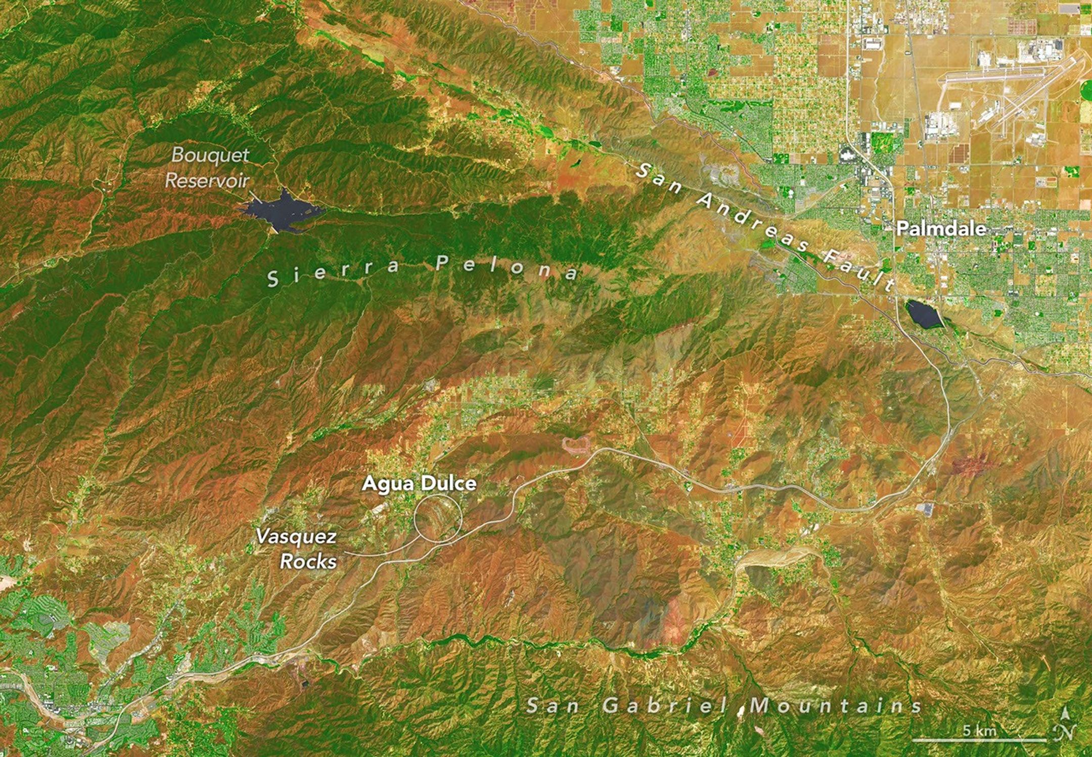
Viewed from space, the Vasquez Rocks are considerably less dramatic, but they show up clearly as bands of gray nestled between mountain ranges in these false-color (left) and natural-color (right) images captured by the OLI (Operational Land Imager) on Landsat 9. The false-color view (bands 6-5-4) incorporates shortwave-infrared and near-infrared observations that accentuate differences in the landscape’s vegetation in comparison to the natural-color image on the right.
Proximity to Los Angeles and the freeway is among the reasons the tilted strata at Vasquez Rocks have long been a popular filming location for television producers. This false-color image (bands 6-5-4) was captured by the OLI (Operational Land Imager) aboard Landsat 9 on July 28, 2026.
NASA Earth Observatory/Michala Garrison
The Vasquez Rocks didn’t start out pointing skyward. When they were forming 25 million years ago, sediment was spread across alluvial fans—cone-shaped deposits that develop as fast-moving streams empty onto relatively flat plains. The sediment likely hadn’t traveled far, much of it eroding from nearby uplands. Over time, the alluvial fan deposits were buried and cemented into thick layers of sandstone and conglomerate rock.
Over millions of years, the region was then reshaped by the interaction of tectonic plates just to the east. Two plates grind past each other along a boundary that includes the San Andreas Fault, a strike-slip fault where the North American plate moves southeast and the Pacific plate northwest, contributing to the powerful tectonic forces that ripple throughout the region.
Eventually this tectonic activity led to the uplift and deformation of the Soledad Basin, with sedimentary layers gradually tilting, folding, and rotating. Once they were exposed at the surface, millions more years of weathering and erosion sculpted the formations further, removing softer material and leaving the more resistant sandstone and conglomerate fins and ridges that wow visitors today.
The rock formations represent far-flung moons and planets in several other Star Trek episodes and Vulcan, Spock’s home planet, in two Star Trek movies. Other productions have highlighted the Vasquez Rocks as well. They make appearances in dozens of other television shows and movies, including the science fiction series Westworld, For All Mankind, and Battlestar Galactica.
NASA Earth Observatory images by Michala Garrison, using Landsat data from the U.S. Geological Survey.Story by Adam Voiland.
Downloads
July 28, 2026: False color (bands 6-5-4)
JPEG (22.57 MB)
July 28, 2026: Natural color
JPEG (19.33 MB)
References & Resources
County of Los Angeles Department of Parks and Recreation, Vasquez Rocks Natural Area. Accessed September 4, 2026.
Directors Guild of America (2003, November) Vasquez Rocks. Accessed September 4, 2026.
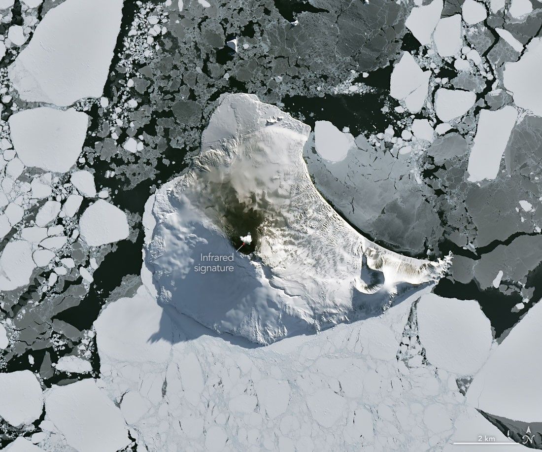
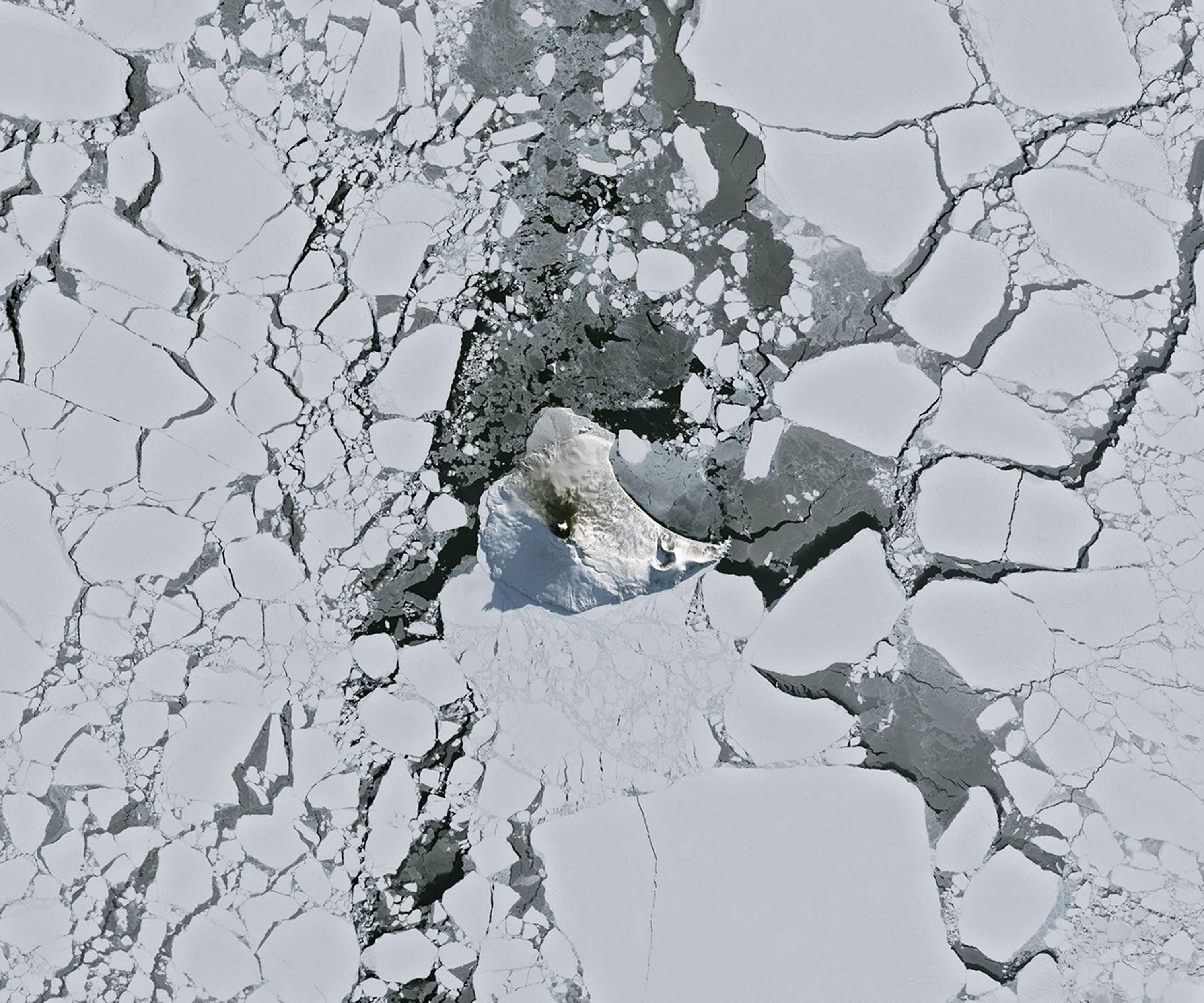
Mount Michael on Saunders Island, seen in this image acquired with the OLI (Operational Land Imager) on Landsat 8 on August 24, 2026, hosts a frequently active lava lake in its summit crater.
NASA Earth Observatory/Michala Garrison
Winter near the Antarctic Circle brings months of frozen darkness, when sea ice chokes ocean waters and many of its denizens hunker down to ride out the harsh conditions. But as winter began to release its icy grip, an uncommonly clear satellite image revealed that part of this remote realm was still very much awake, at least volcanically speaking.
Mount Michael, the stratovolcano at the center of Saunders Island, rises above the ice-filled South Atlantic Ocean in this image, acquired with the OLI (Operational Land Imager) on the NASA-USGS Landsat 8 satellite on August 24, 2026. The natural-color image is overlaid with an infrared signal (OLI bands 7-6-5), shown in red, revealing heat from the persistent lava lake in its summit crater. A puff of a volcanic plume hovering over the peak, along with darkened snow on its northern slopes, also suggests ongoing activity.
Saunders Island is one of the South Sandwich Islands, a string of small volcanic peaks about 350 kilometers (220 miles) long that formed from the South American plate subducting beneath the tiny South Sandwich plate. Regular eruptions, including at Mount Michael, have occurred on these islands in recent centuries.
Because of the volcanoes’ remoteness, scientists rely on satellite data to understand their activity. An analysis of thermal anomalies in Landsat, Sentinel, and ASTER (Advanced Spaceborne Thermal Emission and Reflection Radiometer) observations spanning 30 years led researchers to conclude that Mount Michael hosts a persistent lava lake in its summit crater. Only a handful of other volcanoes on Earth, including Kīlauea, Nyamulagira, and Erta Ale, are known to have similar, frequently active features.
Thermal observations from the MODIS (Moderate Resolution Imaging Spectroradiometer) and VIIRS (Visible Infrared Imaging Radiometer Suite) instruments have also enabled long-term monitoring of Mount Michael. Data provided through MIROVA, a near-real-time volcanic hot spot detection system, indicate that low-intensity activity has been ongoing at the volcano for the past several years. Other observations from NASA’s Aura satellite show that emissions of sulfur dioxide and other gases are common at Mount Michael.
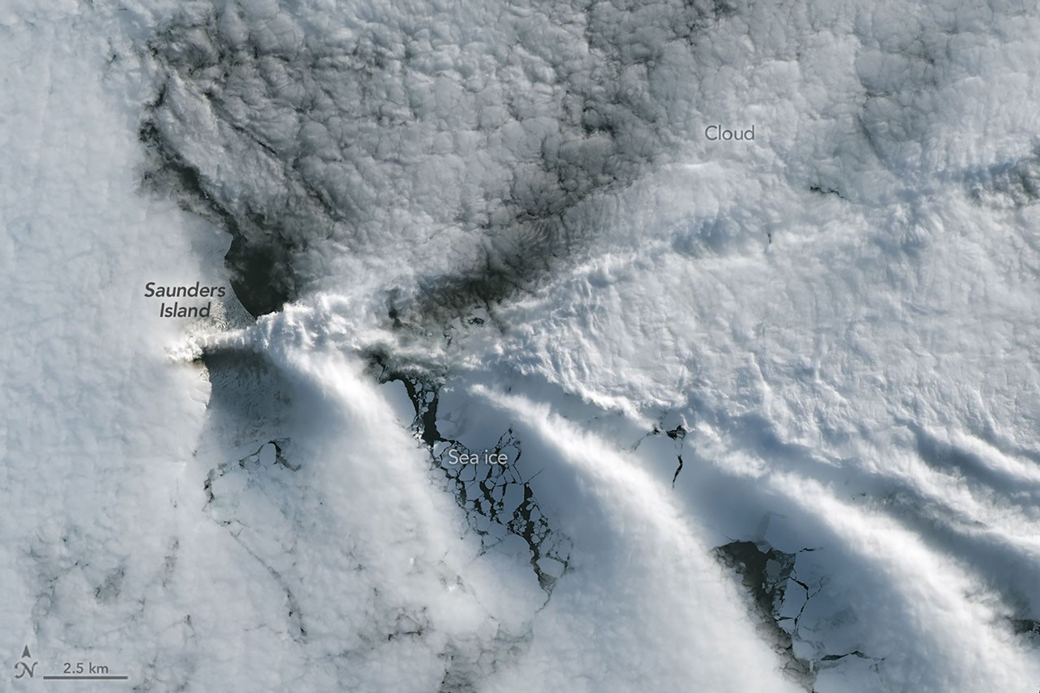
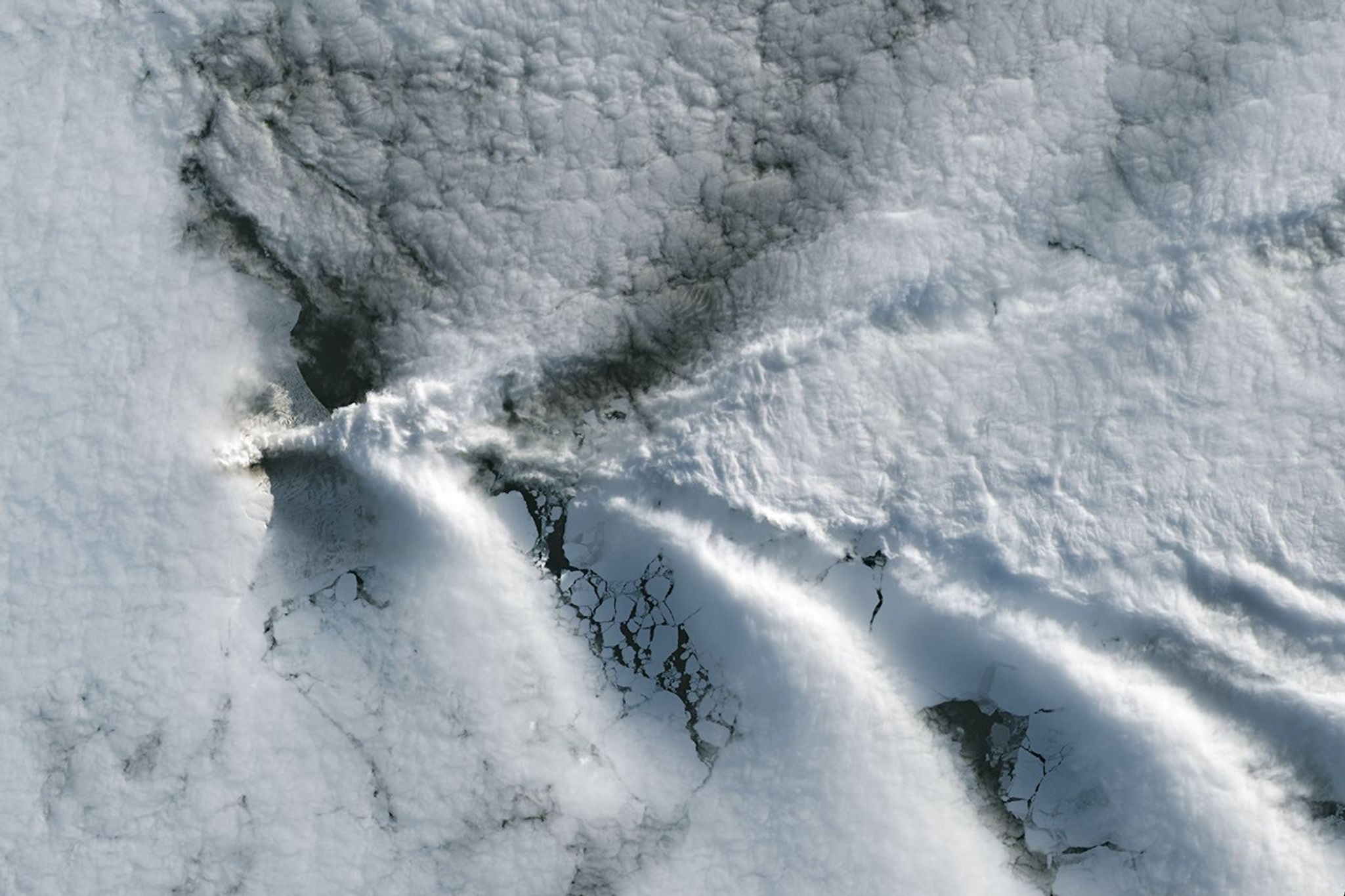
Wave clouds form downwind of Saunders Island in this image acquired with the OLI (Operational Land Imager) on Landsat 9 on September 1, 2026.
NASA Earth Observatory/Michala Garrison
The cloud-free window over Mount Michael would close in short order. One week later, when Landsat 9 passed over the island, a more active atmosphere had returned. But the weather patterns interacted with the island to put on a spectacle of their own. The 843-meter-high (2,766-foot-high) peak jutting from the ocean disturbed passing winds to produce a series of wave clouds resembling the wake of a ship, a familiar phenomenon in this region. False-color imagery captured by NASA’s Aqua satellite indicates that a volcanic track caused by degassing sulfur dioxide was likely present as well.
NASA Earth Observatory images by Michala Garrison, using Landsat data from the U.S. Geological Survey. Story by Lindsey Doermann.
Downloads
August 24, 2026
JPEG (4.27 MB)
September 1, 2026
JPEG (1.14 MB)
References & Resources
Global Volcanism Program (2026) Saunders. Accessed September 4, 2026.
When hurricane forecasters released their seasonal outlooks in spring 2026, the El Niño brewing in the Pacific contributed to predictions of below-normal activity in the Atlantic basin but above-normal activity in the northeastern and central Pacific basins. In early September, near the climatological peak of hurricane season, those spring outlooks were on target, with the eastern Pacific buzzing with activity and the Atlantic notably quiet.
As of September 3, the Northeast Pacific had produced 15 named storms and six hurricanes, well above the norm for that point in the season. The Atlantic basin, meanwhile, laboring under unfavorable wind shear conditions, had produced just five named storms and no hurricanes. El Niño typically enhances hurricane activity in the eastern and central Pacific basins because of the unusually warm water temperatures it brings to those parts of the ocean. It tends to suppress hurricane activity in the Atlantic basin by shifting large-scale circulation patterns in a way that makes it harder to sustain storms there.
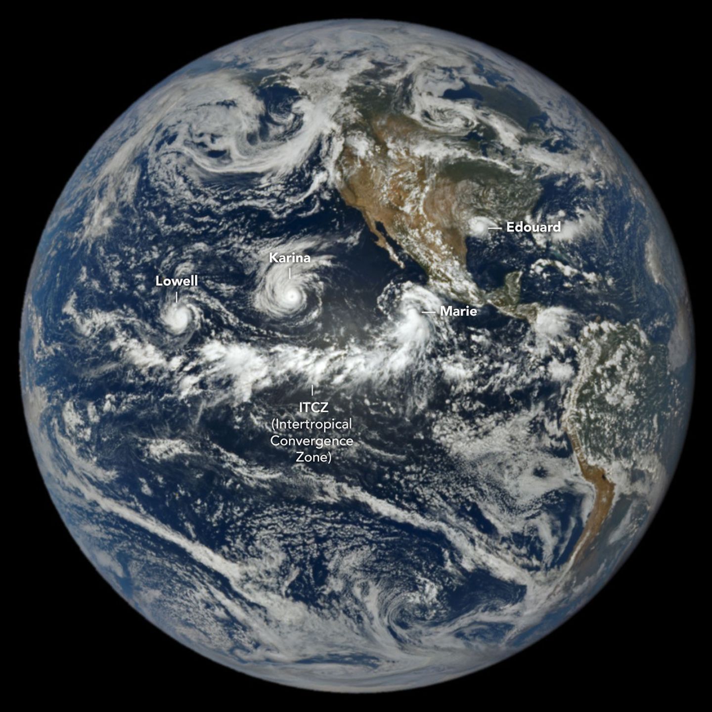
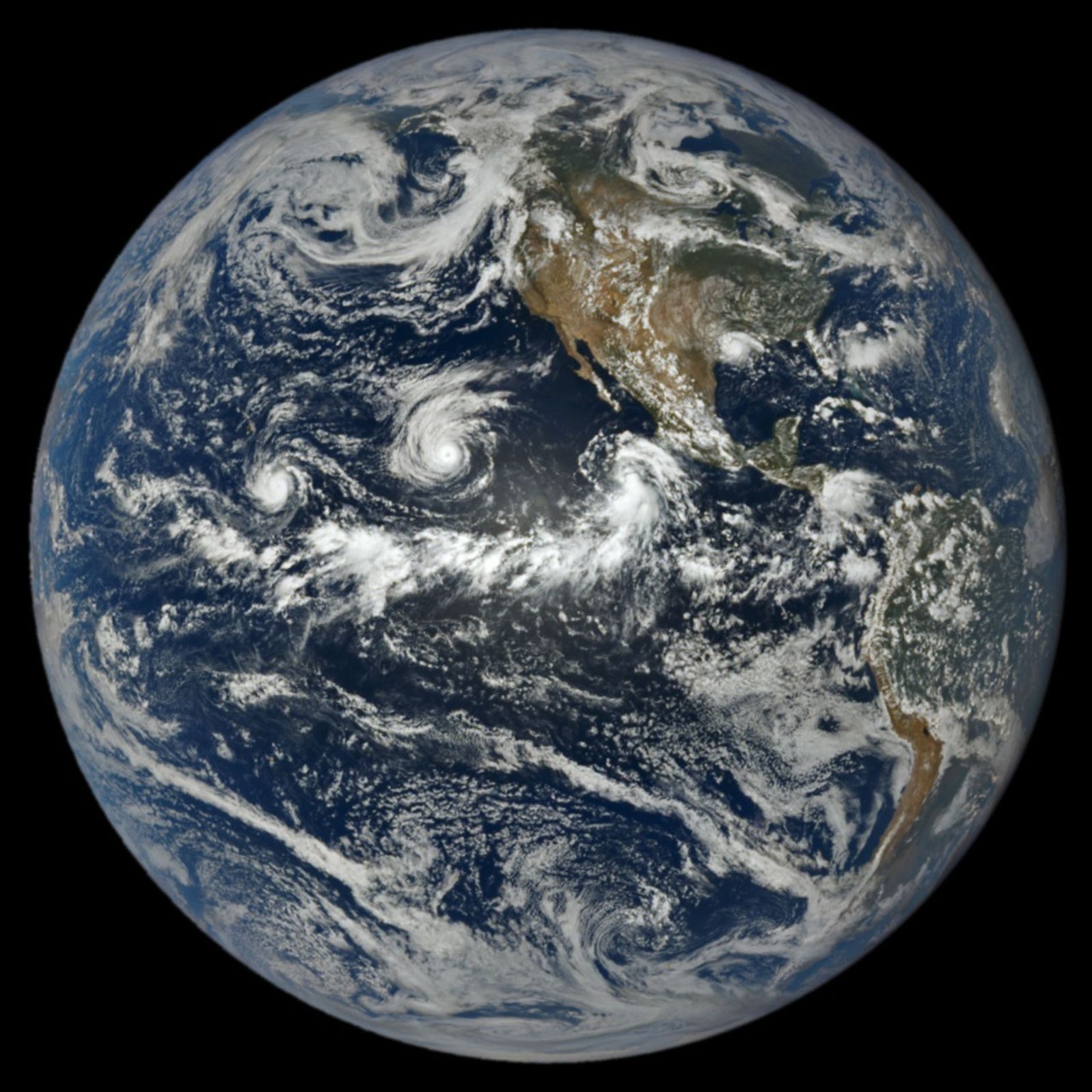
At 1:14 p.m. Pacific Daylight Time (20:14 Universal Time) on September 1, NASA’s EPIC (Earth Polychromatic Imaging Camera) on the DSCOVR (Deep Space Climate Observatory) satellite captured an image of three tropical cyclones churning simultaneously in the Pacific, along with one in the Atlantic. A band of clouds and thunderstorms associated with the Intertropical Convergence Zone (ITCZ) is visible to the south of the storms. The spacecraft was nearly 1 million miles from Earth and just shy of 93 million miles from the Sun when the image was acquired.
The trio of storms in the Pacific were Lowell, Karina, and Marie. Of the three, Lowell became the strongest, with winds reaching category 5 strength for several hours on September 2. Around the same time, Karina, spinning a few thousand kilometers to the east, achieved category 4 strength, a rare case of category 4 and 5 hurricanes occurring simultaneously in the area. Marie, spinning southwest of Baja California, was still a tropical storm when the image was acquired but was strengthening as it moved northwest.
In the Atlantic, Tropical Storm Edouard was visible to EPIC over Louisiana and Texas, shortly after the short-lived storm made landfall. It brought torrential rains and strong winds that downed trees and power lines. Some areas received 15 to 24 inches (38 to 61 centimeters) of rain, according to National Weather Service meteorologists.
As of September 3, the Atlantic basin’s total accumulated cyclone energy (ACE) index was 4.4, about 9 percent of normal for that date, according to statistics compiled by Colorado State University meteorologists. Meanwhile, the Northeast Pacific basin’s ACE was 130, about 50 percent above normal. The ACE index incorporates both the intensity and longevity of storms, making it easier to compare individual storms and seasons.
Several NASA Earth-observing platforms provide data that can aid in emergency preparedness before landfall and damage assessment and response afterward. Use the “Events” tab on NASA’s Worldview browser to track current hurricanes and explore related NASA data products.
NASA Earth Observatory image by Lauren Dauphin, using data from DSCOVR EPIC. Story by Adam Voiland.
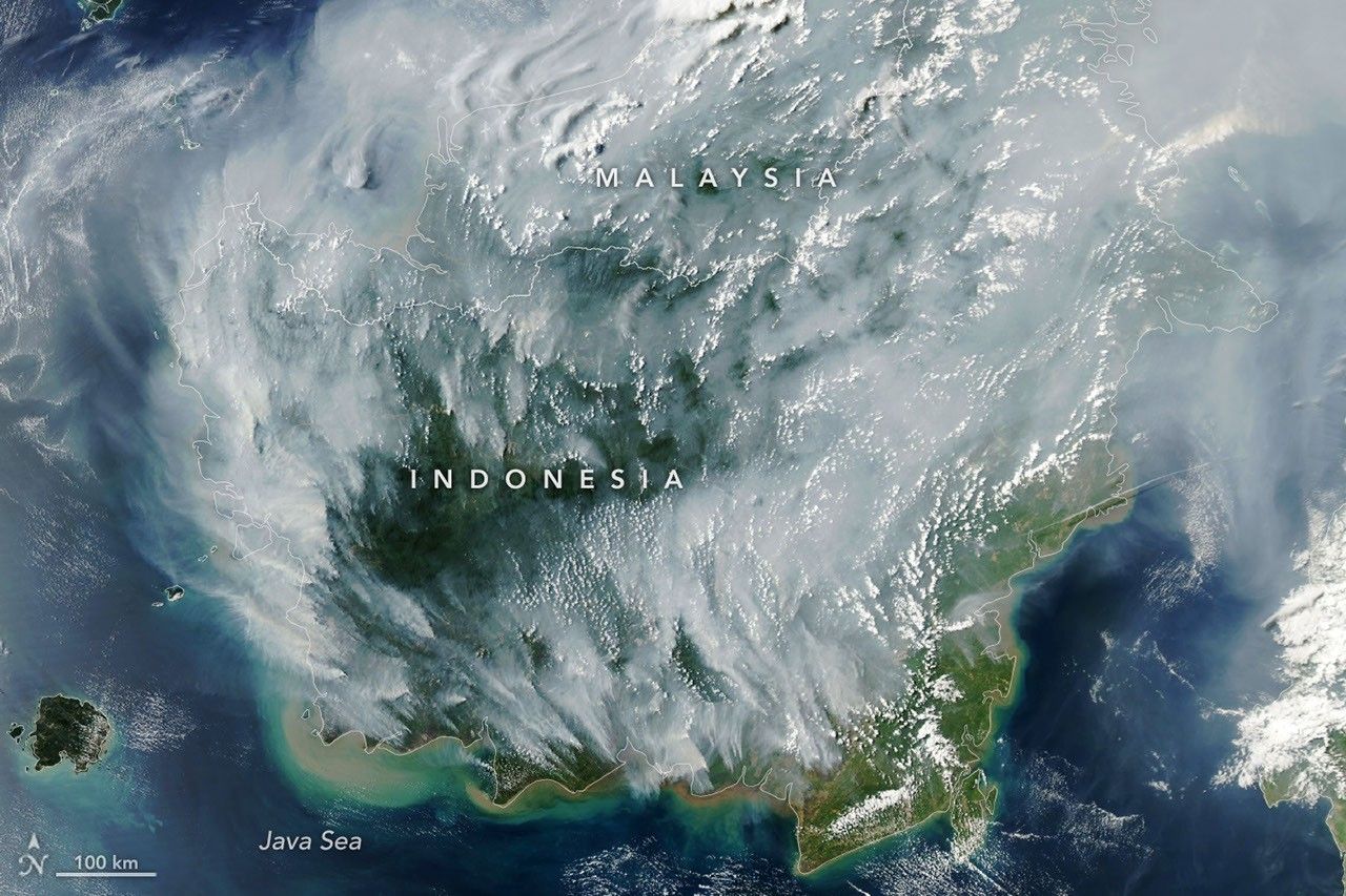
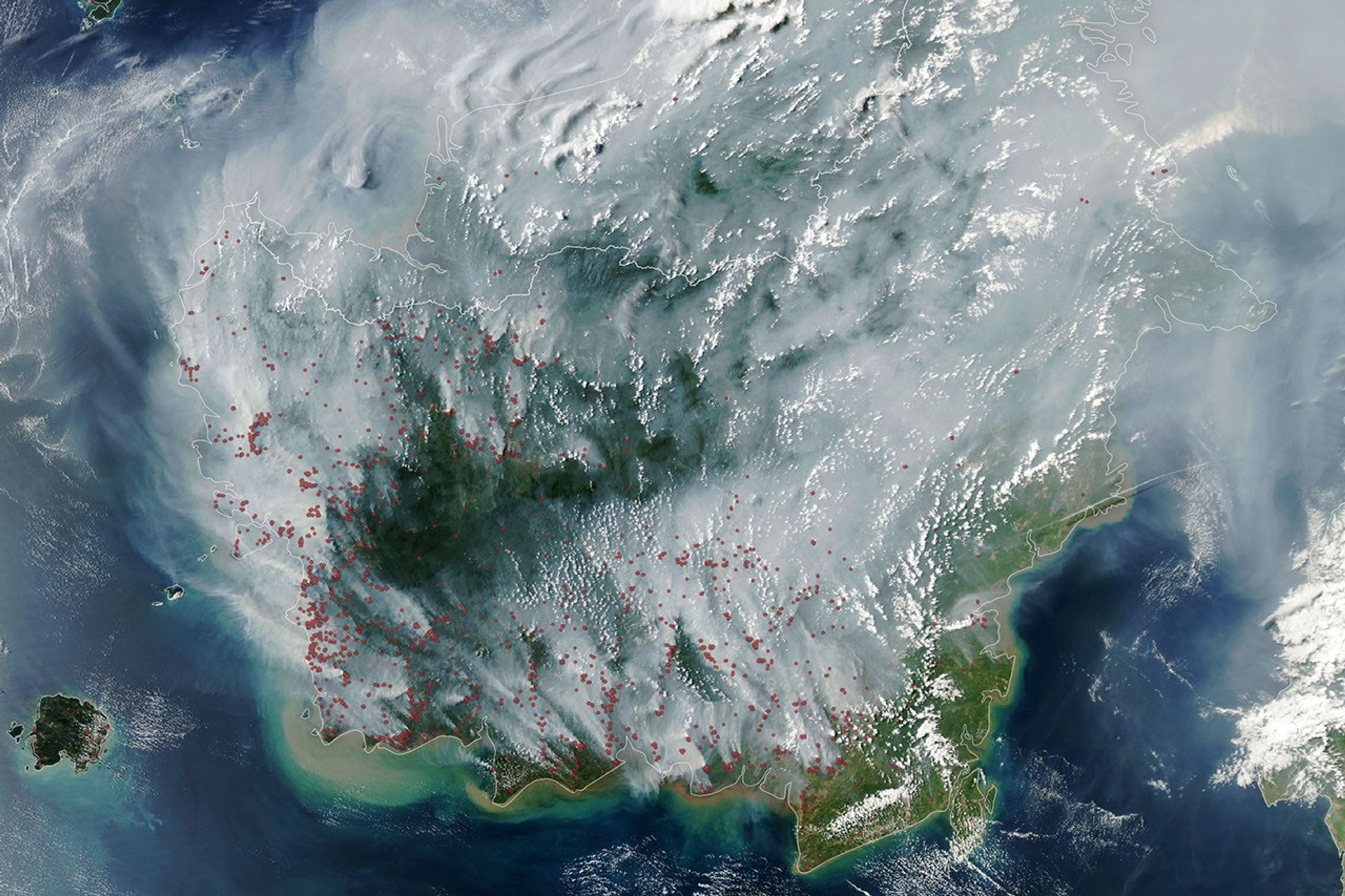
Thick gray plumes of smoke stream from large numbers of fires scattered across the island of Borneo.
NASA Earth Observatory / Lauren Dauphin
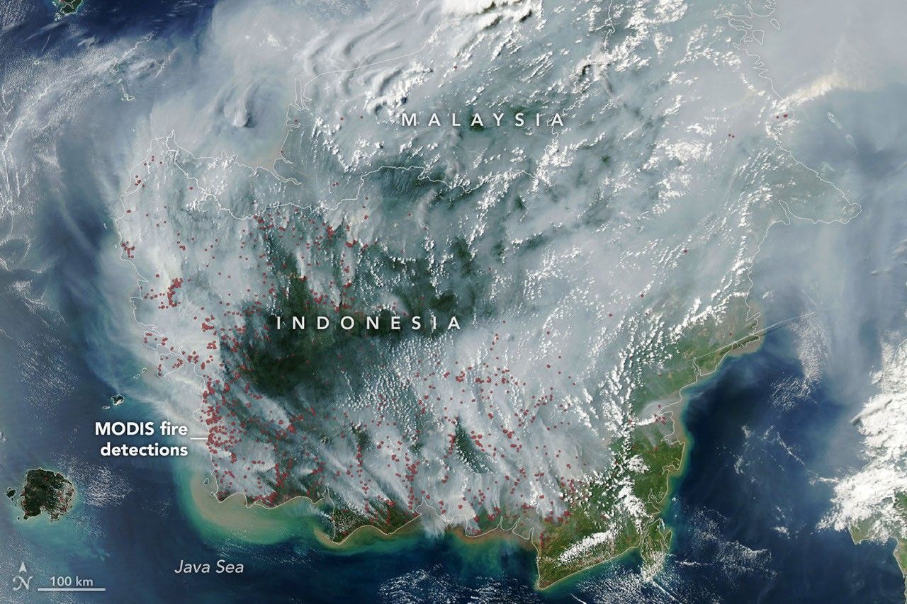
The locations of MODIS fire detections are depicted with small red circles. Most are visible on the southern side of the island.
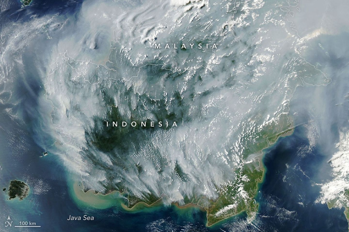
Thick gray plumes of smoke stream from large numbers of fires scattered across the island of Borneo.
NASA Earth Observatory / Lauren Dauphin
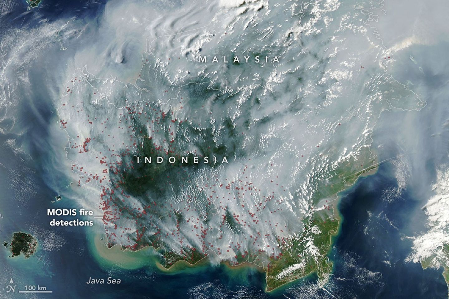
The locations of MODIS fire detections are depicted with small red circles. Most are visible on the southern side of the island.
No Fire Detections
Fire Detections
If there were an apex predator among fires, tropical peatlandfires would be a top contender. These fires, which burn in dried wetland soils, are slow-burning, highly polluting, and notoriously difficult to extinguish because they smolder at low temperatures and often burn underground through expansive deposits of peat. By one estimate, peat fires generate three times more fine particulate matter than other tropical forest fires, five times more sulfur dioxide, three times more organic carbon, and two times more methane and carbon monoxide.
Fire season was underway in Indonesia when the MODIS (Moderate Resolution Imaging Spectroradiometer) on NASA’s Aqua satellite captured this image on September 1, 2026. In the map on the right, each red dot depicts one “fire detection.” A fire detection is a pixel in which the sensor and an algorithm determined there were thermal anomalies indicative of fire. Multiple detections can be generated by a single fire.
Peat fires are a recurring challenge in Indonesia, which is home to about 36 percent of the world’s tropical peatlands. When parched by drought, the archipelago’s peat landscapes have become unrelenting infernos on several occasions over the past three decades, with fires producing blankets of smoke for weeks on end and upending daily life for millions of people.
While fires occur in Indonesia every year, previous El Niño years—1997 and 2015 especially—produced the most extreme burning in recent decades. The climate pattern, assessed by NOAA as present and strengthening in August, typically leads to sharp reductions in rainfall in Indonesia, particularly when combined with a positive phase of the Indian Ocean Dipole, which was also present.
“Indonesia is only about three weeks into its fire season, but we’re seeing fire activity track sharply upward, similar to 2015,” said Robert Field, a Columbia University researcher who developed a tool called the Global Fire Weather Database that produces experimental, real-time fire weather forecasts. “The strong El Niño is making the dry season drier over the fire-prone parts of the country and exacerbating burning—just as we anticipated it would,” he said. In 2015, after burning for more than three months, Indonesia’s fires had released 1.75 billion tons of greenhouse gas equivalents—more than Japan emits in a year. As of September 2, Indonesia’s 2026 fires, having burned for about a month, have released roughly 10 percent as much as the 2015 fires.
As in 2015, Indonesia was in the midst of a severe and widespread drought in summer 2026. About 90 percent of the country received little to no rainfall in early August, according to data from the Indonesian meteorological agency. Normally, it’s too wet for fires to spread through underground peat deposits in Kalimantan, Sumatra, and Papua, but they can in dry conditions. “Surface fires are less of a concern, but when fires get underground, they just won’t stop,” Field said. “They’ll keep burning until the rains come in October or November.”
The Indonesian government uses NASA and NOAA observations from the MODIS and VIIRS sensors to track active fires in near-real-time. Indonesia’s Ministry of Forestry MODIS- and VIIRS-based fire-monitoring platform SiPongi, for instance, tallied 946 hotspots on August 31, 2026.
However, it’s difficult for MODIS and VIIRS to detect fires through thick smoke or clouds, within the forest understory, or underground in peat deposits. When Indonesian fires become the most intense, the number of fires recorded by VIIRS or MODIS can actually decrease. “The worst smoke events, paradoxically, can be the hardest to observe from space with MODIS and VIIRS,” said Mark Cochrane, an ecologist at the University of Maryland Center for Environmental Science who has conducted field research on peat fires in Indonesia for nearly a decade.
The large-scale construction of irrigation canals and drainage of peat swamps in the 1990s, part of an effort to establish massive rice farms, contributed to the flammability of the region today by significantly lowering the water table in wetland areas, Cochrane said. He also noted that oil palm and other plantation forestry is common in this region. Yet after an unusually grim fire season in 2015, governments and other organizations have worked to dam up some irrigation canals and restore wetlands. There have also been renewed efforts to improve firefighting capacity and reduce the number of fires that people accidentally ignite.
“This year will be a real stress test of the measures that were put in place after 2015,” said Shi Jun Wee, a University of Maryland graduate student. Wee is working on a team partnering with NASA and MapBiomas to develop new algorithms and techniques to detect more understory fires than MODIS and VIIRS can by tapping into shortwave infrared observations from Landsat and Sentinel-2 satellites. As the fires progress, he plans to track developments using NASA’s Worldview data browser, FIRMS (Fire Information for Resource Management System), HLS (Harmonized Landsat and Sentinel-2) observations, and GFED (Global Fire Emissions Database).
On the ground in Indonesia and neighboring countries, the smoke is already causing widespread disruptions. Indonesian officials have warned that large swaths of the population have been exposed to hazardous smoke. Some schools started shifting to remote learning, nine national parks have closed, and several flights have been delayed due to heavy smoke, according to news reports.
“People tend to focus on these fires during an El Niño and then forget about them,” Cochrane said. “We need sustained focus, even during the years when they aren’t as bad, to solve this,” he said. “These fires create a tremendous amount of emissions.”
NASA Earth Observatory image by Lauren Dauphin, using MODIS data from NASA EOSDIS LANCE and GIBS/Worldview.Story by Adam Voiland.
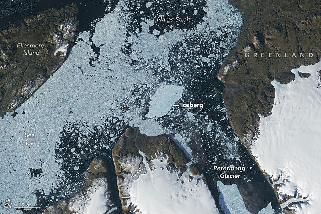
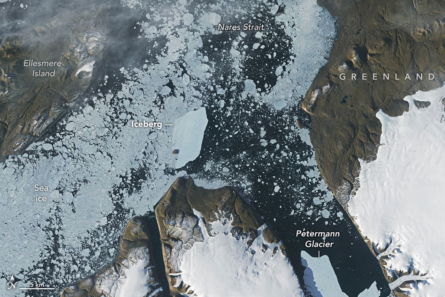
A satellite view shows the iceberg after it pivoted out of the fjord into Nares Strait, wedged against a small, brown island.
NASA Earth Observatory / Lauren Dauphin
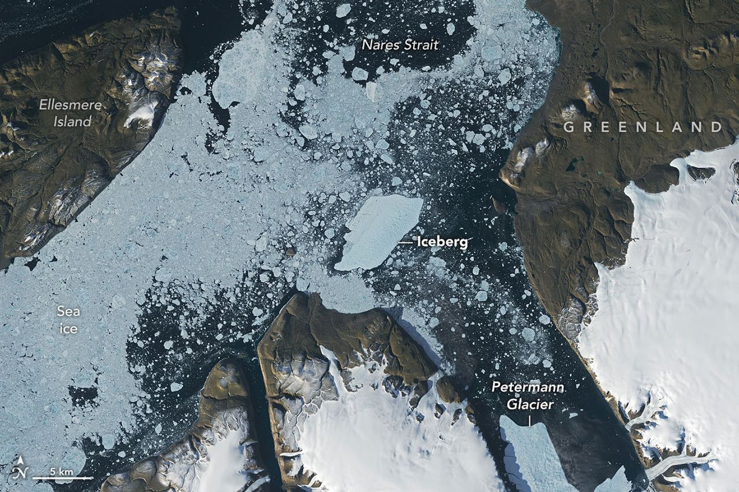
A satellite view shows a large tabular iceberg at the junction of its home fjord and Nares Strait.
NASA Earth Observatory / Lauren Dauphin
A satellite view shows the iceberg after it pivoted out of the fjord into Nares Strait, wedged against a small, brown island.
NASA Earth Observatory / Lauren Dauphin
A satellite view shows a large tabular iceberg at the junction of its home fjord and Nares Strait.
NASA Earth Observatory / Lauren Dauphin
AUGUST 24
AUGUST 23
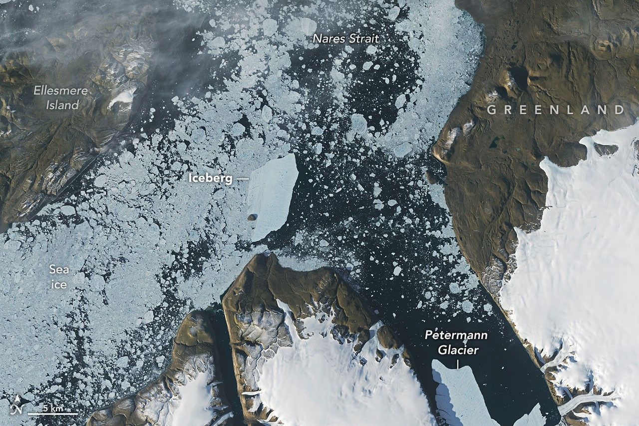
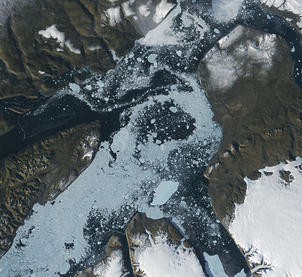
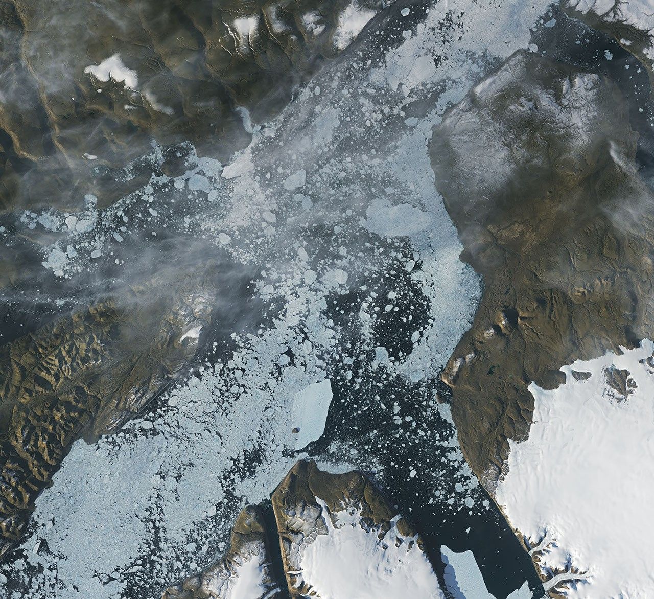
An iceberg from Petermann Glacier encounters Joe Island in northwestern Greenland, visible in images captured by the OLI (Operational Land Imager) on Landsat 9 on August 23, 2026 (right), and August 24, 2026 (left). NASA Earth Observatory images by Lauren Dauphin.
Summer is prime iceberg season in Greenland’s glacier-fed fjords, and 2026 was no exception. Especially notable was the berg that broke from the Petermann Glacier along Greenland’s northwest coast in August. Roughly the size of St. Thomas in the U.S. Virgin Islands, it was the largest calving event by any Arctic glacier since 2020.
Iceberg calving is a routine part of an outlet glacier’s life cycle. Scientists watch the process closely, however, along with numerous other observations of the ice and its environment, for longer-term signs of instability. Petermann is one of Greenland’s largest marine-terminating glaciers and acts as a gatekeeper for ice flowing from the ice sheet into the ocean. Its future stability has implications for sea level rise.
The calving event of summer 2026 was spotted on August 4 by Adam Garbo, a doctoral student in glaciology at the University of Ottawa, in imagery from the European Space Agency’s Sentinel-1 mission. Garbo and an international team of colleagues have been using remote sensing to study and track the glacier’s ice tongue.
The team reported that the large tabular iceberg, or “ice island,” measured just over 76 square kilometers (29 square miles) at the time it calved—the largest to break from the glacier since the ice island of 2012 (130 square kilometers). The 2012 calving followed earlier major events in 2008 (31 square kilometers) and 2010 (just over 250 square kilometers).
The August 2026 event could have been even bigger. Garbo and colleagues had been expecting a major calving once one of the large rifts they were monitoring finally cut all the way across Petermann’s ice tongue. “What surprised us was that the calving instead followed a different fracture, producing a smaller ice island than we had originally anticipated,” Garbo said. As of late August, two large rifts remained and were expected to eventually produce new ice islands of roughly 94 square kilometers and 84 square kilometers, though the timing remained uncertain.
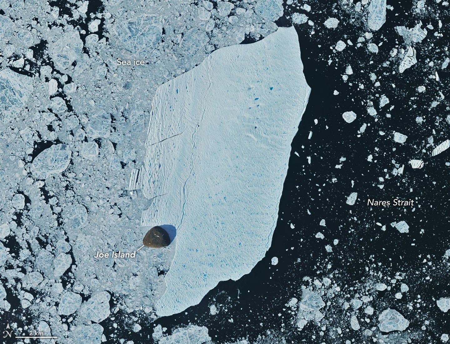
August 24, 2026
NASA Earth Observatory/Lauren Dauphin
Glaciologist Mauri Pelto of Nichols College has also been tracking the iceberg, using images from NASA-USGS Landsat satellites, as it drifted down Petermann Fjord toward Nares Strait. In the week since it calved, the berg drifted an average of 3 kilometers per day. It continued toward the fjord’s junction with Nares Strait, where it rammed into a small rocky outcrop known as Joe Island (Joe Ø). The brief encounter is visible in images captured by the OLI (Operational Land Imager) on Landsat 9 on August 23 (top right) and August 24 (top left). A detailed view of the August 24 image is shown above.
Joe Island sits at the mouth of Petermann Fjord, making it one of the first obstacles a departing ice island meets. Collisions with it—like the one that split the 2010 ice island in two—often mark the start of a berg’s breakup. Petermann bergs tend to be thinner and more fragile than those calved by glaciers such as Greenland’s Jakobshavn and Helheim, and thinner still than Antarctica’s behemoths, Pelto noted.
“We were certainly watching closely as it interacted with Joe Island and were impressed that it survived the interaction without further fragmentation,” Garbo said.
The ice island was estimated to be less than 150 meters thick at the time of calving. Wind and surface currents have swept it out of the fjord, and satellite images show it pivoting away from Joe Island and continuing southwest through Nares Strait. As it drifts, it will fracture into smaller pieces as tides, winds, currents, and melting continue to weaken the ice.
Thicker bergs that calve from tidewater glaciers without floating ice-shelf extensions can drag and even become grounded on the seafloor within the fjord, while ice islands, like those from Petermann, might run aground later in their drift. Many ice islands have become “grounded” off the coasts of Coburg and Baffin islands.
Garbo and colleagues noted that ice islands and their fragments have been known to travel considerable distances, posing potential hazards to marine activities and infrastructure while also distributing freshwater through the ocean as they melt.
NASA Earth Observatory images by Lauren Dauphin, using Landsat data from the U.S. Geological Survey. Story by Kathryn Hansen.
Every month, NASA Earth Observatory features a puzzling satellite image. The September 2026 puzzler appears above.
Your Challenge Identify the location shown in this satellite image. Share what clues you see, where you think it is, and what makes this place interesting or unique to you.
How to Answer Submit your response using this form and select “Puzzler Answer” as the topic. Please include your preferred name or alias.
You can keep it simple and just guess the location. Want to impress us? Tell us which satellite and instrument captured the image, which spectral bands were used, or point out a subtle detail about the geology or history of the area. If something catches your eye, or if this is your home or means something to you, we’d love to hear about it.
The Prize We can’t offer prize money or a trip to space to see Earth like satellites and astronauts do. But we can offer something almost as rewarding: puzzler bragging rights.
About a week after the challenge, we’ll post the answer at the top of this page, along with a link to an Earth Observatory Image of the Day story that explains the image in more detail. We’ll recognize the first person who correctly guesses the location, and we may also highlight readers who share especially thoughtful or interesting answers. By submitting a response, you acknowledge that your comments may be edited, excerpted, and published on this page.
Until then, zoom in, look closely, and enjoy the challenge. See you at the reveal!
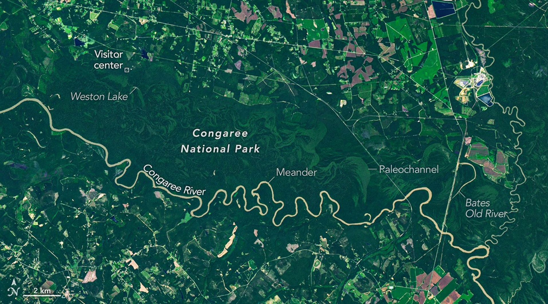
The OLI on Landsat 9 captured this image of the Congaree River winding through floodplain forests in Congaree National Park on August 18, 2025.
NASA Earth Observatory/Michala Garrison
Among the 63 U.S. national parks, few are as defined by a single river’s floodplain as Congaree National Park in South Carolina. While the features are also prominent in other parks, a full 80 percent of Congaree National Park lies within the Congaree River floodplain.
It’s a place home to one of the largest intact tracts of old-growth bottomland hardwood forests in the United States. In this image captured by the OLI (Operational Land Imager) on Landsat 9, the river winds through the forested plain, along with curving bands of green that trace old channels, ridges, and swales left behind as the river gradually migrated across it. Slight differences in elevation in these paleochannels and other landforms affect how frequently they flood, producing distinct ecosystems that appear in contrasting shades of green.
The river flows through flat, soft terrain, which encourages the formation of bends and meanders. Water typically flows faster on the outside of bends, leading to more rapid erosion as the channel carves into the outer riverbank. It moves more slowly on the inside of bends, resulting in the deposition of sediment and the growth of sandy features called point bars. Over time, this process can cut off a bend from the main river channel, forming U-shaped oxbow lakes.
The National Park Service lists Weston Lake, 1.2 miles (1.9 kilometers) from the visitor center, as one of the park’s most permanent oxbow lakes, noting that it is relatively deep and lacks the shallow clay and silt layer found in most of the park’s other oxbow lakes, such as Devil’s Elbow. On the right side of the image is Bates Old River, a roughly 4-mile-long abandoned channel of the Congaree River and one of the longest oxbow lakes in South Carolina. Over time, abandoned channels and oxbow lakes can fill with sediment and become shallow wetlands. Some of these low-lying, water-filled features are known as sloughs, where flood-tolerant cypress-tupelo forests tend to grow.
While loggers targeted forests along the Congaree in the 1880s, challenges such as frequent flooding, interminably muddy roads, and mosquito-plagued conditions meant that most of the floodplain forests escaped the widespread logging that transformed other parts of the Southeast. By the 1950s, conservationists had begun to recognize how rare old-growth forests of this type had become in the region. Congress designated the area a national monument in 1976, and it became a national park in 2003.
As the river snakes its way through the park’s mostly flat terrain, it overflows its banks several times per year, usually in the winter and early spring but also in the summer and fall after hurricanes and major rainstorms. These floods distribute broad layers of nutrient-rich silt throughout the floodplain, nourishing the forests and contributing to the high concentration of unusually large trees in the park.
Over the decades, Congaree National Park has harbored a remarkable array of giant “champion” trees that have held national and state size records for their species. Though individual trees have gained and lost champion status as they have been damaged, have died, or been surpassed by newly measured trees elsewhere, Congaree trees such as the possumhaw (Ilex decidua), water hickory (Carya aquatica), loblolly pine (Pinus taeda), laurel oak (Quercus laurifolia), swamp tupelo (Nyssa biflora), and sweetgum (Liquidambar styraciflua) have held records at times.
Landsat has observed evidence of emperor penguins living on Smyley Island in Antarctica as early as 1989. The TM (Thematic Mapper) on Landsat 4 captured this false-color image (left) of guano stains on fast ice on December 24, 1989. The OLI (Operational Land Imager) on Landsat 8 captured a similar scene on December 10, 2025 (right). The images combine observations of infrared, red, and green light to make it easier to distinguish the guano stains. NASA Earth Observatory images by Michala Garrison.
With their charming waddles, heat-conserving huddles, and tuxedo-like plumage, emperor penguins are among the world’s most recognizable animals. Recent satellite surveys estimate that hundreds of thousands of the flightless birds live in 66 colonies spread around Antarctica’s inaccessible, frozen coastlines. But those numbers could fall in the coming decades because emperor penguins rely on landfast (or fast) ice—a type of sea ice attached to the shoreline—to breed, raise chicks, and molt.
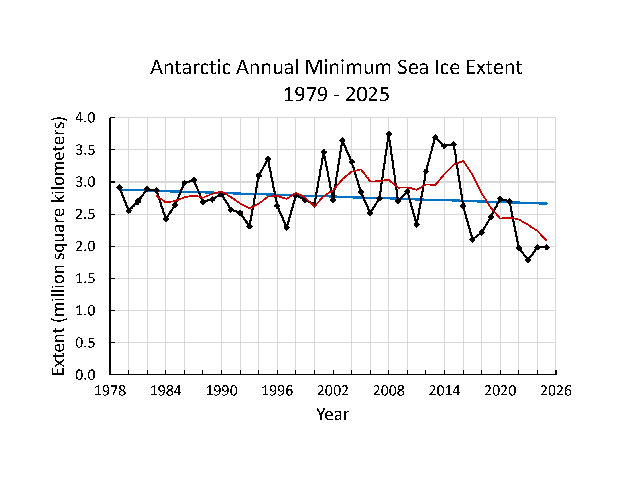
While Antarctic sea ice remained relatively stable between the late 1970s and 2015, it has been declining since 2016, and climate projections suggest that trend will continue. How landfast ice is faring remains poorly understood and is an active area of study. However, one study suggests that it has declined in West Antarctica and the Weddell Sea in recent decades even as it has trended upward in the Bellingshausen Sea and East Antarctica.
Meanwhile, some models project that emperor penguins could disappear by 2100 due to their habitats becoming inhospitable. The U.S. Fish & Wildlife Service listed emperor penguins as threatened in 2022, and the International Union for Conservation of Nature classified them as endangered in 2026.
After Antarctic sea ice cover hit a record low in 2022, British Antarctic Survey researchers reported “catastrophic” breeding failures among Bellingshausen Sea colonies. However, new research, based on decades of observations from NASA-USGS Landsat satellites, offers some hope, underscoring that many colonies have persisted for decades and that emperor penguins may be more flexible about where they breed than previously thought.
Except for a few well-studied colonies, scientists have known little about how long many emperor penguin colonies have existed, how their populations have changed, or how they have responded to past disruptions in landfast sea ice.
Adult and juvenile emperor penguins congregate on sea ice in Antarctica.
Michael Van Woert, NOAA NESDIS, ORA
“There’s little baseline information for what’s ‘normal’ for most of these colonies,” said Michelle LaRue, a wildlife ecologist at the University of Canterbury. That’s made projecting future population levels a challenge.
Two new studies published in 2026 used decades of Landsat observations to start filling gaps in understanding. Landsat cannot resolve individual penguins, but researchers identify colonies from the guano stains that accumulate where thousands of birds congregate on the ice.
Using this technique, researchers at the University of Freiburg found that 18 colonies predate their initial identification by an average of 17 years. Because Landsat has imaged Antarctica continuously since the early 1980s, it provides one of the few systematic long-term records of remote penguin colonies.
Among the oldest colonies studied was the roughly 6,000-bird Smyley Island colony in the Bellingshausen Sea, which dates to at least 1989, two decades earlier than previously known. Other colonies that predated their earliest known presence by 20 or more years included those at Barrier Bay, Brownson, Luitpold Coast, Ragnhild, Smith, and Verdi Inlet.
Scientists have watched the Smyley Island colony closely in recent years because it is among the colonies that may have suffered a total breeding failure in 2022. Satellite images captured that year show the colony splitting up, with some penguins moving onto a large iceberg grounded near the coast.
Despite persistently low sea-ice conditions since then, the colony has continued to appear in satellite imagery, generally establishing itself near icebergs along the edge of the ice shelf. The image above on the right shows the colony in December 2025, the most recent month Landsat has observed the colony.
“We’re seeing a degree of resilience in the Smyley Island colony,” LaRue said. “They seem to be doing okay now, and we will continue to monitor them to learn more about their behaviors.” The colony’s persistence underscores that one bad breeding year—even a total failure—doesn’t mean the end of a colony. Blizzards and predators can lead to bad years with very low chick survival rates as well, she added. “It’s when we start to see frequent breeding failures year after year that the birds won’t be able to keep up, and it starts to be a problem for a colony.”
Landsat 8 captured an image of the SANAE colony with a guano trail leading from rift ice to the ice shelf on January 23, 2018 (left). On January 4, 2023, the birds had returned to their original fast ice area (right). The images combine observations of infrared, red, and green light to make it easier to distinguish the guano stains.
NASA Earth Observatory/Michala Garrison
A second study, led by Grant Macdonald, a remote sensing scientist at Durham University, found further evidence of behavioral flexibility. Macdonald and colleagues analyzed nearly 40 years of observations from Landsat, the ASTER (Advanced Spaceborne Thermal Emission and Reflection Radiometer) on NASA’s Terra satellite, and other sources for three colonies disrupted by iceberg calving or early sea ice breakup. They found that penguins of the Mertz and SANAE colonies responded by temporarily shifting to nearby icebergs, embayments, or ice shelves before returning to their former breeding sites.
Landsat first imaged the SANAE colony in 1984 on fast ice in a sheltered bay in the Queen Maud Land region in East Antarctica. After a major calving event in 2011 exposed the fast ice to more punishing winds, the colony relocated to rift ice in an embayment 11 kilometers (7 miles) to the south. The move proved temporary. Part of the group moved to another nearby site, and part of it returned to the original breeding location in 2016.
Yet in the 2016–2017 breeding season, the returnees did something unexpected. Despite the presence of stable fast ice, they trekked onto the ice shelf and huddled and bred there. In the Landsat image above, a winding guano-stained trail traces the penguins’ route onto the ice shelf. By 2022, after roughly a decade of wandering and splitting between sites, the entire colony had returned to its original breeding ground on the fast ice, where it has bred each year since.
At the third colony the researchers studied, the Astrid colony on the Vigridisen Ice Shelf, the birds kept returning to their original breeding location even after a major calving event in 2006. That’s likely because some fast ice remained and nearby icebergs provided some shelter. The guano stains indicate that the colony did, however, sometimes spend time on a nearby ice shelf toward the end of the breeding season both before and after the calving event.
Indeed, moving and sometimes breeding on alternative surfaces such as ice shelves, icebergs, or rift ice may be “more common and feasible than previously thought,” Macdonald said, perhaps because some sites offer better shelter from wind. This willingness to move may represent a “useful adaptation” as ocean temperatures warm and sea ice declines, he added, though he cautioned that behavioral flexibility alone won’t necessarily offset the long-term effects of continued sea-ice loss.
“We have so much more to learn about emperor penguins,” added LaRue. “These colonies are so remote and difficult to access that satellites—especially government satellites with easily accessible data—are going to be absolutely invaluable to understanding what the future will bring for them.”
NASA Earth Observatory images by Michala Garrison, using Landsat data from the U.S. Geological Survey. Photo by Michael Van Woert (NOAA NESDIS, ORA).Story by Adam Voiland.
The rugged terrain of the Silver Island Mountains and Crater Island rises above the pale playa and bright salt flats of former Lake Bonneville. The image was acquired with the OLI (Operational Land Imager) on Landsat 8 on June 4, 2026, and overlaid on a digital elevation model.
NASA Earth Observatory/Michala Garrison
At its peak, ancient Lake Bonneville would have been a sight to behold. Nearly as large as Lake Michigan, the Ice Age lake spread across much of western Utah and parts of Nevada and Idaho. When it eventually receded, it left behind flat, bright playas and salt flats rich with minerals—a landscape that would later serve as the setting for feats of engineering and technological ingenuity, as well as epic tales of exploration and desperation.
Lake Bonneville began forming about 55,000 years ago during a cool, wet period, when volcanic eruptions in what’s now southeastern Idaho diverted the Bear River, causing water to gather in Gem Valley and other basins to the south. For tens of thousands of years, a natural dam at Red Rock Pass helped confine the lake.
Then, about 18,000 years ago, water breached that dam, unleashing a torrent that entered the Columbia River system. Over a six-week period, amid one of North America’s largest floods, lake levels plummeted by more than 350 feet (105 meters). As the climate warmed and dried in subsequent millennia, the lake shrank dramatically, leaving remnants that include today’s Great Salt Lake, Utah Lake, and Sevier Lake.
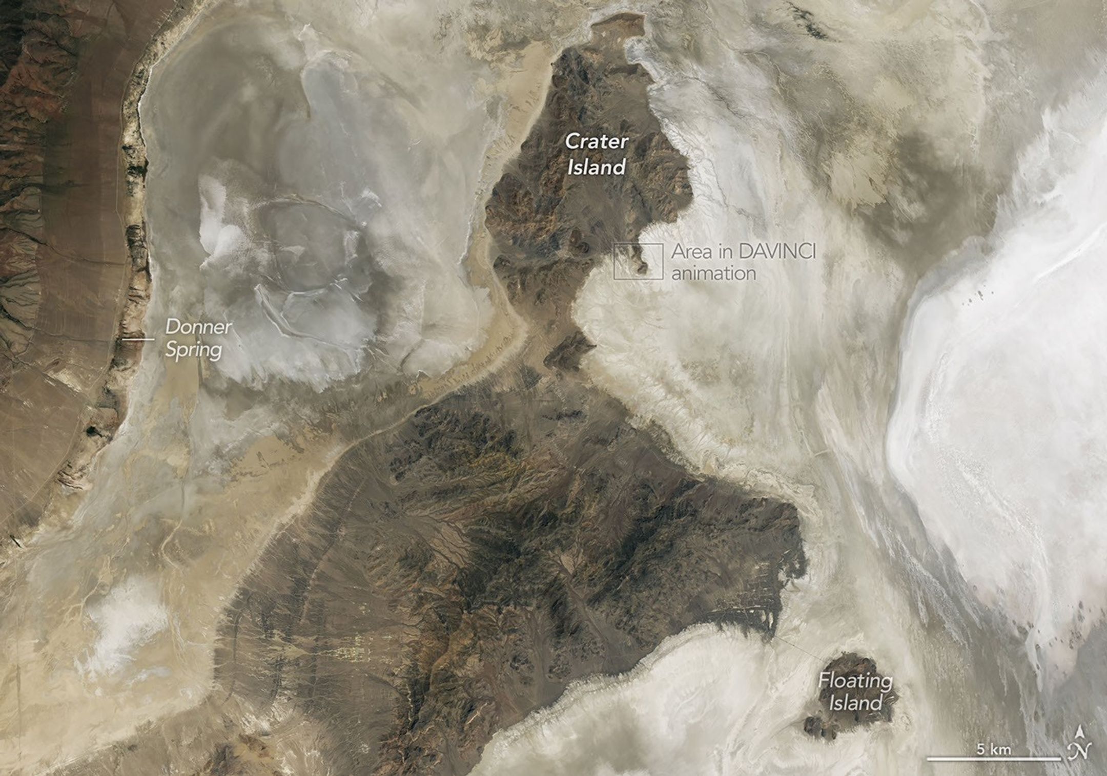
Lake Bonneville may be gone, but its imprint on the region’s landscape remains—even in satellite imagery. In this image (below) captured by the OLI (Operational Land Imager) on the NASA-USGS Landsat 8 satellite, bathtub-like rings and wave-cut terraces trace the position of former shorelines. The dried lakebed—where fine-grained clay, marl, and sandy sediment settled out of the water—appears pale in comparison to the darker, rockier, more vegetated surroundings.
NASA scientists analyzed the terrain in this part of Utah when testing technologies that will be used on NASA’s DAVINCI mission to Venus. This image was acquired with the OLI (Operational Land Imager) on Landsat 8 on June 4, 2026.
NASA Earth Observatory/Michala Garrison
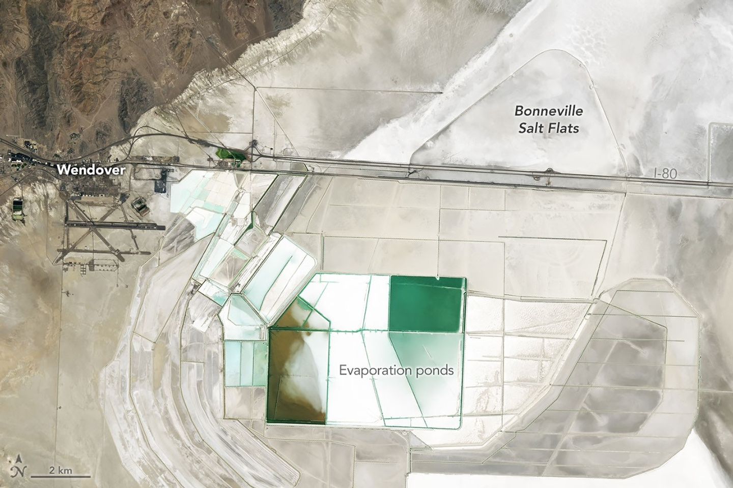
In deep parts of the basin, where runoff and groundwater still pool, bright deposits of evaporite minerals coat the land surfaces, forming salt flats. These remarkably flat surfaces are the product of water gradually evaporating and concentrating minerals to produce brines and hard mineral crusts, typically including halite and gypsum, along with potassium- and magnesium-bearing salts. Brines and deposits like these—particularly of potash, which is used as a fertilizer—have long made the playa a target for mining, as seen in the rectangular evaporation ponds above and below.
In contrast, the darker, more rugged terrain—including the Silver Island Mountains, the Newfoundland Mountains, and the Pilot Range—that rises above the playas is built from layers of erosion-resistant sedimentary and metasedimentary bedrock that is hundreds of millions of years old. These mountains also contain younger igneous and metamorphic rocks that formed when magma intruded into the ancient sedimentary sequence.
Crater Island, for instance, is composed of sedimentary rocks, including silica-rich sandstones and quartzites that formed as sands accumulated in a shallow ocean, as well as intrusions of quartz monzonite, granites, and other igneous rocks. Periods of crustal stretching later produced the fault-block mountains that define the landscape.
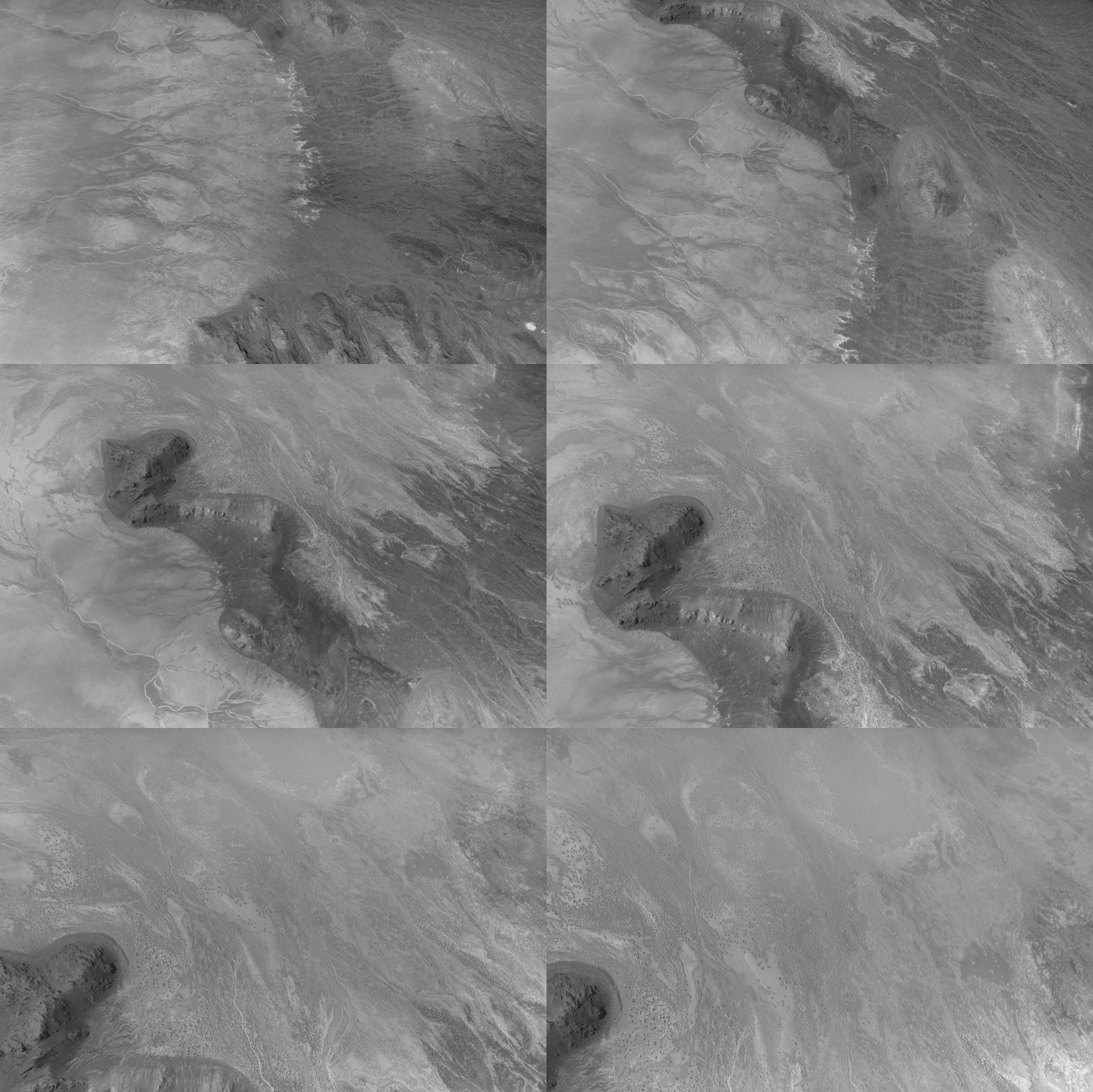
This animation shows the descent over Crater Island, Utah, of the camera system that will one day fly aboard NASA’s DAVINCI mission to Venus. It was created by stitching together 37 infrared images captured during a test on June 24, 2026.
Malin Space Science Systems/NASA/Jay Friedlander
Mapping geological distinctions like this took center stage in June 2026 when NASA scientists and engineers working with the agency’s DAVINCI mission came to Crater Island—a place they call “Venus on Earth”—to field-test the design of a set of cameras and a package of instruments that will eventually descend through the thick atmosphere of Venus and photograph mountains at scales finer than these Landsat images. During a 60-minute descent, the pioneering probe will capture near-infrared images, measure the atmospheric chemistry, and explore the environment of a world in unprecedented detail.
During the rehearsals at Crater Island, the camera system took hundreds of images of various rock formations, including iron-rich and silica-rich rock units, while suspended from a helicopter as it descended toward the surface. Using only the images acquired by DAVINCI’s camera systems, the team made three-dimensional maps of the area consistent with existing geologic maps, giving the scientists confidence that they will be able to map the geology of an analogous mountainous region on Venus that DAVINCI will study, an area called Alpha Regio.
Other epic adventures have played out on and around Lake Bonneville’s playas, as well. The flat, smooth surfaces have often been the setting for new land speed records. In 1960, Mickey Thompson became the first American to break the 400-miles-per-hour (640 kilometers-per-hour) barrier, hitting 406.60 miles per hour (654.36 kilometers per hour) in a streamlined race car on the Bonneville Salt Flats. The feat temporarily earned him the nickname “fastest man on Earth.”
People mine minerals from the Bonneville Salt Flats and use its flat surface to pursue land speed records. This image was acquired with the OLI (Operational Land Imager) on Landsat 8 on June 4, 2026.
NASA Earth Observatory/Michala Garrison
More recently, in August 2026, Andy Green, the first person to break the sound barrier on land, set a record for the fastest land speed in a hydrogen-fueled internal-combustion vehicle, reaching 406.320 miles per hour (653.909 kilometers per hour). By burning hydrogen rather than gasoline, the “rocket car” produced no carbon dioxide.
Nearly two centuries earlier, in August 1846, members of the ill-fated Donner-Reed Party also passed along the southern edge of Crater Island. As part of a shortcut toward Pilot Peak, they journeyed from Hastings Pass, past Floating Island, and toward Donner Spring. However, in an ominous sign of challenges to come, their heavy wagons broke through the thin salt crust and became mired in underlying mud, slowing them down and prompting them to abandon several wagons in the desert.
NASA Earth Observatory images by Michala Garrison, using Landsat data from the U.S. Geological Survey.Story by Adam Voiland.
Output from NASA’s GEOS (Goddard Earth Observing System) global model shows daily maximum surface air temperature across Western Europe from May 1 to August 19, 2026. The darkest red areas indicate temperatures that met or exceeded 40°C (104°F).
NASA Earth Observatory/Lauren Dauphin
Western Europe got its first hint of an unusual summer in May 2026, when a heat dome produced exceptional temperatures that shattered records in several countries. Remarkable as it was, that early heat wave turned out to be only the opening salvo.
By mid-August, Europeans were sweating through their fifth heat wave of the season, with the latest onslaught pushing temperatures well above 40 degrees Celsius (104 degrees Fahrenheit) across a broad area. During these bouts of extreme weather, high temperatures were often unrelenting, persisting for several days and sometimes weeks on end, and remaining overnight.
For a region accustomed to relatively mild summers, the heat upended everyday life. Hospitalizations and heat-related deaths spiked. Highways and train tracks buckled, forcing road closures and service disruptions. Large and destructive wildfires raged in areas where they were once rarely seen. The heat also worsened the severe drought that has gripped the region for months, contributing to record-low river water levels and disrupting water and power supplies, transportation routes, and agriculture.
The animation above shows the daily maximum surface air temperature across Western Europe from May 1 to August 19, 2026. It was produced by combining satellite observations with temperatures predicted by a version of NASA’s GEOS (Goddard Earth Observing System) global model, which uses mathematical equations to represent physical processes in the atmosphere. The darkest red areas indicate where temperatures met or exceeded 40°C.
The heat broke records at a furious pace, often by wide margins. According to the UK Met Office, temperatures soared as high as 35.1°C (95.2°F) in London on May 26, smashing the previous May record by 2.3°C (4.1°F). In June, Bordeaux, France, broke its maximum-temperature record on three consecutive days, hitting 42.5°C on June 24, Météo-France reported. Slovakia, meanwhile, set new national records for both daytime and nighttime highs in August. Combined June and July temperatures in Western Europe were the highest on record, according to Europe’s Copernicus climate monitoring service.
In Europe, extreme temperatures collided with several vulnerabilities, including limited access to air conditioning, high nighttime temperatures, and a lack of green space in some cities. The circumstances triggered not just discomfort but heat exhaustion and heatstroke in some cases. Preliminary reports suggest that heat may have been associated with 10,000 excess deaths, including thousands of people in the UK, France, Germany, and Belgium.
“Air conditioning is an especially critical issue in Europe in the short term,” said Anamika Shreevastava, a researcher at New York University who studied urban heat islands as a postdoc at NASA’s Jet Propulsion Laboratory. One of her goals was to produce thermal maps based on NASA data from missions like ECOSTRESS that city planners could use to make cities more resilient to heat waves.
International Energy Agency data show that 23 percent of homes in Europe have air conditioning, compared to 90 percent of homes in the United States. That difference contributes to the much higher death rates that researchers have documented in European cities during heat waves than in comparable American cities. “Longer term, cities can also plant trees, expand parks, use reflective roof paint, and transition to building materials less likely to retain heat,” Shreevastava said.
An analysis from the World Health Organization indicates that heat stress is the world’s leading cause of weather-related deaths, noting it exacerbates underlying illnesses, including cardiovascular disease, diabetes, mental health conditions, and asthma. Researchers have calculated that roughly 489,000 heat-related deaths occur each year, with 45 percent of the deaths in Asia and 36 percent in Europe.
“For older adults with physical health problems, temperatures as low as 26.7°C (80°F) can pose significant danger,” said Deborah Carr, a Boston University sociologist who specializes in the study of aging. “Nighttime heat is especially harmful for older adults whose homes lack air conditioning.”
Carr is part of a research team that used demographic data, along with temperature and climate data archived by NASA, to identify which parts of the world are at the greatest risk of current and future heat exposure. Southern Europe was among the areas facing growing heat exposure and an aging population, the researchers found.
Other research, published in Lancet Planetary Health in August 2026, underscores the importance of demographics in assessing the risks posed by heat. This study, led by Stanford researcher Qinqin Kong, mapped where increasing heat is likely to lead to intolerable conditions in the coming decades for young, middle-aged, and older adults, concluding that safe thresholds will be breached often and widely, with risks falling disproportionately on older people.
“The human body can tolerate only a limited range of ambient heat,” said Kong, a recipient of a NASA Earth and Space Science and Technology award. “Understanding where, when, and to what extent these limits are exceeded is critical.”
With intolerable levels of heat expected to affect more people across larger regions and for longer periods than previously thought, Kong and his colleagues hope that their findings will inform targeted heat action plans, emergency preparedness, and health system planning.
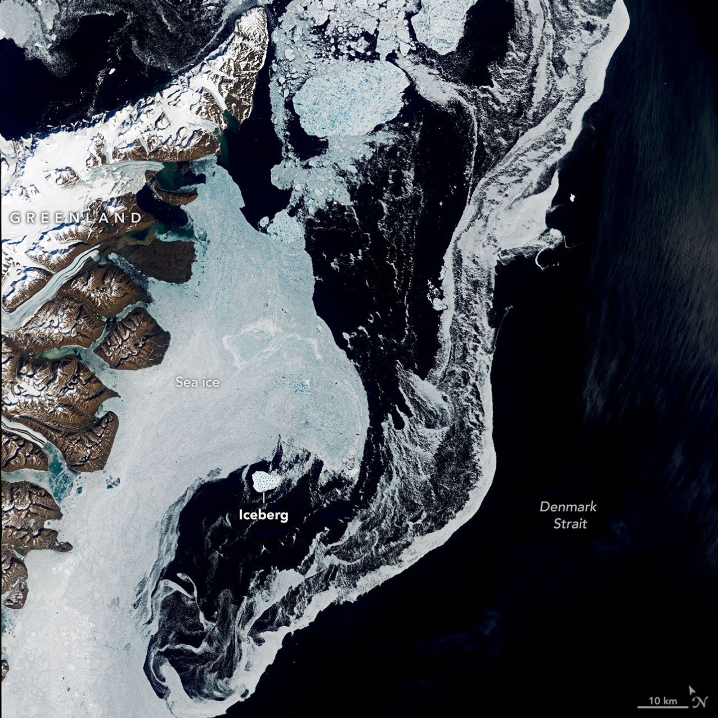
An iceberg drifts through the Denmark Strait in this image acquired on June 12, 2026, by the OLI (Operational Land Imager) on Landsat 9.
NASA Earth Observatory/Lauren Dauphin
Greenland’s jagged coastline is lined with fjords, many of them cradling marine-terminating glaciers that routinely calve icebergs into the water. It’s common to see these bergs, small and large, drifting in the island’s fjords each summer once the sea ice breaks up. In summer 2026, one exceptionally large berg turned up in the Denmark Strait—more than a thousand kilometers south of where it apparently originated.
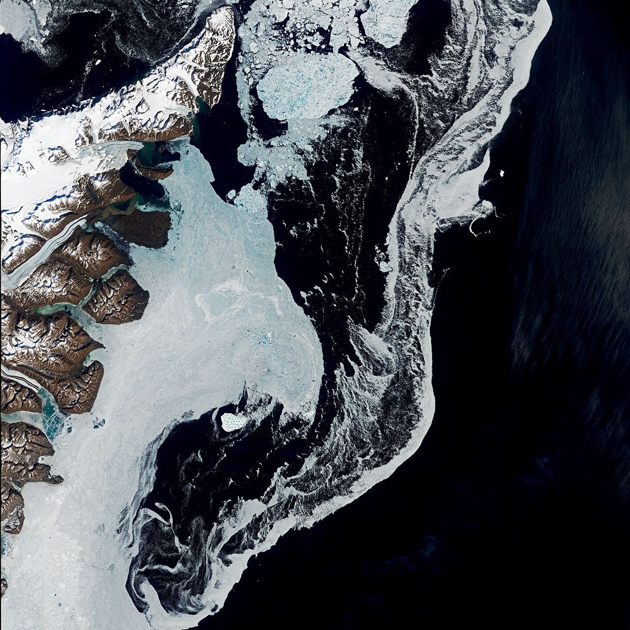
These images, captured by the OLI (Operational Land Imager) on Landsat 9, show the iceberg on June 12 as it drifted in the strait between Greenland and Iceland. It was just south of Kangikajiip Appalia, a cape on Greenland’s east coast visible in the scene’s upper left, amid a mixture of sea ice and berg fragments known as “mélange.”
Alexis Denton, oceanographer and chief scientist with the International Ice Patrol, noted that several clues indicate it is an iceberg rather than thick, multi-year sea ice: its proximity to shore, its whiter color, and larger size compared to the surrounding sea ice. Measuring roughly 17 square kilometers (7 square miles) on June 12, the iceberg was about five times the area of New York City’s Central Park. That’s modest compared to the behemoth bergs that calve from Antarctic glaciers and ice shelves but large by Greenland standards.
Keld Quistgaard, a senior ice advisor with the Danish Meteorological Institute’s Greenland Ice Service, noted that it originated in Jøkelbugten—a bay in northeastern Greenland. The berg’s precise origin within that bay, however, remains something of a mystery. It’s possible that the berg broke off from Zachariæ Isstrøm or its adjacent remnant ice shelf. The ice shelf, which together with Zachariæ Isstrøm once filled the bay, was abandoned after the glacier rapidly retreated in the early 2000s.
Tracing its path back through satellite imagery is challenging. Through spring, the bay and surrounding coastal areas are choked with sea ice and berg fragments, making individual bergs hard to distinguish, especially if covered in bright snow. In late May, for instance, the berg was surrounded by numerous look-alikes. Only later in the season, as it drifted farther south and the ice around it thinned out, did it become distinct enough to easily spot.
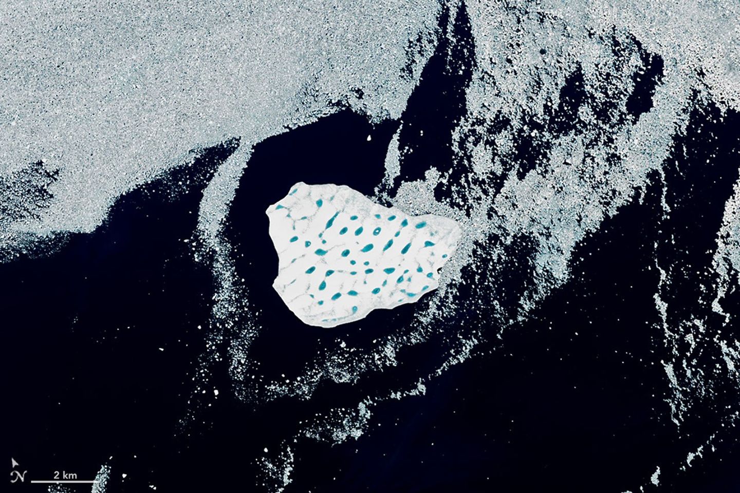
The iceberg’s bright white surface is pocked with light blue meltwater ponds in this detailed view of the image, acquired on June 12, 2026, by the OLI (Operational Land Imager) on Landsat 9.
NASA Earth Observatory/Lauren Dauphin
Its size and striking network of blue meltwater ponds offer some clues to its origin, according to Christopher Shuman, a retired University of Maryland glaciologist. Shuman thinks the berg broke from the remnant ice shelf rather than the glacier itself. Bergs calved from Zachariæ Isstrøm tend to be smaller, he said. Also, the berg’s surface—pocked with meltwater ponds, “like Swiss cheese”—closely resembles the remnant shelf ice. Past satellite images show pieces of that shelf ice drifting south and getting trapped among islands bordering the bay, where winds and tides have jostled them for years.
As of mid-August, the berg was about 1,500 kilometers (900 miles) from the bay, drifting south on the Greenland Coastal Current into the North Atlantic. Quistgaard expected the iceberg to gradually disintegrate throughout the month. Recent satellite imagery suggested it was doing just that.
Breaking up in the Denmark Strait means that remnants of the berg are unlikely to drift into busier shipping lanes that go past the southern tip of Greenland. “Its journey is a reminder of the dynamic Earth,” Shuman said, “as well as the seasonal variability of the ice in this part of the North Atlantic.”
NASA Earth Observatory images by Lauren Dauphin, using Landsat data from the U.S. Geological Survey.Story by Kathryn Hansen.
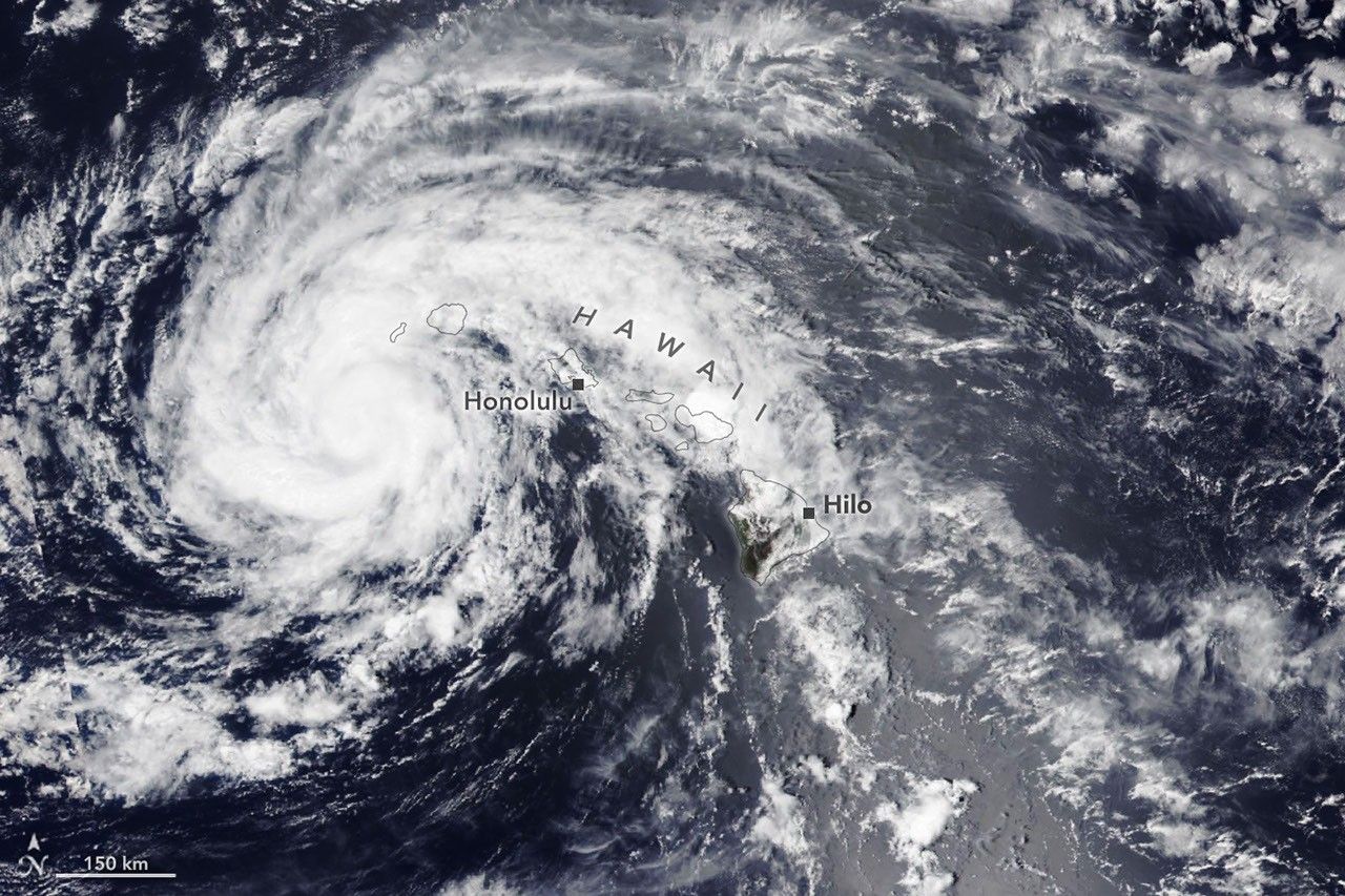
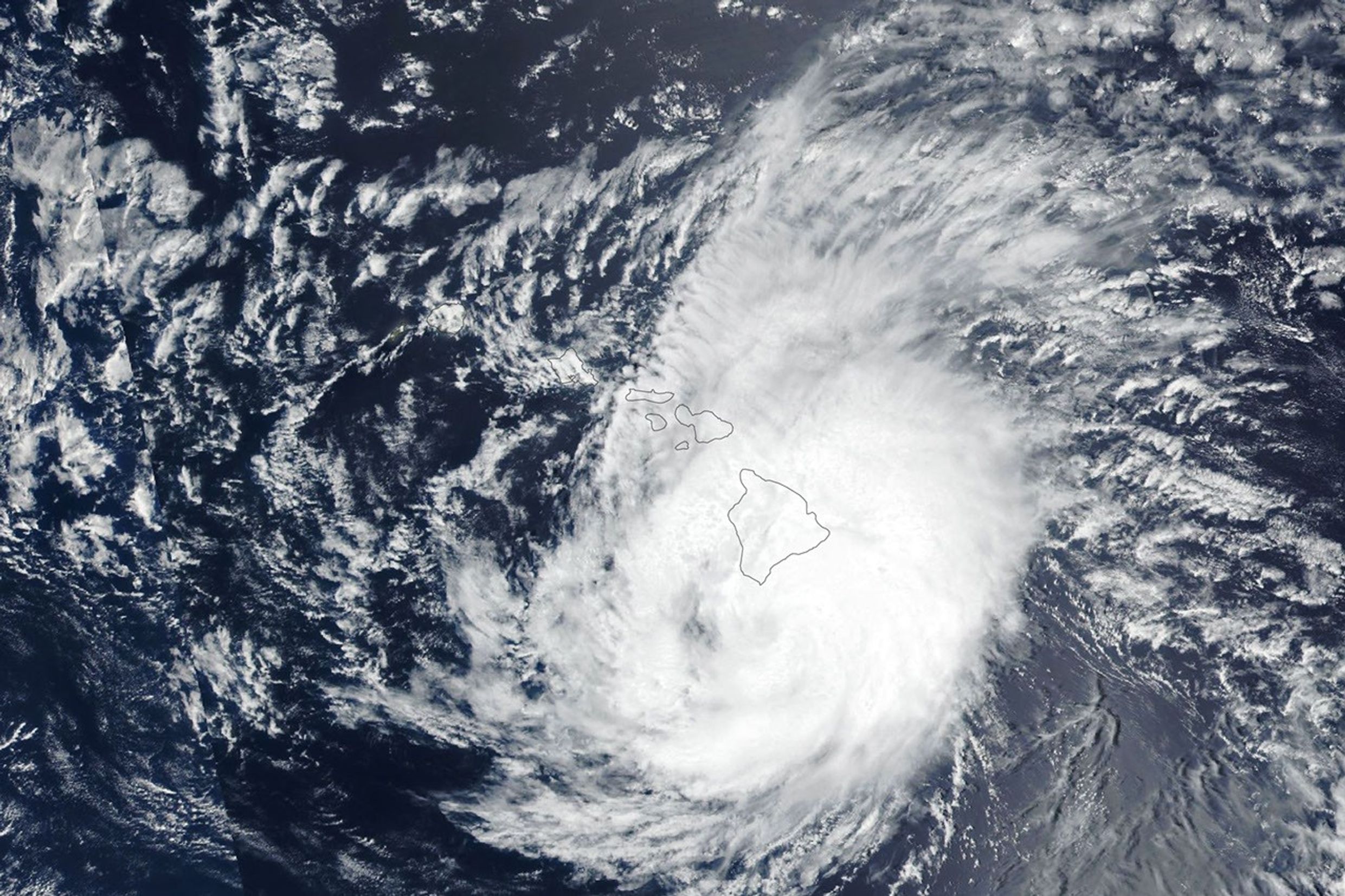
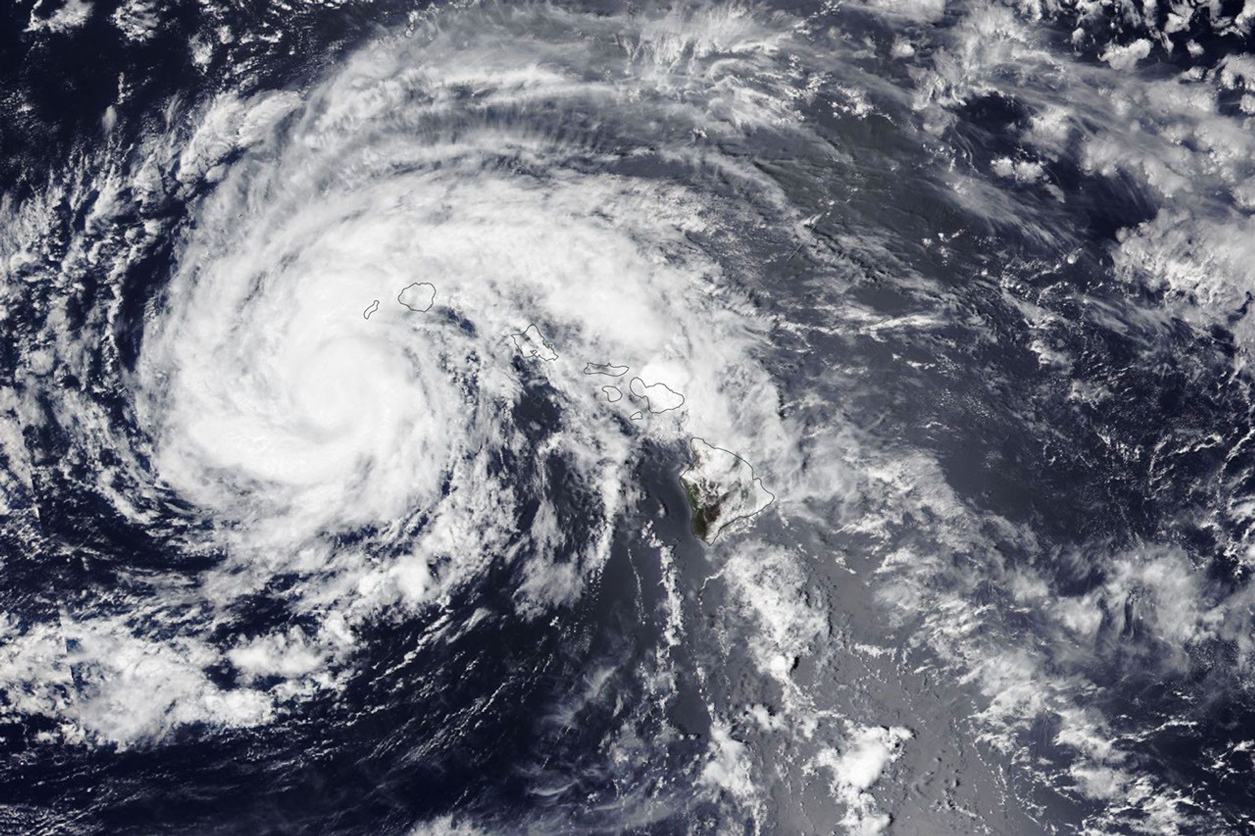
The spiraling clouds of a tropical storm are centered near the Hawaiian island of Kauaʻi.
NASA Earth Observatory / Lauren Dauphin
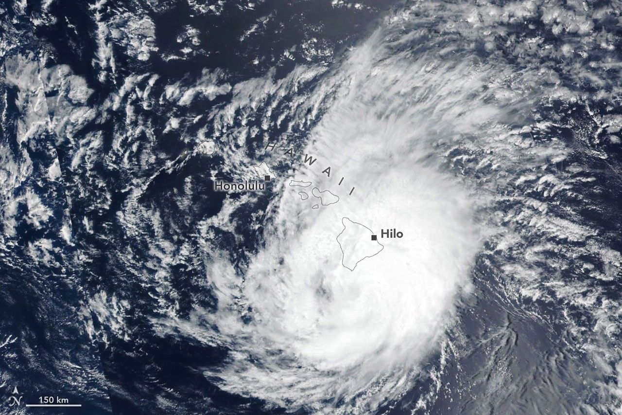
The spiraling clouds of a hurricane appear near the Hawaiian Islands. Its eye is just south of the Island of Hawaiʻi.
NASA Earth Observatory / Lauren Dauphin
The spiraling clouds of a tropical storm are centered near the Hawaiian island of Kauaʻi.
NASA Earth Observatory / Lauren Dauphin
The spiraling clouds of a hurricane appear near the Hawaiian Islands. Its eye is just south of the Island of Hawaiʻi.
NASA Earth Observatory / Lauren Dauphin
August 16, 2026
August 15, 2026
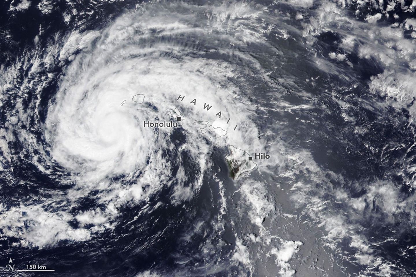
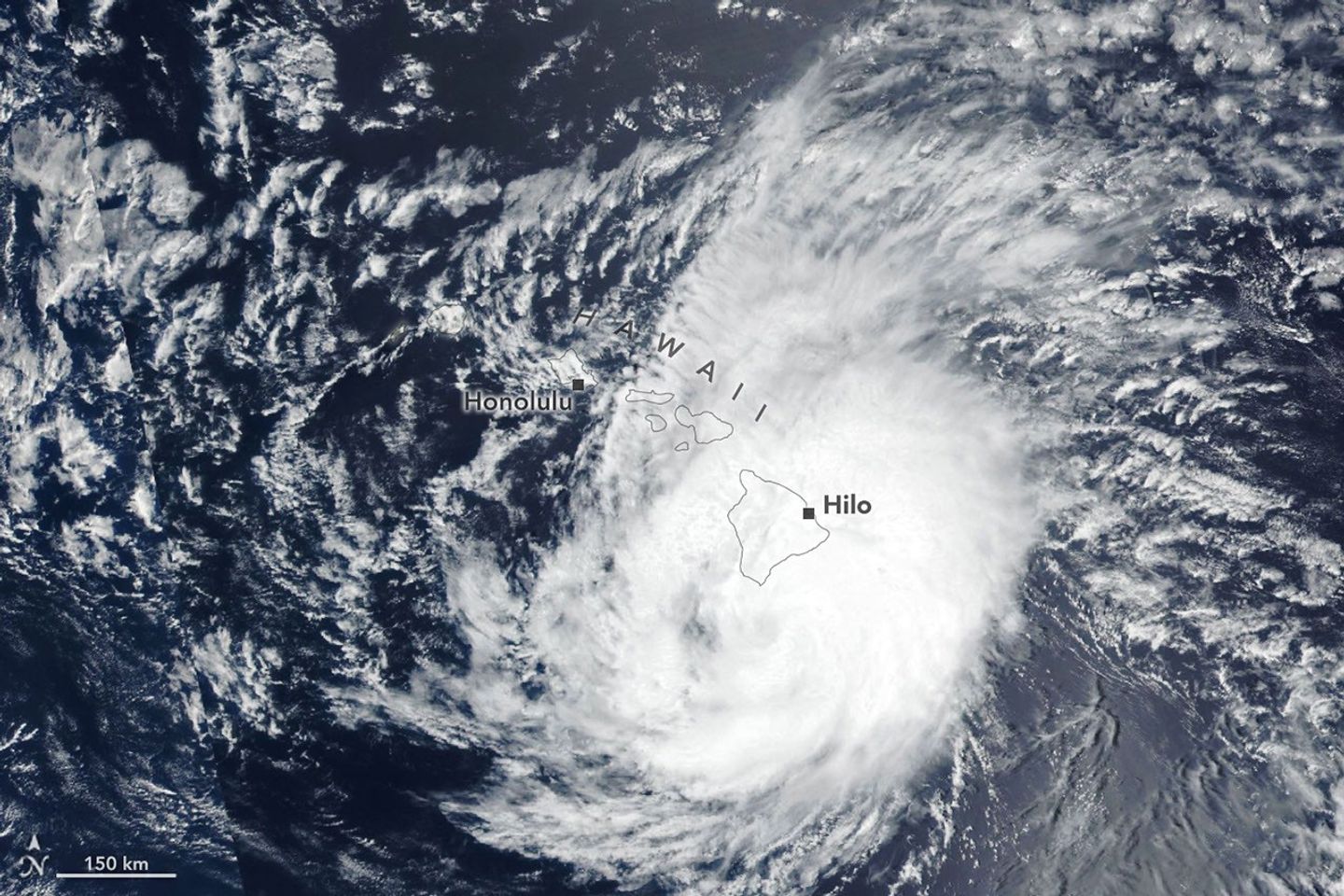
Lala skirts south of the Island of Hawaiʻi as a category 1 hurricane in the right image, acquired by the VIIRS (Visible Infrared Imaging Radiometer Suite) on the Suomi NPP satellite on August 15, 2026, at about 1:45 p.m. Hawaii Standard Time (23:45 Universal Time). The storm decreased in intensity while tracking northwest and was a tropical storm when the VIIRS on the NOAA-20 satellite captured the left image about 24 hours later. NASA Earth Observatory images by Lauren Dauphin.
The Island of Hawaiʻi narrowly avoided a direct landfall by Hurricane Lala in mid-August 2026. The storm nonetheless delivered serious damage as it passed just south of the island on August 15 (above, right) as a category 1 storm on the Saffir-Simpson wind scale.
Lala brought rainfall totals exceeding 20 inches (50 centimeters) to parts of the island, causing flash flooding and ongoing mudflow risks. The highest rainfall total for the storm—43.55 inches (110.6 centimeters) as of the morning of August 17—was recorded at Laupāhoehoe, on the coast northwest of Hilo. Lala downed trees, damaged bridges, and knocked homes off their foundations. Coastal areas were pummeled by large waves, while the summit of Mauna Kea, over 13,000 feet (4,000 meters) above sea level, experienced blizzard conditions.
By early afternoon on August 16, when the other image (left) was acquired, the storm had tracked northwest, roughly parallel to the island chain, and was southwest of Kauaʻi. Lala had decreased in intensity to a tropical storm, with sustained winds of 65 miles (105 kilometers) per hour, according to the National Hurricane Center.
While the Island of Hawaiʻi took the brunt of the storm, other islands also saw destructive effects. Strong winds caused widespread power outages, with more than 220,000 customers statewide without power as of the afternoon of August 16, according to news reports. Across the islands, wind and rain damaged infrastructure, and floodwaters and debris rendered roads impassable.
It has been an active tropical cyclone season in the Eastern Pacific so far in 2026, meteorologists note, consistent with what scientists expect during an El Niño, which has been underway as of mid-June. Warm water in the equatorial Pacific—the hallmark of El Niño—and the moisture and energy it transfers to the atmosphere help fuel nascent tropical storms. Lack of wind shear, another typical El Niño pattern in this region, also encourages tropical storms to develop and strengthen. The Atlantic hurricane season, in contrast, has been relatively calm, as greater wind shear over the Atlantic Ocean and Caribbean Sea during an El Niño inhibits hurricane formation by dissipating the upward motion of heat.
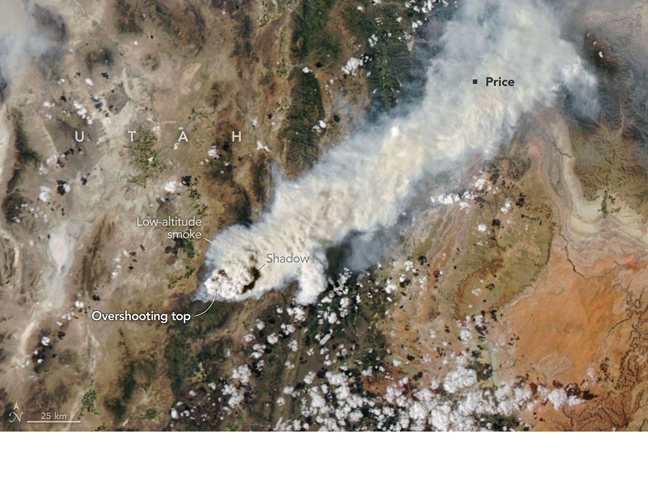
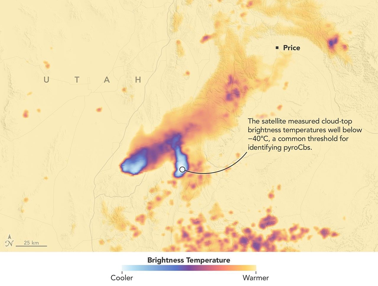
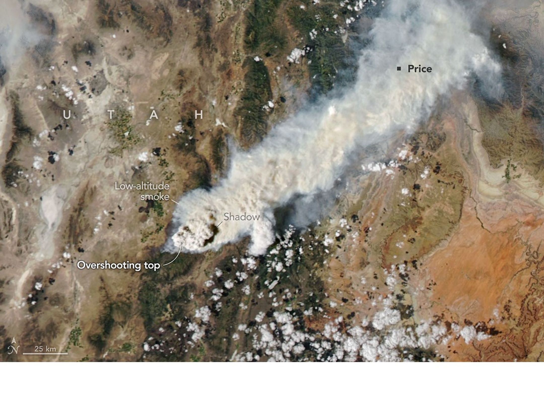
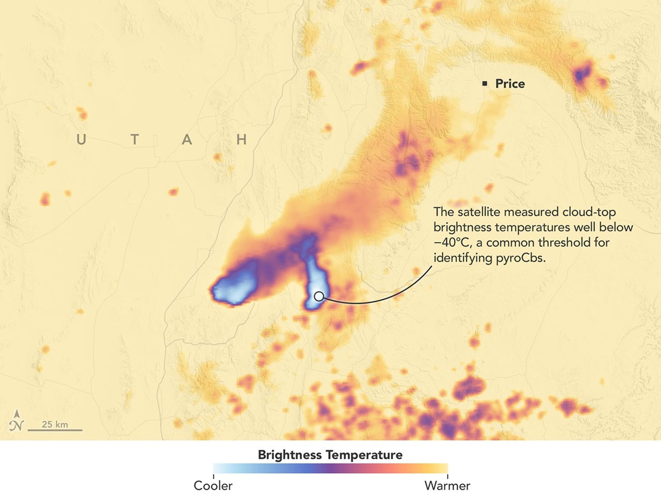
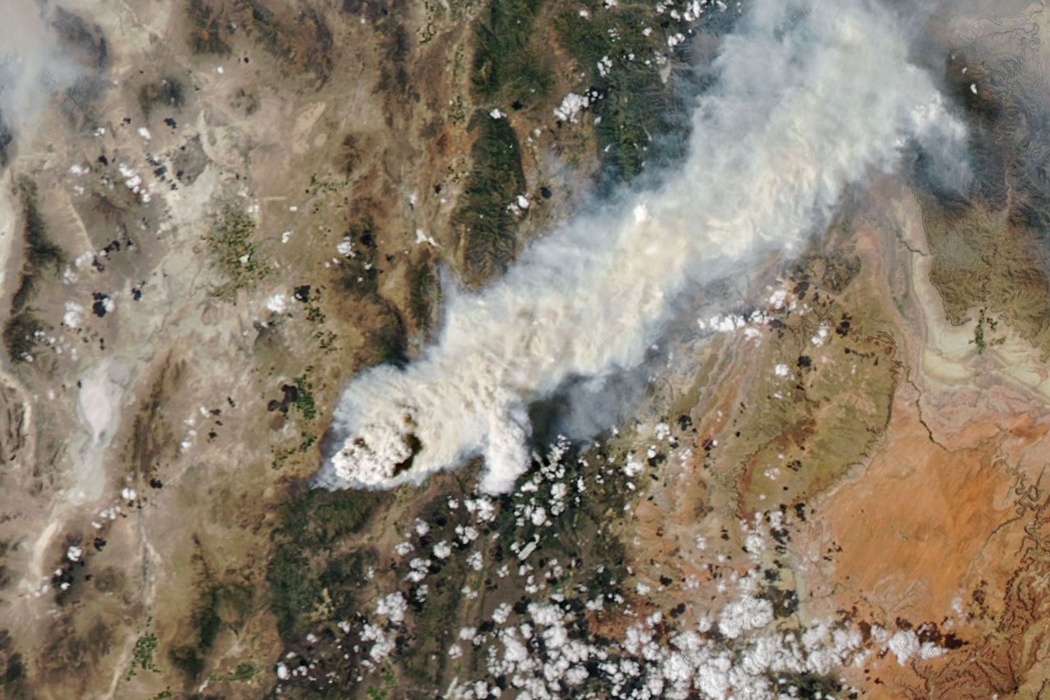
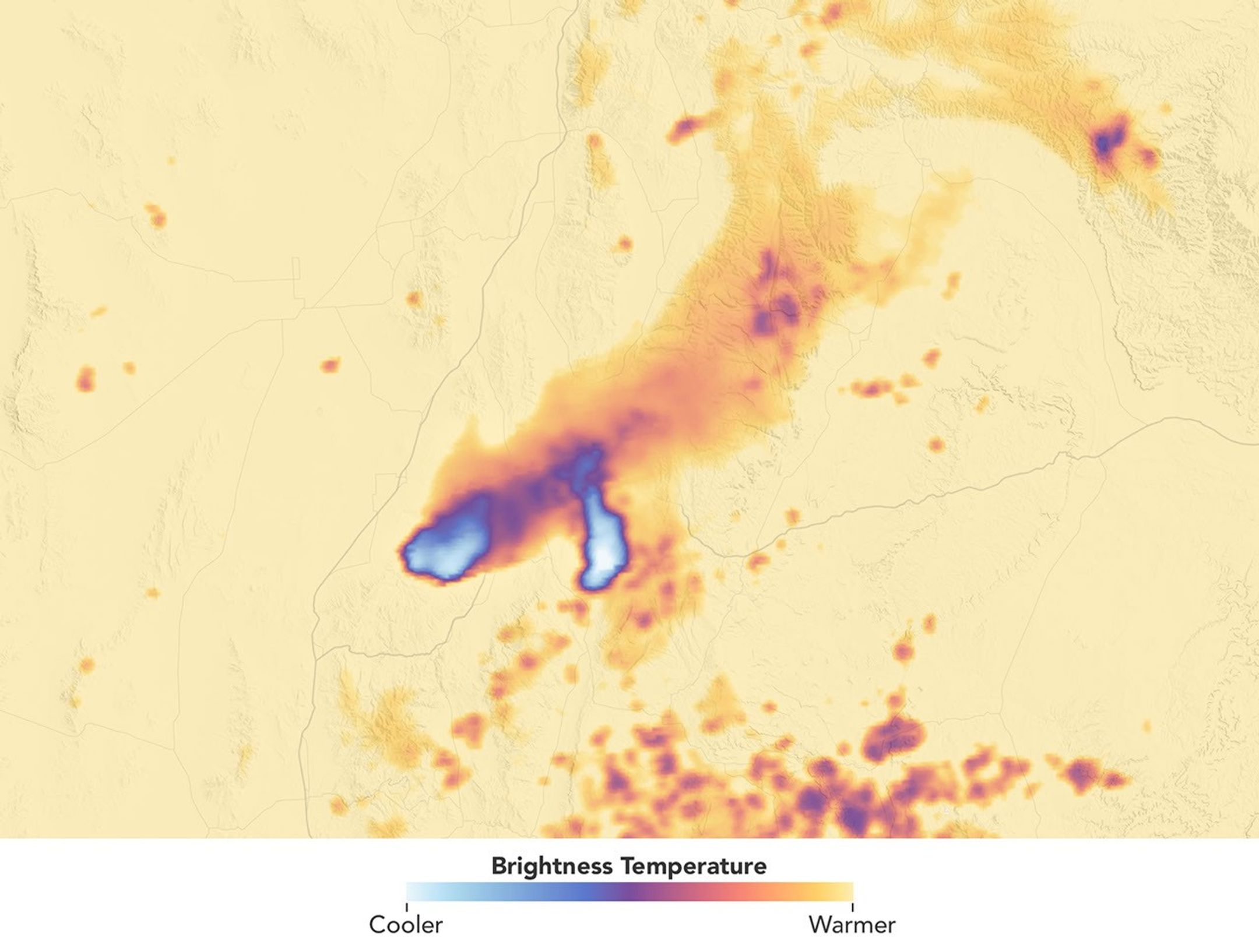
A smoke-infused pyrocumulonimbus (pyroCb) rises from the Widemouth 2 fire in Utah in these images captured by the MODIS (Moderate Resolution Imaging Spectroradiometer) on NASA’s Aqua satellite. The left image is natural color; the right image is false color, revealing cloud-top brightness temperatures below -40°C, a commonly used threshold for identifying pyroCbs. NASA Earth Observatory images by Michala Garrison.
Scientists have long known that volcanoes can launch large quantities of particles into the stratosphere. In the past few decades, it has become clear that wildfires do this, too, by generating towering, smoke-infused pyrocumulonimbus (pyroCb) clouds.
The largest pyroCbs are stunning weather-making features that generate massive thunderheads capable of unleashing lightning, hail, and heavy rain. A growing body of research shows that pyroCbs can also leave an outsized imprint on the upper atmosphere by channeling pulses of particles and gases into the stratosphere’s mostly dry, cloudless confines. Once there, smoke can spread widely and linger for months or years, sometimes circling the globe and likely influencing the ozone layer and Earth’s energy budget.
Understanding these enigmatic and dangerous clouds is why a team of atmospheric scientists—part of a NASA mission called INSPYRE (INjected Smoke and PYRocumulonimbus Experiment)—is spending the summer chasing them with NASA’s ER-2 aircraft, NSF/NCAR’s GV, and a suite of truck-based sensors. The team completed one of its first sampling runs of the summer on August 3, 2026, when the GV flew through a high-altitude pulse of smoke from the Widemouth 2 fire, one of Utah’s largest so far this year.
Lightning ignited the fire on July 27, 2026, but it remained relatively small until August 2, when it more than doubled in size amid intense winds and hot, dry conditions. That afternoon, soon after it had produced two pyroCb bursts, the MODIS (Moderate Resolution Imaging Spectroradiometer) on NASA’s Aqua satellite captured this image (above), showing a chimney of high-altitude cloud and smoke casting a shadow on low-altitude smoke below.
These bursts propelled clouds high enough that Aqua measured cloud-top brightness temperatures well below −40°C, a common threshold for identifying pyroCbs and a sign that the cloud tops were bubbling to the top of the troposphere and sometimes into the stratosphere. The brightness temperature measurements “reveal two discrete pulses of pyroCb action,” said Michael Fromm, a scientist at the U.S. Naval Research Laboratory. “The westernmost is the youngest pulse and stands out in the visible imagery by virtue of its shadow.”
Though relatively routine and minor, this pyroCb event followed a pre-dawn pyroCb from the same fire, imaged by the NOAA weather satellite GOES-West. “Morning pyroCbs are much more unusual,” Fromm said, because they don’t benefit from daytime heating that helps fuel convection. In this case, however, there appeared to be enough atmospheric instability and water vapor in the air to allow for pyroCb development.
Multiple pyroCbs in a single day could have added unwanted complexity for forecasters and fire officials battling the blaze and organizing evacuations, said David Peterson, INSPYRE’s principal investigator. “Minimizing that sort of uncertainty for fire forecasters is a big part of the reason we’re out here studying this,” he added.
Remote sensing experts like Peterson and Fromm routinely study pyroCbs from afar with satellites, but it’s less common for pilots to chase and sample smoke plumes just hours after they form. In this case, the GV aircraft, on the ground in Colorado when the Widemouth 2 fire blew up, made a beeline for a high-altitude smoke plume as it drifted over New Mexico on August 3. The instruments on the plane sampled smoke at roughly 12 kilometers (8 miles) above the surface, collecting data at a height that isn’t typically incorporated into forecast models.
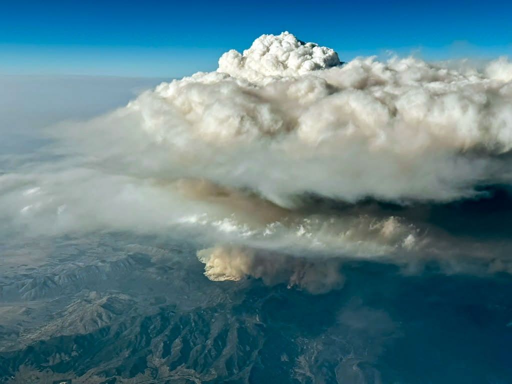
A photo of the Widemouth 2 fire taken from an INSPYRE aircraft during a sampling flight on August 3, 2026, shows a smoke-infused cloud rising high above the fire.
Bernadett Weinzierl/University of Vienna
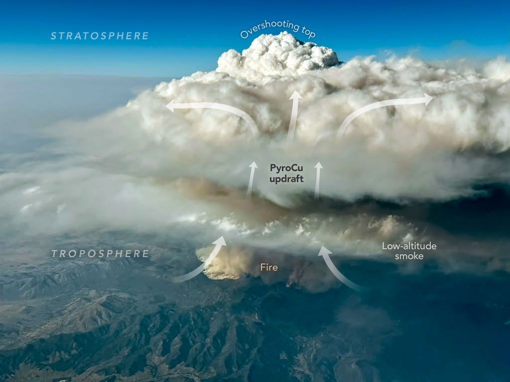
During that mission, a scientist on board captured this image (above) of a pyrocumulus (pyroCu) billowing up over the Widemouth 2 fire. While not as tall or energetic as pyroCbs, pyroCus are precursor clouds that share many of the same characteristics. Here, heat from the fire is fueling strong convective updrafts, forming a towering cloud with puffy overshooting tops that poke into the upper troposphere as lower-altitude smoke drifts below.
Satellites excel at identifying pyroCbs by measuring the temperature of the cloud tops that form above smoke plumes. Using this technique, researchers have established that wildfires produce about 70 pyroCbs per year, many in dense forests of Canada and Russia, though plenty also occur in grasslands and savannas in the United States and Australia. So far in 2026, Fromm and colleagues have identified at least 13 in the continental United States.
Since one of the first pyroCbs appeared in the scientific literature in the early 2000s, scientists have cataloged well over 700 events, and they now believe that wildfires may contribute up to 25 percentof the black carbon and organic aerosols in the lower stratosphere. The sheer frequency of pyroCbs means that the total mass of particles they inject over the course of a wildfire season may rival that of large volcanic eruptions.
Still, many questions about the enigmatic clouds remain unanswered. It isn’t clear what vegetation is most likely to fuel pyroCbs, why some form more lightning than others, why they form in only a small fraction of fires, and how to accurately forecast them.
“Whether it be their dangerous manifestations on the ground or their long-lasting imprint on the upper troposphere and lower stratosphere,” Fromm said, “pyroCbs continue to surprise us.”
NASA Earth Observatory images by Michala Garrison, using MODIS data from NASA EOSDIS LANCE and GIBS/Worldview. Photo by Bernadett Weinzierl/University of Vienna.Story by Adam Voiland.
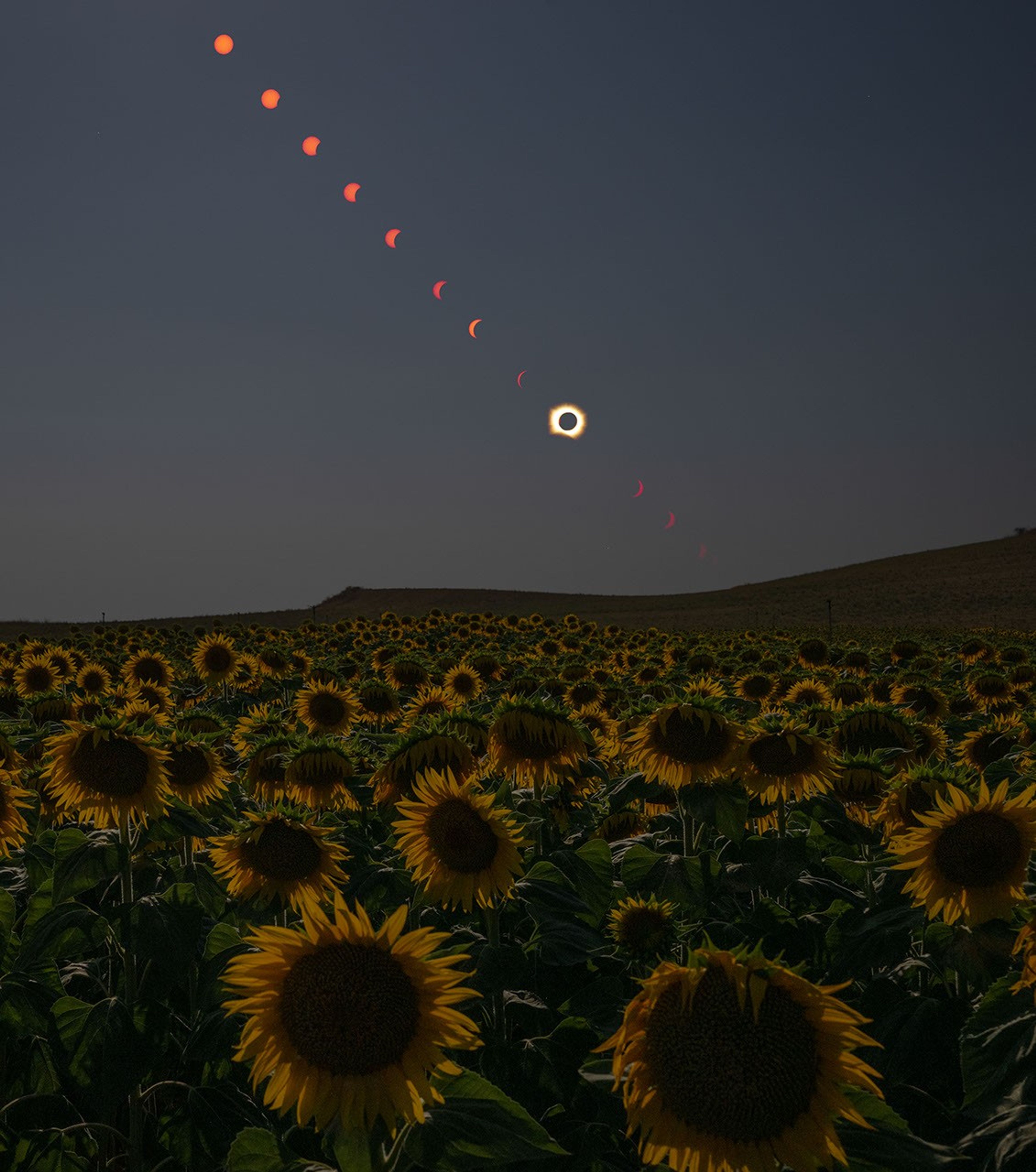
Skywatchers across a swath of northern Spain witnessed a total solar eclipse when the Moon lined up directly between the Sun and Earth on August 12, 2026. Those within the path of totality had the rare chance to glimpse the Sun’s active outer atmosphere, or corona, during the short time the Moon blocked the Sun.
This composite photo was taken before, during, and after the total eclipse from a field of appropriately themed flowers in San Millán de los Caballeros, a town about 40 kilometers (25 miles) south of León in northwestern Spain. Along with parts of Greenland and Iceland, Northern Spain was one of the few places on land that fell within this eclipse’s path of totality.
Sunset was approaching when the Moon’s shadow, or umbra, swept across Spain. In León, the partial eclipse began at 7:32 p.m. and ended at 9:22 p.m. local time, just minutes before the Sun dipped below the horizon. Totality lasted about two minutes, starting at 8:28 p.m. Farther east in Spain, the Sun set before the eclipse ended.
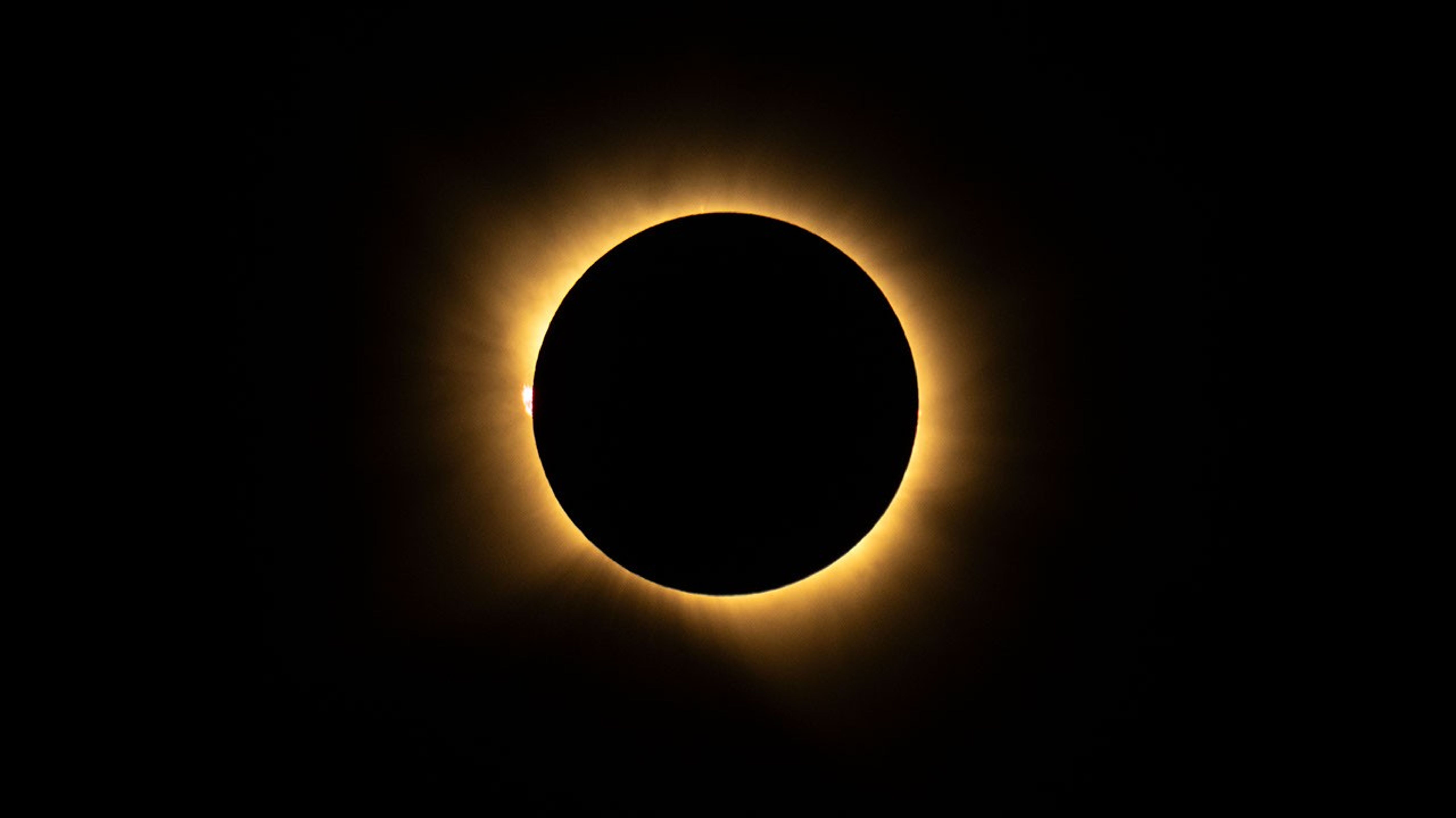
A total solar eclipse is seen from San Millán de los Caballeros, Spain, on August 12, 2026.
In the photo above, taken during totality, a glowing loop of plasma called a solar prominence is visible extending into the corona on the left. Plasma, a super-hot gas composed mostly of ionized hydrogen and helium, flows along the tangled and twisted structure of the Sun’s magnetic fields. Solar prominences, which can measure many times higher than Earth is wide, are sometimes visible to the naked eye during eclipses.
Solar eclipses offer NASA the opportunity to get a different look at the Sun and our own atmosphere. On August 12, science teams staged in Iceland to chase the Moon’s shadow in one of NASA’s WB-57 high-altitude jets and image the corona in visible and infrared light. And the NASA-supported Nationwide Eclipse Ballooning Project launched scientific balloons before, during, and after the eclipse to measure how Earth’s atmosphere changed when the Sun was temporarily blocked.
While viewing opportunities in the path of totality were limited, the rest of Europe and parts of Africa, Canada, and the U.S. experienced a partial eclipse. Photos and video from the total and partial eclipse are available in NASA’s image library. The next total solar eclipse will occur on August 2, 2027, with the path of totality crossing southern Spain, North Africa, Saudi Arabia, and Yemen.
NASA photos by Bill Ingalls. Story by Lindsey Doermann.
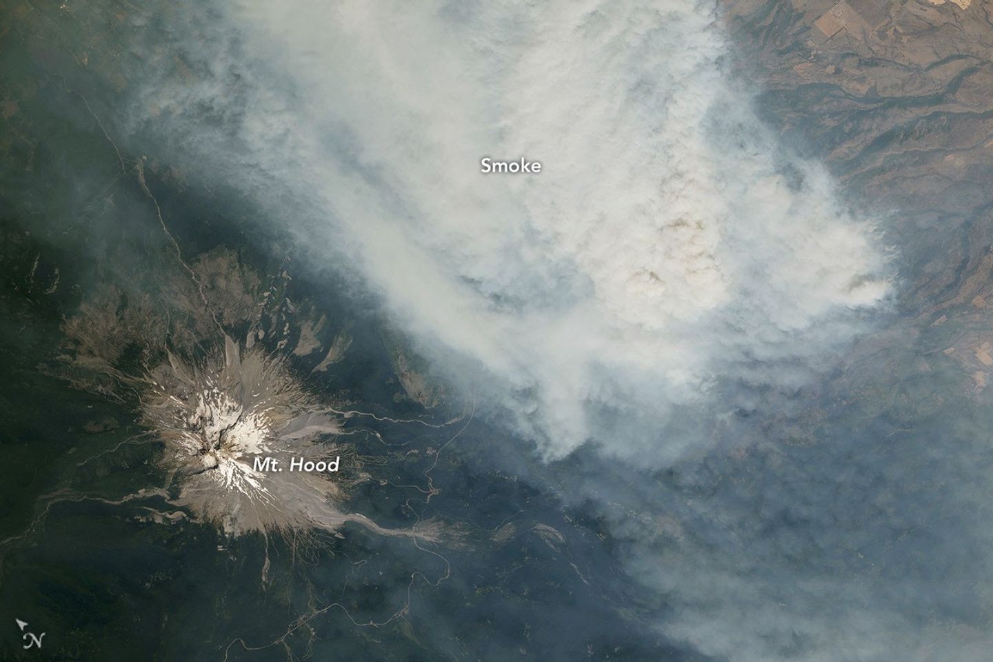
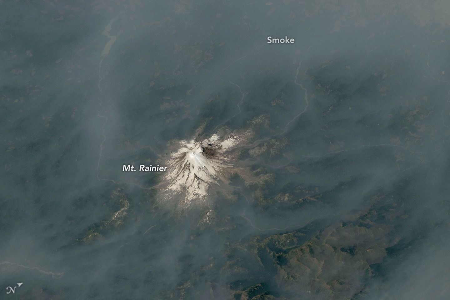
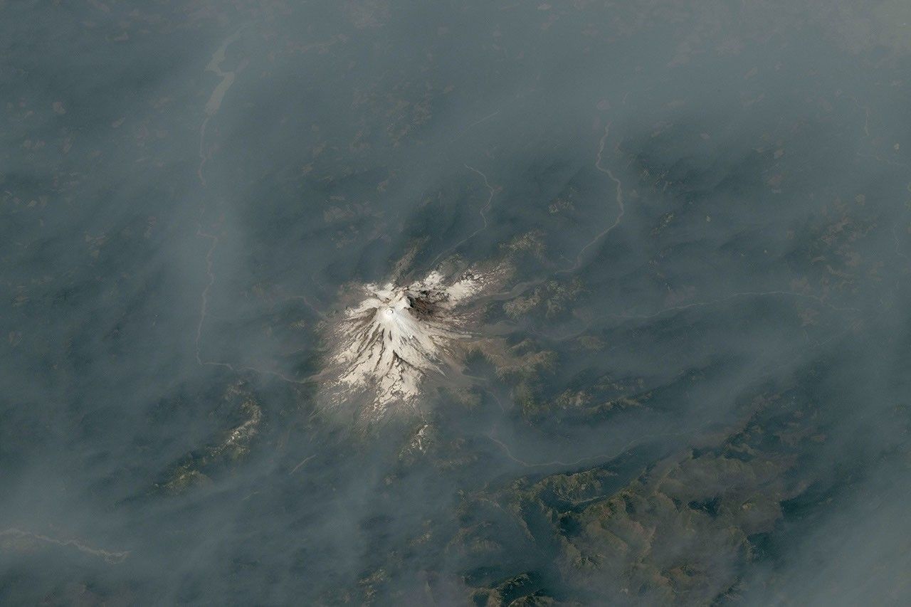
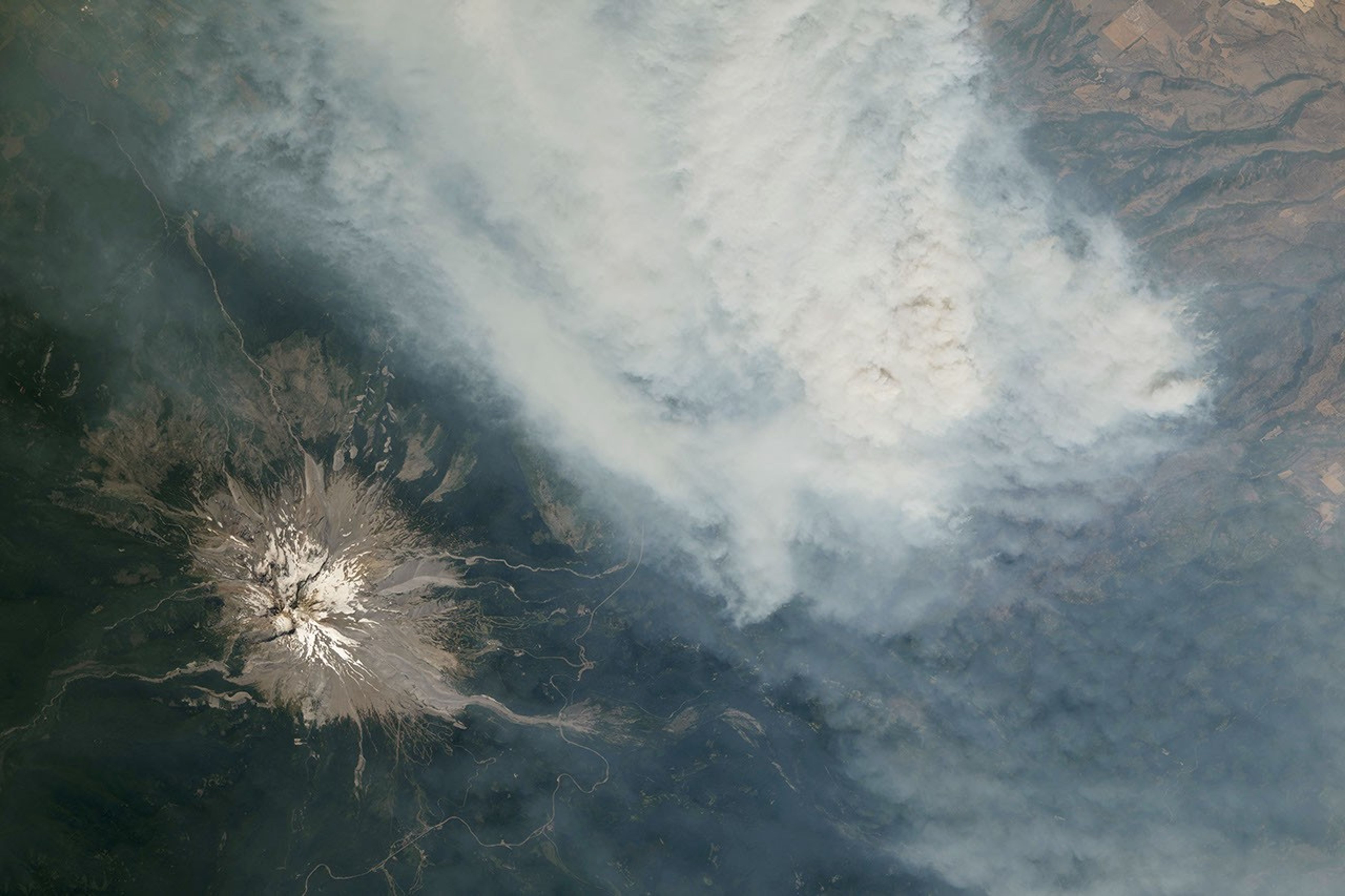
In a contrast of fire and ice, smoke from wildland fires mingled with several of the Cascade Range’s prominent, glaciated volcanoes in summer 2026. Astronauts on the International Space Station photographed the scene while orbiting over the U.S. West in late July and early August.
Mount Hood, Oregon’s tallest peak at 11,249 feet (3,429 meters), is pictured above, near a thick plume of smoke pouring from the Grasshopper fire. Thunderstorms passed over the forest in the preceding weeks, and a lightning strike on July 23 ignited the blaze pictured in this July 31 photo. The fire, burning east of the mountain, spread quickly north and east across Mount Hood National Forest amid hot, dry conditions, according to InciWeb.
As of August 12, it had burned nearly 84,000 acres (34,000 hectares) and spread beyond national forest boundaries. Several communities in Wasco County were under “go now” evacuation orders, and the nearby town of Dufur was advised to prepare for immediate evacuation.
August 4, 2026
Roughly 100 miles to the north in Washington, Mount Rainier—the state’s tallest peak at 14,411 feet (4,392 meters)—was wreathed in smoke. No major fires burned nearby when this photo was taken on August 4. Instead, smoke drifted in from fires in central and eastern Washington, carried by winds blowing from the east due to a high-pressure system offshore. That day, the National Park Service reported that air quality in the park reached unhealthy levels due to elevated concentrations of fine particulate matter (PM2.5).
Several days later, the Grand Park 2 fire was observed burning within park boundaries, about 3 miles north of the Sunrise Visitor Center. As of August 12, the fire had burned 223 acres (90 hectares) and was uncontained; the cause was yet undetermined.
Above-normal fire potential was expected to persist across the Northwest through August, according to an outlook from the National Interagency Fire Center. Warm, dry weather—conditions influenced by El Niño—combined with cured fuels to set the stage for large, long-burning fires following lightning- or human-caused ignitions.
Astronaut photographs ISS075-E-1705 and ISS075-E-2221 were acquired on July 31, 2026, and August 4, 2026, respectively, with a Nikon Z9 digital camera using a focal length of 400 millimeters. They are provided by the ISS Crew Earth Observations Facility and the Earth Science and Remote Sensing Unit at NASA Johnson Space Center. The images were taken by a member of the Expedition 75 crew. The images have been cropped and enhanced to improve contrast, and lens artifacts have been removed. The International Space Station Program supports the laboratory as part of the ISS National Lab to help astronauts take pictures of Earth that will be of the greatest value to scientists and the public, and to make those images freely available on the Internet. Additional images taken by astronauts and cosmonauts can be viewed at the NASA/JSC Gateway to Astronaut Photography of Earth. Story by Kathryn Hansen.
Downloads
Mt. Rainier: August 4, 2026
JPEG (10.14 MB)
Mt. Hood: July 31, 2026
JPEG (7.44 MB)
References & Resources
InciWeb (2026, August 12) Grand Park 2 Fire. Accessed August 12, 2026.
InciWeb (2026, August 11) Grasshopper Fire. Accessed August 12, 2026.
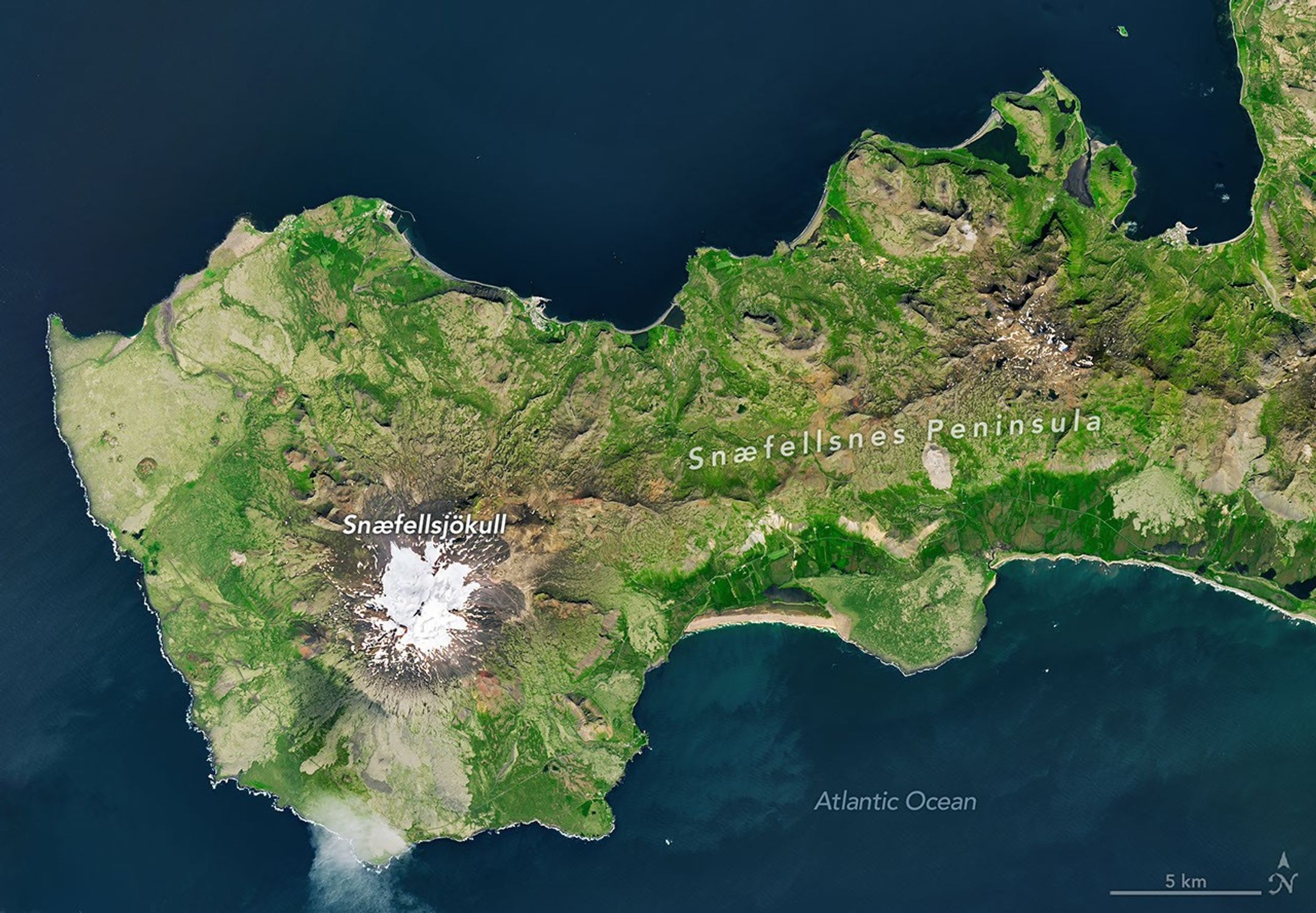
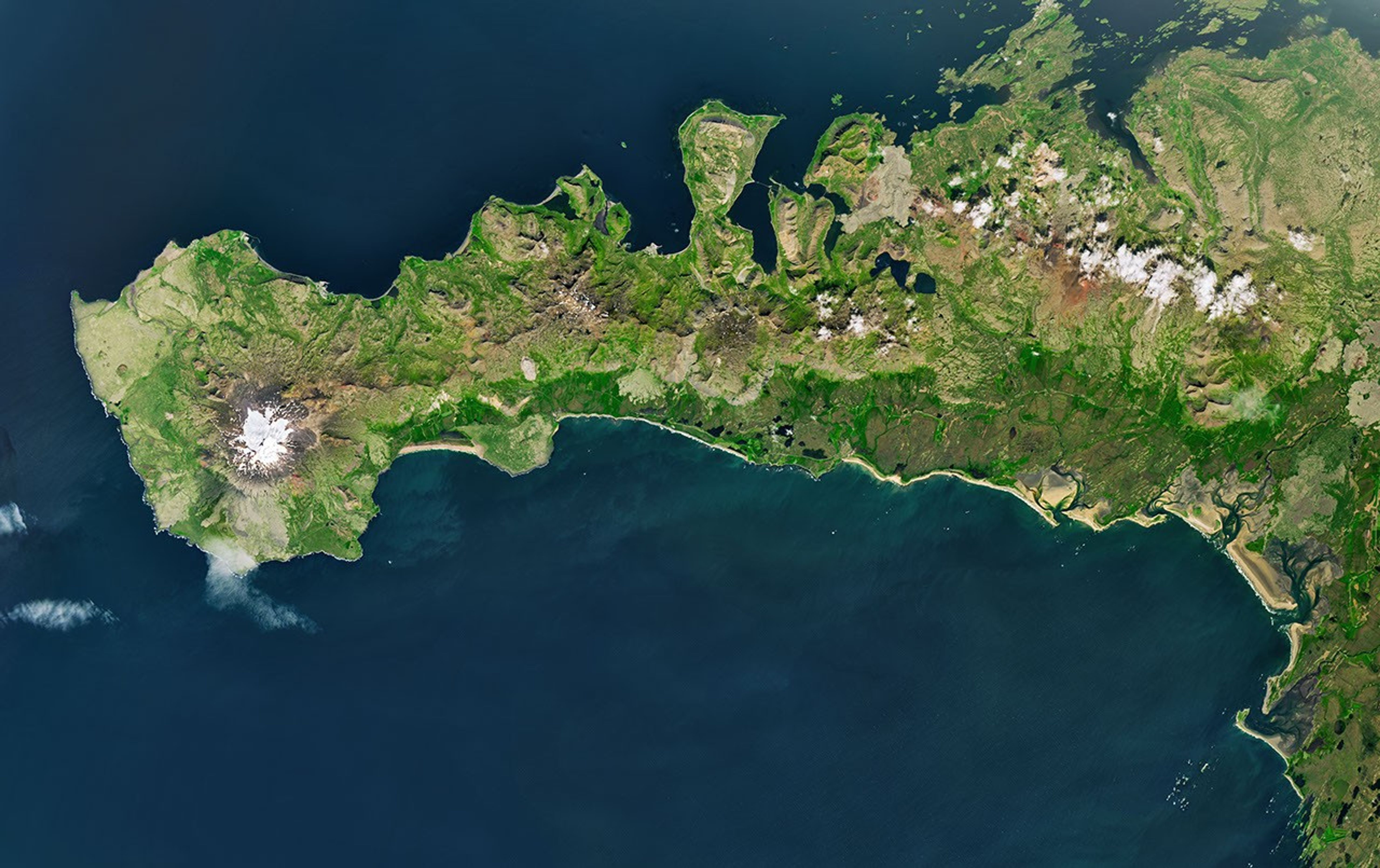
The glacier-capped Snæfellsjökull volcano is the defining feature of Iceland’s Snæfellsnes peninsula, shown in this image acquired with the OLI (Operational Land Imager) on Landsat 9 on July 25, 2026.
NASA Earth Observatory/Michala Garrison
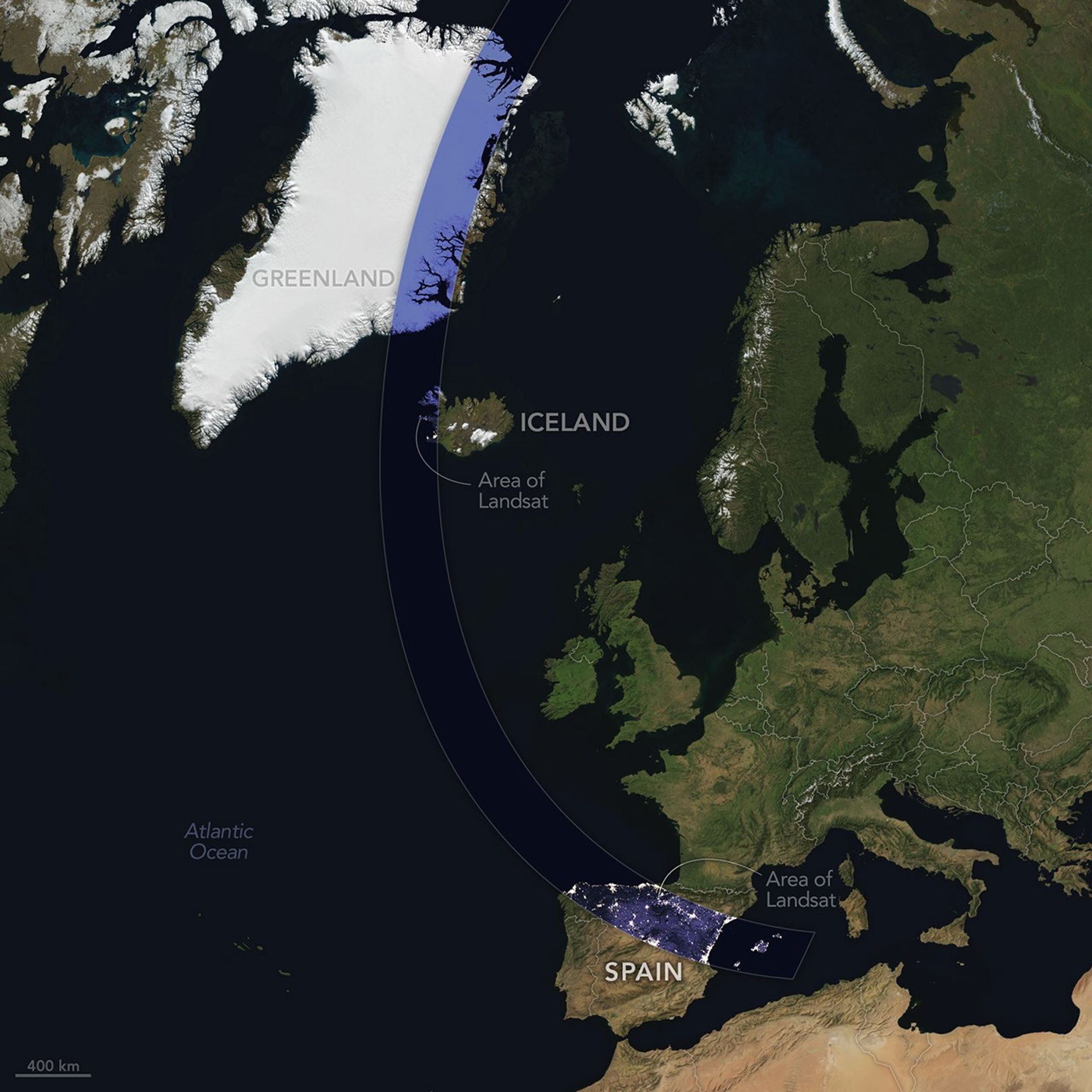
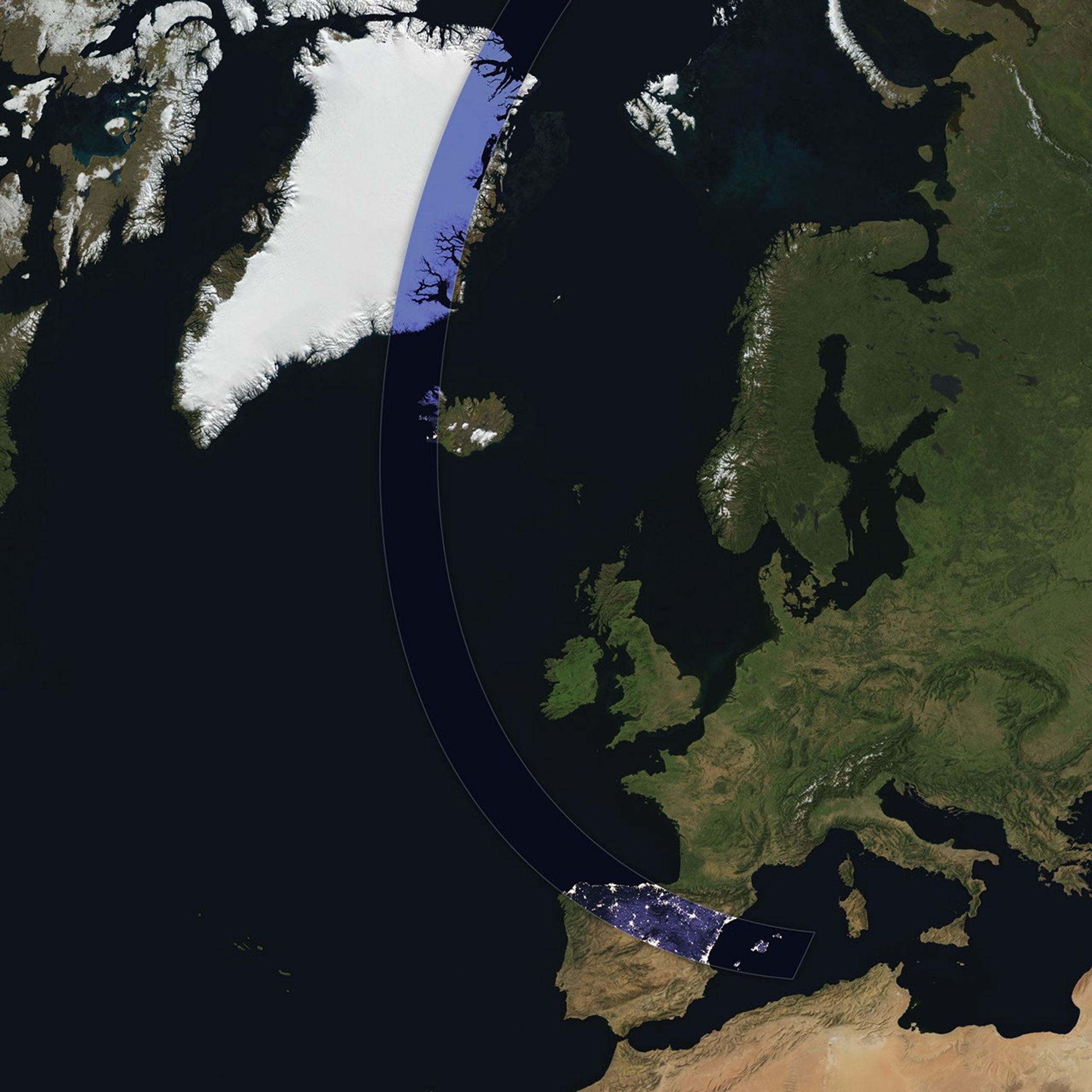
The Sun, Moon, and Earth align on August 12, 2026, to produce a total solar eclipse. When this celestial event last occurred, on April 8, 2024, the path of totality stretched across North America, giving millions the chance to glimpse the Sun’s corona. In 2026, the viewing locales are more limited; only a handful of land areas in the Northern Hemisphere, including parts of Iceland and Spain, fall within the path of totality.
On August 12, the Moon’s shadow will first cross over the Arctic Circle from northern Russia and then track along the eastern side of Greenland. At about 5:45 p.m. local time in Iceland (17:45 Universal Time), the country’s western fringes—including the Snæfellsnes peninsula, shown in the Landsat image above—will begin to experience totality. The greatest eclipse will occur near this sparsely populated peninsula when the Moon appears the largest and covers more of the Sun.
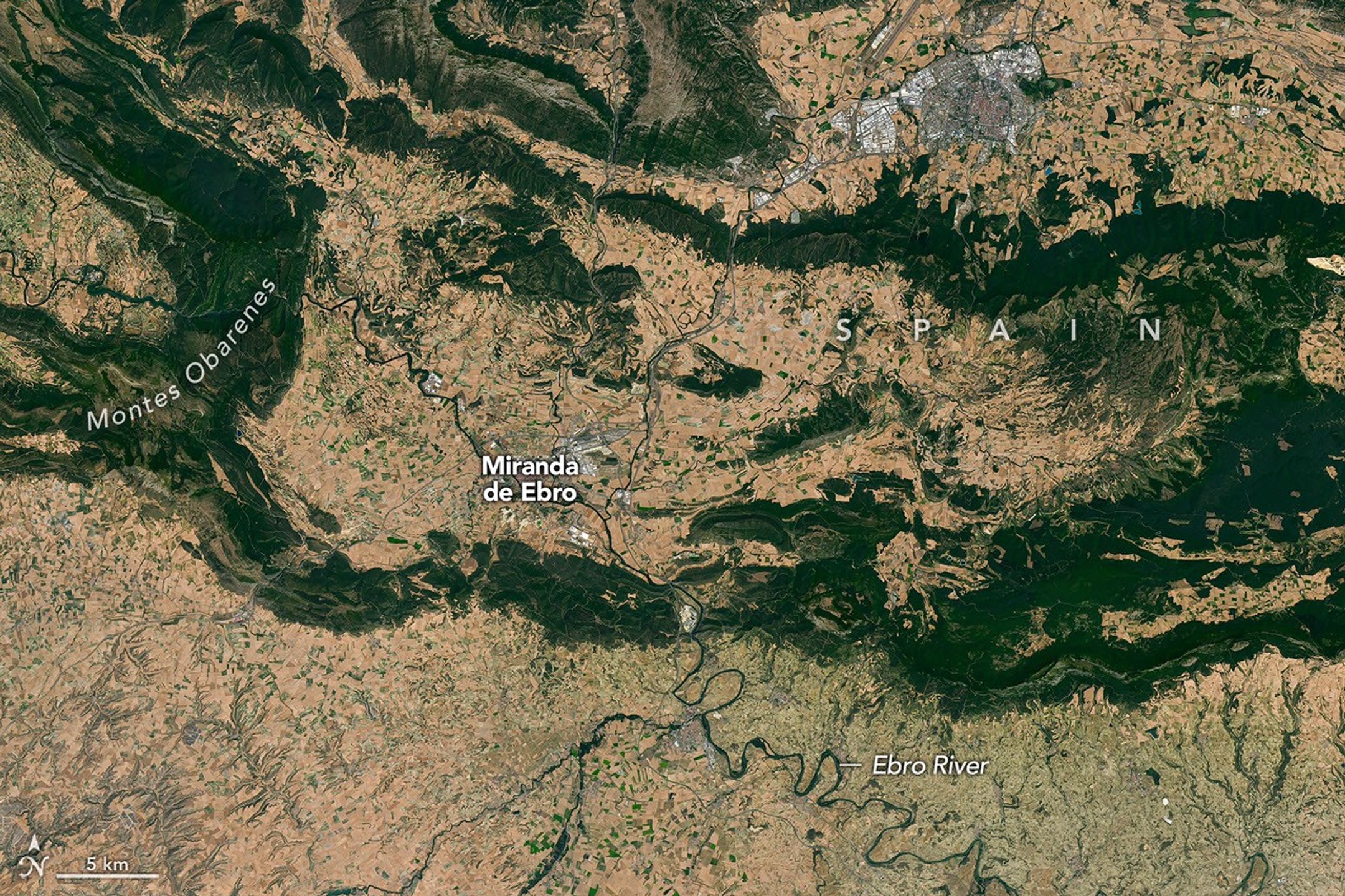
The path of totality of the solar eclipse on August 12, 2026, spans Greenland, Iceland, and Spain. The base imagery for the map comes from Blue Marble: Next Generation, with data from Black Marble shown in the path of totality. Blue Marble is built from scenes captured by MODIS (Moderate Resolution Imaging Spectroradiometer), while Black Marble is based on observations by the VIIRS (Visible Infrared Imaging Radiometer Suite) day-night band.
NASA Earth Observatory/Michala Garrison
The Snæfellsjökull volcano on the western end of the peninsula is covered in ice and last erupted about 1,800 years ago. It is the highlight of a national park of the same name, where people are expected to visit to view the eclipse. The stratovolcano even has a literary claim to fame: in Jules Verne’s A Journey to the Center of the Earth, characters venture underground through its crater, later emerging in an eruption of Stromboli, in Italy. In 2025, a broader area of the peninsula was designated a UNESCO biosphere reserve, containing over 70 percent of Iceland’s flora and an agglomeration of volcanic landscapes, wetlands, and grasslands.
From Iceland, the eclipse shadow, or umbra, progresses across the North Atlantic and reaches northern Spain shortly before sunset. It runs east-southeast across the country, much like the Ebro River (Río Ebro), seen in the Landsat image below.
The Ebro River, meandering across northern Spain in this image acquired with the OLI (Operational Land Imager) on Landsat 8 on July 21, 2026, is in the path of totality of the August 2026 solar eclipse.
NASA Earth Observatory/Michala Garrison
The upper Ebro emerges from rugged terrain in Parque Natural de Montes Obarenes-San Zadornil, where it carves canyons and gorges through the eastern foothills of the Cantabrian Mountains. It then meanders through La Rioja, a region known for its vineyards. About 400 kilometers (250 miles) away, the river reaches a delta on the Mediterranean coast between Barcelona and Valencia.
Based on satellite measurements of cloud cover in August over several decades, viewers in Spain have a higher likelihood than those in Iceland of getting a clear look at the eclipse. And despite limited viewing opportunities in the path of totality, the rest of Europe, parts of Africa, Canada, and the northern and northeastern U.S. will experience a partial eclipse.
Water covers intertidal mudflats around Roebuck Bay in Western Australia, as seen in this image captured by the OLI (Operational Land Imager) on Landsat 8 on March 18, 2026.
NASA Earth Observatory / Lauren Dauphin
Editor’s Note: Today’s story is the answer to the August Puzzler.
Tides are among the clearest signs of the Moon’s pull on Earth. Just 239,000 miles (385,000 kilometers) away, the Moon’s gravity pulls on Earth’s oceans and solid crust, subtly distorting them into a more oblong shape with bulges roughly extending toward and away from the Moon.
High tides happen throughout Earth’s oceans, but in some places they leave an unusually strong fingerprint on the landscape. Among those places is Roebuck Bay, a crescent-shaped feature in the Kimberley region of Western Australia.
Roebuck Bay’s tidal range can reach a remarkable 9 meters (30 feet). Rising and falling tides repeatedly inundate and expose expansive mudflats, flood broad mangrove forests and salt marshes, and feed branching networks of tidal drainage channels. Many parts of Australia have tidal ranges of 2 meters or less. But the large range at Roebuck Bay is mostly a consequence of northwestern Australia’s unusually wide, shallow continental shelf, which helps amplify tides as they approach the coast.
The image at the top of the page shows the bay on March 18, 2026, when water levels were high. Green mangrove forests grow thickly along the shoreline and line the mouths of a network of evenly spaced, linear tidal creeks. These mangrove forests are dynamic. Analysis of decades of Landsat observations shows them expanding westward by nearly 2 meters per year as sediment from the waterways to the east accumulates in the sheltered bay.
Farther inland, branching networks of tidal drainage channels connect with the tidal creeks, giving the bay its feathered appearance. These channels, partially obscured by thick vegetation in March, were more visible earlier and later in the year, when vegetation was thinner.
Around Roebuck Bay, inland vegetation greens after monsoon rains, peaking in March, and turns brown and dry by June. The Landsat 8 and 9 satellites captured these images throughout 2026.
NASA Earth Observatory / Lauren Dauphin
Monsoonal rains, typically falling between December and March, transform the landscape around the bay into lush grasslands and seasonal wetlands. As the rains fade in May and June and the dry season takes hold, these ephemeral grasses and sedge ecosystems die back, turning the landscape shades of gold and brown. The consistent spacing of the tidal creeks is likely not a tidal effect; it appears to be influenced by the regular spacing of linear dunes in the broader region, as seen in the plains to the east.
The bay’s dramatic tidal and seasonal changes are striking from above, and they also support a bounty of life on the ground. The mangroves serve as nurseries for crustaceans and fish, and the mudflats teem with dozens of types of invertebrates, including snails, worms, crabs, clams, and cockles. Shells and snails can reach an abundance of 2,500 per square meter, according to the Australian government.
This bounty of marine life is a major draw for birds. The bay, one of the most important sites for migratory birds in Australia and a key stop on the East Asian-Australasian Flyway, regularly hosts hundreds of thousands of birds, including plovers, godwits, and knots.
NASA Earth Observatory images by Lauren Dauphin, using Landsat data from the U.S. Geological Survey.Story by Adam Voiland.
Downloads
January 29, 2026
JPEG (3.65 MB)
March 18, 2026
JPEG (3.41 MB)
June 20, 2026
JPEG (3.61 MB)
References & Resources
Birdlife International (2026) Roebuck Bay. Accessed August 10, 2026.
Brockmann Consult (2025) Roebuck Bay. Accessed August 10, 2026.

 Login
Login